| Issue |
A&A
Volume 662, June 2022
|
|
|---|---|---|
| Article Number | A9 | |
| Number of page(s) | 40 | |
| Section | Catalogs and data | |
| DOI | https://doi.org/10.1051/0004-6361/202141681 | |
| Published online | 31 May 2022 | |
ALMA-IMF
II. Investigating the origin of stellar masses: Continuum images and data processing⋆
1
Department of Astronomy, University of Florida, PO Box 112055 Florida, USA
e-mail: This email address is being protected from spambots. You need JavaScript enabled to view it.
2
Laboratoire d’astrophysique de Bordeaux, Univ. Bordeaux, CNRS, B18N, allée Geoffroy Saint-Hilaire, 33615 Pessac, France
3
Instituto de Radioastronomía y Astrofísica, Universidad Nacional Autónoma de México, Morelia, Michoacán 58089, Mexico
4
Univ. Grenoble Alpes, CNRS, IPAG, 38000 Grenoble, France
5
Departamento de Astronomía, Universidad de Concepción, Casilla 160-C, 4030000 Concepción, Chile
6
S. N. Bose National Centre for Basic Sciences, Block JD, Sector III, Salt Lake, Kolkata 700106, India
7
Univ. Grenoble Alpes, CNRS, IPAG, 38000 Grenoble, France
8
Institut de Ciències de l’Espai (ICE, CSIC), Can Magrans, s/n, 08193 Cerdanyola del Vallès, Catalonia, Spain
9
Institut d’Estudis Espacials de Catalunya (IEEC), 08340 Barcelona, Catalonia, Spain
10
Instituto Argentino de Radioastronomía (CCT-La Plata, CONICET; CICPBA), C.C. No. 5, 1894, Villa Elisa, Buenos Aires, Argentina
11
National Astronomical Observatory of Japan, National Institutes of Natural Sciences, 2-21-1 Osawa, Mitaka, Tokyo 181-8588, Japan
12
Department of Astronomy, Yunnan University, Kunming 650091, PR China
13
Institut de Radioastronomie Millimétrique (IRAM), 300 rue de la Piscine, 38406 Saint-Martin-D’Hères, France
14
Univ. Grenoble Alpes, CNRS, IPAG, 38000 Grenoble, France
15
AIM, CEA, CNRS, Université Paris-Saclay, Université Paris Diderot, Sorbonne Paris Cité, 91191 Gif-sur-Yvette, France
16
LERMA (UMR CNRS 8112), École Normale Supérieure, 75231 Paris Cedex, France
17
ESO Headquarters, Karl-Schwarzchild-Str 2, 85748 Garching, Germany
18
National Astronomical Observatory of Japan, 2-21-1 Osawa, Mitaka, Tokyo 181-8588, Japan
19
Department of Astronomy, The University of Tokyo, 7-3-1 Hongo, Bunkyo, Tokyo 113-0033, Japan
20
The Graduate University for Advanced Studies (SOKENDAI), 2-21-1 Osawa, Mitaka, Tokyo 181-0015, Japan
21
Institute of Astronomy, National Tsing Hua University, Hsinchu 30013, Taiwan
22
Department of Astronomical Science, SOKENDAI (The Graduate University for Advanced Studies), 2-21-1 Osawa, Mitaka, Tokyo 181-8588, Japan
23
Max-Planck-Institute for Astronomy, Königstuhl 17, 69117 Heidelberg, Germany
24
Laboratoire de Physique de l’Ecole Normale Supérieure, ENS, Université PSL, CNRS, Sorbonne Université, Université de Paris, 75005 Paris, France
25
University of Connecticut, Department of Physics, 196A Auditorium Road, Unit 3046, Storrs, CT 06269, USA
26
Departamento de Astronomía, Universidad de Chile, Casilla 36-D, Santiago, Chile
27
Herzberg Astronomy and Astrophysics Research Centre, National Research Council of Canada, 5071 West Saanich Road, Victoria, BC V9E 2E7, Canada
28
College of Science, Ibaraki University, 2-1-1 Bunkyo, Mito, Ibaraki 310-8512, Japan
29
Institute of Astronomy and Astrophysics, Academia Sinica, No. 1, Section 4, Roosevelt Road, Taipei 10617, Taiwan
30
AIM, IRFU, CEA, CNRS, Université Paris-Saclay, Université Paris Diderot, Sorbonne Paris Cité, 91191 Gif-sur-Yvette, France
31
Max Planck Institute for Radio Astronomy, Auf dem Hügel 69, 53121 Bonn, Germany
32
Department of Astronomy, University of Maryland, College Park, MD 20742, USA
33
4-183 CCIS, University of Alberta, Edmonton, Alberta, Canada
34
Jansky fellow of the National Radio Astronomy Observatory, Socorro, NM 87801, USA
35
School of Physics and Astronomy, Cardiff University, Cardiff, UK
36
NVIDIA Research, 2788 San Tomas Expy, Santa Clara, CA 95051, USA
37
Universidad de Chile, Camino el Observatorio 1515, Las Condes, Santiago de Chile, Chile
Received:
25
June
2021
Accepted:
21
September
2021
Abstract
We present the first data release of the ALMA-IMF Large Program, which covers the 12m-array continuum calibration and imaging. The ALMA-IMF Large Program is a survey of fifteen dense molecular cloud regions spanning a range of evolutionary stages that aims to measure the core mass function. We describe the data acquisition and calibration done by the Atacama Large Millimeter/submillimeter Array (ALMA) observatory and the subsequent calibration and imaging we performed. The image products are combinations of multiple 12 m array configurations created from a selection of the observed bandwidth using multi-term, multi-frequency synthesis imaging and deconvolution. The data products are self-calibrated and exhibit substantial noise improvements over the images produced from the delivered data. We compare different choices of continuum selection, calibration parameters, and image weighting parameters, demonstrating the utility and necessity of our additional processing work. Two variants of continuum selection are used and will be distributed: the “best-sensitivity” (bsens) data, which include the full bandwidth, including bright emission lines that contaminate the continuum, and “cleanest” (cleanest), which select portions of the spectrum that are unaffected by line emission. We present a preliminary analysis of the spectral indices of the continuum data, showing that the ALMA products are able to clearly distinguish free-free emission from dust emission, and that in some cases we are able to identify optically thick emission sources. The data products are made public with this release.
Key words: instrumentation: interferometers / stars: luminosity function / mass function / ISM: structure / submillimeter: ISM / stars: protostars / HII regions
Data are only available at the CDS via anonymous ftp to cdsarc.u-strasbg.fr (130.79.128.5) or via http://cdsarc.u-strasbg.fr/viz-bin/cat/J/A+A/662/A9
Note to the reader: The CC-BY license for the open access publication of this article has been cancelled on 5 December 2022. This affects the conditions under which the article can be shared and reused.
© ESO 2022
1. Introduction
In our Galaxy, stars form out of dense, dust-rich gas that has its peak emission in the far-infrared and is bright at millimeter wavelengths. Observations of the thermal continuum emission from dust grains have become the most important tool for determining the mass of the pre-stellar material that collapses under self-gravity to form stars (e.g., Motte et al. 1998; Enoch et al. 2008). While star formation within the local kiloparsec is well-observed with single-dish instruments and small interferometers, the Atacama Large Millimeter/submillimeter Array (ALMA) has opened new opportunities to study star formation at solar system scale resolution throughout the Galaxy (e.g., Ginsburg et al. 2017; Motte et al. 2018; Csengeri et al. 2018; Sanhueza et al. 2019).
We have therefore undertaken a large observing program to take advantage of these new capabilities. ALMA-IMF is an ALMA Large Program1 to survey fifteen high-mass star-forming regions in the Galactic plane. The survey overview is given in Motte et al. (2022, hereafter Paper I).
The primary goal of ALMA-IMF is to measure the gas-phase precursor to the stellar initial mass function (IMF), the core mass function (CMF). This distribution function has previously been observed, in local clouds, to share a shape with the IMF (e.g., Motte et al. 1998; Alves et al. 2007; Könyves et al. 2015), leading to the suggestion that the origin of stellar masses is in this gas phase, though other interpretations of this similarity are possible (Offner et al. 2014). The local-cloud observations were limited both in the upper mass limit (Mcore, max ≲ 10 M⊙) and in the range of physical conditions probed, especially in terms of feedback from high-mass stars and protostars. The precursor works that motivated ALMA-IMF (Ginsburg et al. 2017; Motte et al. 2018; Sanhueza et al. 2019) have shown that a range of CMF shapes exist in high-mass star-forming regions (e.g., Beuther & Schilke 2004; Zhang et al. 2015; Ohashi et al. 2016; Lu et al. 2020), driving the need to observe a larger sample.
The ALMA-IMF sample has been selected to probe the full range of evolutionary stages and a wide range of Galactic environmental conditions. The selection, described in the companion overview paper (Paper I), is based on the ATLASGAL survey (Schuller et al. 2009; Csengeri et al. 2014) and ancillary multi-wavelength data. It consists of 15 regions in the process of forming star clusters at different evolutionary stages: young regions, with no signs of high-mass stars having ignited HII regions; intermediate, with only ultracompact or hypercompact HII regions present and feedback effects confined to a small region, and evolved, in which HII regions coexist with ongoing star formation.
In this paper, we present the data reduction, imaging, and characterization to obtain continuum maps in ALMA’s Band 3 centered at 99.66 GHz, and Band 6 centered at 230.6 GHz. Paper I describes the sample selection and early results. Paper III; Louvet et al (in prep.) describes the core catalog extracted from the data presented here.
Section 2 describes the observations and data acquisition. Section 3 describes the processing performed to produce the delivered data products. Section 4 describes the data products. Section 5 demonstrates some preliminary science applications of the data, focusing on the spectral index measurements. We summarize the result in Sect. 6.
There are several appendices discussing self-calibration comparison (Appendix A), self-calibration parameter details (Appendix B), data processing and handling (Appendix C), listing central frequencies (Appendix D), describing different data releases (Appendix E), describing the W43-MM1 B6 archival data (Appendix F), describing additional data products produced excluding CO and N2H+ (Appendix G), and listing the supplemental figure sets and additional overview figures (Appendix H).
The data are released on Zenodo2.
2. Observations
We report a summary of the observations taken by ALMA and a brief description of the target selection. Table I.1 lists the details and the observing setup for the targeted fields.
The observing strategy for the ALMA-IMF program was to take a homogeneous approach to imaging 15 of the most extreme Galactic massive clumps covering a distance range between 2 and 5.5 kpc (Figs. 1 and H.2). The mosaics in ALMA’s band 3 (B3; 91–106 GHz) and band 6 (B6; 216–234 GHz) were set up to map a ≳1 × 1 pc area covering the highest column density region of each protocluster as determined from ATLASGAL and Hi-GAL imaging (Csengeri et al. 2018; Molinari et al. 2010). The angular resolution for each individual protocluster was chosen to achieve a physical resolution ≲2000 au for all regions. All target fields were observed with two 12m array configurations in band 3 to achieve both high spatial resolution and high dynamic range. In band 6, the more distant regions (d > 3.9 kpc), W43, W51, G338.93, G337.92, G333.60, and G010.62 required two 12m configurations, while the more nearby used only one. The long- and short-baseline observations are denoted TM1 and TM2, respectively, in the ALMA-delivered data products. Full details of the array configurations are given in Table I.1. The resulting angular resolution is between 0.3″ and 1.5″ using a robust weighting of 0 (see more details in Sect. 3.1.6).
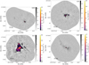 |
Fig. 1. Overview plot showing B3 continuum emission maps. The plots are shown with two colorbars, the first (grayscale) showing −5 to +15 times the noise on a linear scale, then a second (matplotlib’s inferno colorscheme) showing the range +15 times the noise to the peak intensity of the image in an arcsinh stretch. The field names are labeled in the top-right corner. A scalebar in the bottom-left shows the size of 0.5 pc at the target’s distance. The synthesized beam is shown as a blue ellipse in the bottom-left corner; it may be too small to print properly. Only the first four fields in B3 are shown here. The remaining figures are shown in Appendix H. |
The mosaics have varying fields of view (FOVs) to accommodate different clouds. Generally, the Band 3 FOV is larger than that of Band 6 because of the intrinsically larger primary beam at Band 3. The fields of view are shown overlaid on Spitzer GLIMPSE (Benjamin et al. 2003; Churchwell et al. 2009) images in Appendix H, Fig. H.3.
All fields also included 7m array and total power observations in the same spectral setup. The total power observations cannot be used to create images of the continuum and therefore are not discussed here. Although the data products presented here make no use of the 7m array data, the properties of the short spacing information are discussed in Sect. 3.4.
The program data were originally retrieved from the ALMA archive shortly after passing the quality assessment by the observatory, and were further inspected by our data reduction team. We examined the pipeline-produced calibration web logs in detail, noting any clear problems in the data. In several cases, this process enabled reports back to the observatory that data quality failed to meet standards and triggered additional observations. Weblog examination and initial tests were distributed over the whole data reduction team.
The data presented in this paper were later retrieved from the ALMA archive using astroquery (Ginsburg et al. 2019b) between June 2019 and June 2020. These data were restored to measurement sets using the scriptForPI.py files provided by the ALMA archive, and further batch processed with the custom scripts and imaging parameters determined from the individual tests discussed below.
All of these measurement sets have been subsequently taken back to the ALMA observatory for QA3 reprocessing, and therefore their latest archival versions may show differences compared to the version used for this work. Members of the FAUST Large Program (Project code: 2018.1.01205.L) reported that the system calibration temperature approach adopted by ALMA sometimes results in artificial suppression of bright lines3. The issues amount to a combination of spectral normalisation and system temperature calibration problems. The ALMA-IMF data were affected by these issues and returned to the Joint ALMA Observatory for further QA3 processing in November 2020. Reprocessing was completed in March 2021. Because continuum data are minimally affected (the expected effect is proportional to the affected bandwidth, and the bright lines affected are generally excluded in this work), the data presented here did not undergo this QA3 reprocessing. However, we will also release the reprocessed data; see Appendix E.
The W43-MM1 B6 data were taken as part of the pilot program, 2013.1.01365.S (Motte et al. 2018). These data were also reprocessed following the same QA3 procedure as the 2017.1.01355.L data.
3. Data
We present the data obtained from the ALMA-IMF Large Program (2017.1.01355.L, plus W43-MM1 data from 2013.1.01365.S) and discuss the data reduction process followed to obtain images of the continuum emission.
3.1. ALMA-IMF data pipeline
We describe the ALMA-IMF data pipeline and the subsequent data quality assessment steps we performed in this section. The pipeline can be found on the github repository4.
Our custom pipeline is used to perform several essential steps on the continuum data:
-
Combination of different array configurations (the ALMA-IMF data include up to two 12m array configurations for each field).
-
Masked deep cleaning of the images.
-
Self-calibration of the mosaic data.
The main advantages of our processing are the masked deep cleaning with parameters optimized for each field and the self-calibration that greatly (by up to a factor of 5) increases the signal-to-noise ratio in several fields.
The ALMA-IMF data pipeline starts from the ALMA pipeline-calibrated data and restores the archival data products to measurement sets using the standard ALMA pipeline procedures. We verified the observatory’s quality assessment analysis by examining the weblogs. While several issues of potential concern were noted, such as high phase variations in the calibrators in some execution blocks, all pipeline products were good enough for initial imaging, and we determined that further correction via self-calibration was the best approach for improving the images.
To enable continuum selection, faster cleaning, and self-calibration, the science target data were split out from the original pipeline-processed data sets. The continuum selection process is described in Sect. 3.1.3, and the subsequent spectral averaging is described in Sect. 3.1.5.
3.1.1. Implementation details
The ALMA-IMF data pipeline is designed to run in the CASA (McMullin et al. 2007) environment, and is implemented as a suite of python scripts. The workflow is as follows:
-
Retrieve and extract the data from the ALMA archive.
-
Run scriptForPI.py to restore the measurement sets.
-
Run the pipeline script split_windows.py to create the separate continuum and line measurement sets.
-
Run the continuum_imaging_selfcal.py script to perform the imaging and self calibration.
The pipeline relies on astroquery (Ginsburg et al. 2019b) to retrieve the data. Several of the analysis routines use astropy (Astropy Collaboration 2013, 2018), spectral-cube5, and radio-beam6. The usual suite of python numerical tools, numpy, scipy, and matplotlib, serve as the base of these other packages (Hunter 2007; Harris et al. 2020; van der Walt et al. 2011; Virtanen et al. 2020).
The pipeline contains many other support files included beyond those described above. Most important is the imaging_parameters.py file, which contains the complete listing of the user-specified parameters used both for imaging and self-calibration.
3.1.2. Processing and data Storage
The data processing was done in several stages. In the first, distributed stage, each member of the data reduction team downloaded a small number of target fields (one to four) and processed them locally. They delivered processed products and the corresponding imaging parameters to a central repository.
In a second stage, all of the data were collected on one machine, the University of Florida’s hipergator supercomputer, and the pipeline was re-run following all steps in Sect. 3.1.1. Each complete run of the continuum pipeline takes up to about a week, though the majority of fields complete processing, self-calibration, and final imaging in less than a day. The largest fields, W43-MM2, W51-IRS2, and W51-E B3, take much longer because they are > 4000 pixels on a side, and both the minor and major clean cycles are slow.
The data products during pipeline running can require up to 250 TB of storage space. The raw data are ∼30 TB, but they are duplicated many times over when creating additional measurement sets and line cubes. The continuum image release is much smaller, totaling < 100 GB. Further details of the computing setup and data processing are given in Appendix C.
3.1.3. Continuum selection process
The continuum channels were selected from subsections of the observed bandpass. We lay out the spectral coverage in Table 1. The total bandwidth covered in B3 is 2.93 GHz and B6 is 3.75 GHz. We created two different groups of measurement sets for continuum imaging:
-
In the default (labeled cleanest throughout this text, to indicate that it is the less line-contaminated of the two), we used the ALMA pipeline find_continuum tool developed by Todd Hunter to reject line-contaminated channels. find_continuum was run independently on each of the array configurations (7M-only, 12M-long, 12M-short), resulting in three cont.dat files that describe which parts of the spectrum are contaminated by lines and which are continuum-only.
-
(a)
We merged these continuum selections by union, counting a spectral region as continuum if it was identified as continuum in either of the 12m configuration observations.
-
(b)
We plotted the continuum selection over a variety of spectra extracted from the measurement set (the uv-averaged spectrum) and from an early version of the imaged full cubes (spatially averaged spectra).
-
(c)
Based on the resulting plots, we removed several spectral regions that clearly contained line emission but were identified as continuum by the original script.
-
(a)
-
In a second approach to averaging, we used all bandwidth whether or not it was line-contaminated (labeled bsens, short for “best sensitivity”; Sect. 3.2). This data product should give the best continuum sensitivity in regions without line emission. These images are optimized for detection of faint sources.
Spectral setup of the ALMA-IMF Large Program.
We explain in more detail the cleanest approach. In the ALMA pipeline approach, described in Section 10.28 of the ALMA pipeline users guide for CASA 5.6.17, a dirty cube is created, then the brightest region from the peak intensity map is spatially selected. The region selection is done by applying a threshold to the moment-0 (integrated intensity) and another threshold on the peak intensity maps. The thresholds are determined based on automatic noise determination and a preselected set of heuristics. The two masks are combined by union. A more detailed description is expected in a forthcoming paper led by Todd Hunter. That region is averaged over to create a representative spectrum; this spectrum is dominated by the emission of the brightest regions, which in our data typically correspond to hot cores. The line-containing regions are then automatically identified based on a threshold and excluded. There are several additional steps in the contaminant-rejection process, including handling of spectral edges and atmospheric emission features, but we leave a full description of this process to the paper on this topic.
While this approach is generally as good as can be done in a reasonably automatic way, in regions like those targeted that contain line-rich hot cores, it is imperfect (though more recent versions of the pipeline apparently perform well on hot cores too; Todd Hunter, priv. comm.). We therefore inspected the spectra created from line cubes at varying levels of reduction (some were moderately well-cleaned, others were dirty) and modified the continuum selection based on those cubes where needed. We inspected both the peak intensity spectrum and the mean spectrum (i.e., the spectrum created by taking the maximum value from each channel and the average value of each channel in the image cube, respectively). We expanded or contracted the continuum regions based on a by-eye assessment of whether there was substantial line contamination. Figure 2 shows the fraction of continuum included in each spectral window for each field. Figure 3 shows the continuum selection for each field and for each array configuration. While there are similarities between each target field, the continuum selection is not uniform.
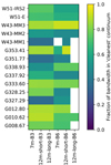 |
Fig. 2. Graphical illustration of the fraction of the bandwidth included in each cleanest continuum band for each field. Empty (white) squares are those where no data were taken in ALMA-IMF, including fields that have only one 12m configuration and W43-MM1 B6, for which data were taken separately in the pilot program (2013.1.01365.S; Motte et al. 2018). |
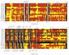 |
Fig. 3. Continuum selection figures for band 3 (top) and band 6 (bottom). For each field, there are up to three rows: the first is 7m, the second is the short-baseline configuration of the 12m array, and the third – when present – is the long-baseline configuration of the 12m array. Red shows data included in the continuum, yellow shows data excluded from the continuum, and black shows where no data were taken (for several fields, only one 12m configuration was used). The blue vertical lines show selected bright emission lines doppler shifted to the target velocity in these fields. Selected lines are N2H+ 1-0, SiO 5-4, H2CO 30, 3 − 20, 2, 12CO 2-1, H30α, H41α, and C18O 2-1. The X-axis shows frequency in the kinematic local standard of rest (LSRK) frame. W43-MM1 B6 was observed with a slightly different frequency setup; its spectral coverage continues beyond the right edge of the plot. |
Several data packages in the archive do not include the findcont step in the calibration files because they were re-imaged by the archive to account for a mosaicing bug. We have restored their cont.dat files from the original weblogs and included them in the data reduction repository.
The effective central frequencies for a range of assumed spectral indices α, where Iν ∝ να, are given in detail in Appendix D. In brief, ν3 mm ≈ 100 GHz and ν1 mm ≈ 228 GHz, with variations up to ∼2 GHz. The central frequencies are calculated as the intensity-weighted average frequency
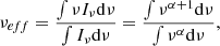 (1)
(1)
where the bounds of integration and dν are computed for each band included in the continuum image. We assume the sensitivity per unit frequency is constant across each spectral window. The cleanest images have different spectral coverage than the bsens images and therefore have different central frequency as a function of α.
3.1.4. Largest angular scale
Interferometers are not sensitive to all angular scales on the sky. Like single-dish, filled-aperture telescopes, they are limited in the smallest measurable size scale by the aperture diameter or longest baseline length. We reported the smallest measurable angular size scale, the synthesized beam, in Table 2. The reported sizes correspond to a two-dimensional Gaussian beam.
Selfcal summary.
The largest angular scale recoverable in an image is similarly limited by sampling in the Fourier (uv) domain. However, unlike the conventional beam size, there is no agreed upon standard for describing the largest recovered angular scale. The CLEAN algorithm, by adding spatial model components with power at all angular scales into the final images, breaks the simple assumption that there is a trivial largest-angular-scale cutoff above which no flux is recovered. Instead, the final images contain flux on large angular scales, including a net “direct current” (DC) component, even though the interferometer did not directly measure flux on these scales. On the largest scales that are measured, though, different weighting schemes can dramatically change how much flux is present; the Briggs weighting adopted in this work, with robust = 0, down-weights the largest angular scales in favor of producing a smaller resolution element. Additionally, the observations were performed as mosaics, which can recover more flux on large angular scales than single-pointing interferometric images.
We therefore do not report a single largest angular scale. Instead, we provide histograms of the baseline length. Figure 4 shows G327.29 as an example; the remainder are provided as a digital supplement8. The histogram illustrates that most baselines are relatively short, densely packed around 100–200m; this pattern holds for all observations. Both the number of visibilities and the histogram of the visibility weights are shown to demonstrate that the weighting prior to imaging does not affect the uv coverage. The synthesized beam size generally corresponds to the ≳95 percentile of baseline lengths. An overview of all of the baseline lengths is given in Fig. 5. While the angular resolution in the B3 and B6 data sets of the same region are generally the same, the largest angular scale recovery may be substantially different. The baseline lengths are transformed to physical scale in Fig. 6, emphasizing that the smallest scale probed is similar between regions, but the largest may vary substantially.
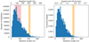 |
Fig. 4. Histograms of the uv sampling of the observations of G327.29 in Band 6. The left histogram shows the number of visibilities as a function of baseline length. In this panel, the top axis indicates the baseline length in units of kilolambda, that is, thousands of wavelengths. The red highlighted region shows the 25th–75th percentile of baseline lengths: half of the data are in this range, illustrating that scales ≲5″ are well-covered in this data set (the peak of the histogram is near ∼5″). The right histogram shows the fractional weight in the visibilities as a function of baseline length; the similarity of the left and right panels shows that the visibility weighting does not substantially deviate from uniformity. In this panel, the top axis indicates the corresponding angular size scale inferred from the equation θ = λ/B, where λ is the observed wavelength and B is the baseline length. Note that the weights are the per-visibility weights derived from the measurement calibration process; the final weights used for gridding are modified by the CLEAN algorithm gridding. In both panels, the orange highlighted region covers the range from the beam major to minor axis. |
 |
Fig. 5. Summary of observed, but un-weighted, uv spacing in all data sets. B3 is left, B6 is right. Each row shows a box plot in which the “whiskers” at either end show the 5th and 95th percentile, the box ends show the 25th and 75th percentile, and the orange line shows the median of baseline length or angular scale. More detailed histograms are given in Fig. 4, demonstrating that the weighted and unweighted baseline lengths are similar. A similar overview figure scaled to the distance of the individual sources is shown in Fig. 6. |
 |
Fig. 6. Summary of observed, but un-weighted, uv spacing in all data sets scaled to the source distance. B3 is left, B6 is right. Unlike Fig. 5, the scales are shown as physical scales. |
3.1.5. Splitting
To create the measurement sets to be used for continuum imaging and self-calibration, we identified the line channels (see Sect. 3.1.3), flagged them out, then ran the split CASA command to average the data spectrally. The spectral averaging widths were selected to keep bandwidth smearing to < 2% based on VLA guidelines9. In band 6, this requirement is a channel width Δν < 0.5 GHz, while at band 3, it requires Δν < 76 MHz, for a beam size of 0.3″. In some cases, this would have allowed us to average down the entire spectral window into a single channel, but instead we opted to have a minimum of two channels per spectral window.
After each individual scheduling block (SB) had its continuum split out, the flags were restored to their original state. The split continuum data were then concatenated into single merged measurement sets for further processing10. The bsens data were split in the same way as the cleanest, but no flagging beyond the original ALMA calibration pipeline’s flagging was performed.
3.1.6. Cleaning and Imaging
We jointly image the multiple 12-m configurations using the tclean task in CASA. This process is a straightforward joint cleaning of multiple measurement sets (MSes) that have been concatenated.
The ALMA-IMF pipeline uses a simple set of heuristics to identify the mosaic center and pixel scale. The mosaic center (phasecenter in tclean) is set to be the mean position of all individual pointings. The pixel scale is set to  , where Bmax is the longest baseline in the MS11, that is, we chose to sample the expected synthesized beam minor axis FWHM with four pixels.
The image size is set to cover the full area of the mosaic. The extrema of the image are found in RA and Dec by identifying the pointing centers of each of the mosaic pointings, then going out further from the phase center by one primary beam full width half maximum (FWHM), which provides padding around the image edge. The CASA synthesisutils tool getOptimumSize is then used to round the image size up to a value that is best suited to FFTs (i.e., a number whose prime factors are 2, 3, and 5). The code used to obtain these heuristics was based on Todd Hunter’s analysisUtils package12.
Masking. We created custom clean masks for each field and each band. Two types of clean mask were used: hand-drawn polygonal regions and local-threshold-based regions.
The local-threshold regions are created in the following process:
-
A first-pass image is created; in the first pass, this is a dirty image, in later passes, it is a cleaned image.
-
A hand-drawn ds9 region, generally a circle, rectangle, or other polygon, is placed on the image encompassing a region containing emission that is to be included in the cleaning.
-
A threshold in Janskys per beam is selected for that region by the user. This threshold is specified in the text attribute of the ds9 region file.
-
A boolean mask image is created including only pixels above the threshold in the hand-drawn region.
-
The steps above are repeated for each hand-drawn region.
-
The individual masks are combined by union; that is, any pixel included in any of the masks is included in the final mask.
The hand-drawn polygonal “clean boxes” were made simply using CASA CRTF regions. The choice of threshold-based or hand-drawn regions was left to the individual team member performing the data processing. No differences in the final product are expected from choosing one approach over the other, as both approaches are adequate to ensure that clean model components are only added to regions expected to contain signal during the self-calibration process.
For each target field and each observing band, at least one, but sometimes several, masks were created in this fashion. In the multiple-iteration self-calibration, different masks were needed for each iteration, with subsequent iterations including a larger area. The final cleaning is done over a more inclusive area.
The regions used for each field and each iteration of self-calibration are distributed in the github repository13.
Visibility weighting. We created test images with Briggs weighting and a range of robust parameters, which control the relative weighting of long and short baselines from −2 to +2. Smaller (more negative) values of the robust parameter result in smaller synthesized beams, while larger values result in larger beams but, potentially, greater sensitivity. However, we found that, for the majority of our fields, there was a minimum in the noise at robust ∼0–0.5 (description of the noise estimation method is given in Sect. 3.3.1). While larger robust values should result in lower thermal noise levels, the greater observed noise is most likely caused by un-modeled, mostly resolved-out, large-angular-scale structure that contributes to noise on larger scales. A representative example is shown in Fig. 7. Figures showing the noise as a function of robust parameter for each field are presented as a supplementary product14. Since we found that robust = 0 provided the best compromise between resolution and sensitivity, we adopted it for our continuum images. All data products presented in this work use robust = 0 unless noted otherwise.
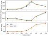 |
Fig. 7. Top: Estimated dynamic range (peak signal divided by noise estimate) as a function of Briggs robust parameter for the W43-MM3 B3 mosaic. Middle: Estimate of the noise as a function of Briggs robust parameter. Bottom: Beam major axis FWHM in arcseconds as a function of the Briggs robust parameter. In all three figures, the lines show the cleanest (blue squares) and “best sensitivity” (bsens; orange circles) data. The noise is estimated in a relatively signal-free region selected from the robust = 0 maps; the rise in noise to higher robust values is partly or entirely caused by added large-scale signal in these regions. |
Deconvolution. We deconvolved the image using the tclean method in CASA (McMullin et al. 2007). Since we expect the continuum emission to exhibit a large spatial dynamic range and some spectral structure, we used the multi-scale multi-frequency synthesis (MTMFS) method described by Rau & Cornwell (2011). In all cases, we used two Taylor terms, representing a constant (tt0) and a term that encodes the spectral index (tt1 = α tt0). The MTMFS method allows us to recover a large flux dynamic range in the images that a single-frequency clean would not be able to achieve (Rau & Cornwell 2011). Multi-scale cleaning was used, generally with 3–4 independent scales following a geometric series; the default choice was scales [0, 3, 9, 27], corresponding to point sources and several larger scales. The resulting images were found to depend only weakly on the choice of scales, so these defaults were only modified in cases where the cleaning process failed to converge.
3.1.7. Self-calibration
The ALMA-pipeline products delivered by the observatory generally suffer from dynamic range limitations when bright sources are in the field of view. The dynamic range limitations, resulting from bright (> 100 mJy) sources and extended structures, create artifacts and excessive negative features and add noise. For several fields, we determined that self-calibration was necessary to achieve our requested sensitivity (see also Sect. 3.3.2).
Self-calibration was attempted on all fields for both the cleanest and bsens data. The self-calibration procedure here follows suggestions of Brogan et al. (2018). We iteratively image, calibrate, and reimage each field for 2–9 iterations. Early iterations use conservative clean masks: they select only bright regions that appear to have been imaged successfully. The first iteration always used solint=‘inf’, the maximum solution interval. Over the course of several iterations, the solution interval was progressively decreased for some fields when adequate solutions were obtained; for some fields, the solution interval was not decreased. Further details are given in Appendix B. The self-calibration was applied with applymode=‘calonly’ and calwt=False such that no data are thrown out and data are not re-weighted during self-calibration; this approach was adopted as the most conservative, since iteratively changing the data could have surprising results. In some fields, the total integrated flux is dominated by compact sources, which are easily selected and included in masks, while in others, extended emission dominated the recovered flux, requiring a more inclusive mask to obtain good calibration solutions. The clean masks were expanded and included more total flux in progressive iterations. For the majority of fields, we used phase-only self-calibration (but see the amplitude self-calibration paragraph below).
The self-calibration parameters are publicly available15 along with the corresponding imaging parameters. They are also summarized in Table B.1. Most self-calibration solutions were obtained by averaging both polarizations (gaintype=‘T’), but in some high S/N cases single-polarization was used (gaintype=‘G’). The single-polarization self-calibration shows no obvious benefit over polarization-averaged self-calibration, however.
Because our data were taken as mosaics, some pointings in each target region include no bright sources. Within each target region, we selected mosaic pointings to use for calibration only if they passed two criteria:
-
The mean signal-to-noise ratio in the self-calibration solutions was at least ⟨SNR⟩ > 5.
-
The standard deviation of the phase solutions was σθ < π/4. This choice of threshold is arbitrary, but means that, assuming the phase solutions are Gaussian distributed, phase wraps – phase solutions with Δθ > π – will be 4-σ events, happening in < 0.01% of solutions, and therefore adding negligibly to noise.
These criteria exclude pointings within the mosaic that have too little flux to achieve a high-quality solution. The phase solutions obtained from the high signal-to-noise fields, which were generally the central several pointings, were then applied to all scans and pointings in the observation. This field-specific mosaic self-calibration has been applied in Ginsburg et al. (2018) and has the advantage of including the signal from many mosaic pointings in the model creation but excluding solutions that may worsen the overall calibration16.
The adopted approach has two theoretical advantages: the calibration solutions are obtained closer on the sky and closer in time to the data. Separations between the source and the calibrator ranged from 1–14°, while separations between phase calibrator observations were ∼10 min. Self-calibrating based on fields in the mosaic always reduced the on-sky separation to < 2′ and usually reduced the time difference to < 5 min. For the B3 observations, each mosaic pointing was included at least once in every cycle between quasar phase-calibrator observations, and so the time interval was always decreased. For the B6 observations, however, the larger mosaics were only about half covered during each inter-phase-calibrator cycle. Therefore, it was possible to have a phase solution from self-calibration be further away in time than the phase calibrator solution. The most affected fields were G333.60 and G328.25, with about half of the fields having longer time separations to the calibrator. Since these fields still showed improvement after self-calibration, the net effect of self-calibration was positive.
Table 2 summarizes the quantitative improvement produced by self-calibration and the noise levels achieved. This comparison is further discussed in Sect. 3.3.2.
Amplitude self-calibration. We explored using amplitude self-calibration. This approach is generally considered higher-risk, since it has the potential to introduce systematic offsets in the calibration. We therefore only adopted the amplitude self-calibrated images as the final products after extensive analysis. We performed several iterations of phase-only self-calibration, followed by a deep clean, prior to performing amplitude self-calibration in order to ensure that systematic errors are not introduced. Solutions were calculated with solint=‘inf’ to maximize signal-to-noise for amplitude self-calibration. There are two regions, G010.62 B3 and G012.80 B3, in which a single iteration of amplitude self-calibration resulted in a very large noise reduction – 32% (G010.62) and 46% (G012.80) improvement - and little or no change in the flux in recovered objects. W51-IRS2 B6 shows a 7% reduction in noise (15% for the bsens images), but a very substantial reduction in obvious artifacts, so we elect to use amplitude self-calibration on this source. Similarly, G012.80 B6 shows a small (3%) reduction in noise, but a substantial qualitative improvement. We note that the cores appear to brighten by ∼1 − 2% from amplitude self calibration, which is negligible compared to the overall systematic calibration uncertainties (which are assumed17 to be ∼10%). Examples of the improvement from amplitude self-calibration are shown in Fig. 8.
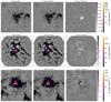 |
Fig. 8. Figures demonstrating the change before amplitude self-calibration (left) vs. after amplitude self-calibration (middle), with the difference of no-amplitude minus with-amplitude self calibration shown on the right to highlight the differences. These three images, G010.62 B3 (top), G012.80 B6 (center), and W51-IRS2 B6 (bottom) showed the greatest structural difference and greatest noise improvement with amplitude self-calibration included. While the noise decreased, and structure moved, the sum of the flux and the peak intensity changed by < 2% in each case. The images use the cleanest spectral selection. |
3.2. Best sensitivity images
In order to obtain the best possible continuum sensitivity, in addition to the images created with line-contaminated channels flagged out, we also created continuum images using all the available bandwidth. This approach gives the best achievable sensitivity in those regions where contamination from molecular lines is not severe. These images were self-calibrated in the same way as the cleanest images, using the same cleaning parameters, masks, and thresholds.
The brightest sources in the field are generally line-rich, and therefore suffer from substantial (and difficult to disentangle) line contribution. For the brightest 1 mm continuum source in G351.77, for example, the peak brightness changes by ∼30% between the line-contaminated and uncontaminated images, which is larger than the calibration uncertainty. Most of the lines producing the contaminating emission are relatively compact and hence confined to the surroundings of the brightest continuum sources in the field; the complex organic molecules giving rise to this contamination are discussed further in Paper I and Csengeri et al. (in prep.). The exceptions are those regions with bright and broad CO outflows, such as W43-MM1 and G351.77; for such regions, a modified bsens image, excluding the CO window, may be more useful, and such products will be made available (see Appendix G). The images with the best possible sensitivity are useful for direct continuum measurements in the emission-poor regions of the maps, and they can be used as boosted signal-to-noise ratio maps for source selection.
In general, we expect that the line-contaminated versions should have higher observed brightness and poorer image quality. Specifically, we expect imaging artifacts to manifest as amplitude errors, since the amplitude of the visibilities deviate from a smooth continuum.
There are intriguing features in the bsens minus cleanest images that show locations with excess line emission. These are most likely hot cores, which have excess line emission throughout the spectrum, HII regions, which have bright and broad recombination line emission, or outflows, which again are spectrally broad but spatially compact. Appendix A shows comparisons between the bsens and cleanest images.
Figure 9 shows the improvement in noise level from the cleanest to the bsens images. The improvement in the noise from cleanest to bsens is clear, and it is correlated with the fraction of bandwidth included in measuring the cleanest continuum. However, there is also substantial scatter, some of which is accounted for by the line contamination added into the bsens data: the line forests in hot cores behave as higher-amplitude noise when they are averaged into continuum visibilities. We also observe that there are several fields in which the noise improved more than expected based on the simple expectation that σ ∝ Δν1/2. The bsens self-calibration solutions achieved substantially higher signal-to-noise ratios, which may partly explain this phenomenon.
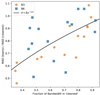 |
Fig. 9. Comparison between the bsens and cleanest data sets. The X-axis shows the fraction of the bandwidth used in the cleanest continuum. The Y-axis shows the ratio of the noise in bsens vs. that of cleanest. The data are the MAD-measured standard deviation in the noise measurement regions. The black curve shows the theoretical expectation that the noise goes down as the square root of the bandwidth, σ ∝ Δν−1/2. Points above the curve have excess noise in the bsens data, while points below improved more than expected. |
3.3. Image quality assessment process
Both the visibility data and the processed images went through extensive quality assessment beyond that performed by the ALMA pipeline and data reduction experts.
To assess the imaging and self-calibration, we created a set of pre- and post-self-calibration images and displayed them in a form similar to Fig. 10. A web form was created to display each image and allow feedback on the general image quality. The web form data were fed in to a common spreadsheet. Each delivered image was inspected by 5–10 members of the ALMA-IMF team, noting any data artifacts or clear problems and reporting them back to the data reduction team for further processing. These QA comments were passed to the individual responsible for imaging the data and were corrected if possible.
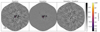 |
Fig. 10. Comparison of the imaging results for the region G010.62 before (left) and after (middle) self-calibration. The right panel shows the difference image, self-calibrated minus pre-self-calibrated. The images being compared use the same model, so they are cleaned to the same depth. |
We present further analysis of the final data products here. Summary statistics are given in Tables 2 and 3.
Best sensitivity vs cleanest continuum comparison.
3.3.1. Noise estimation
To measure the noise in each field, we used a median-absolute-deviation (MAD) estimator of the standard deviation, since the MAD is robust to small numbers of outliers18. However, even with this approach, many of the target fields are dominated by signal, so empirical estimation of the noise level is not trivial. We have identified the regions in each of the maps with little or no signal and estimated the noise from the selected sub-images; the regions used are available from the reduction repository19. The true noise level in the maps is variable, as it depends on the strength of the bright sources and the degree to which our cleaning and self-calibration removed sidelobes in the vicinity of these sources, so we focus our analysis on the minimum noise level in the maps. We estimate the noise levels from the cleaned images uncorrected by the primary beam response pattern; the noise in the primary beam corrected data is higher and non-uniform throughout the images.
Figure 11 shows histograms of the B3 and B6 data for one field, G351.77, with a Gaussian profile overlaid to illustrate the measured noise. This field is a typical case, where the Gaussian captures most of the histogram, but not all. As with all fields, there is a substantial positive tail from the detected signal. Histograms for the other fields are available in an online supplement20.
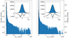 |
Fig. 11. Histograms of the G351.77 cleanest self-calibrated continuum data, which illustrate the noise distribution. The left panel shows B3, the right B6. The inset shows a linearly-scaled zoom-in to the ±5σ region centered around zero, with the residual of the histogram minus the noise model shown below. The noise model is a Gaussian with width calculated from the median absolute deviation estimated from a signal-free area of the field as described in Sect. 3.3.1. |
3.3.2. Pre-selfcal to post-selfcal comparison
We compare the cleaned images before and after self-calibration to determine how much self-calibration improved the data.
To ensure a fair comparison between the images, they needed to have the same degree of cleaning. The final self-calibrated images were restored with deeply-cleaned models that represent our best estimate of the sky brightness. We used these final models to create images with the un-self-calibrated visibility data, which are distributed as files with the suffix preselfcal_finalmodel. We use these most highly-cleaned images to measure the noise level before and after self-calibration. We show the difference between the self-calibrated image and the un-self-calibrated image in Fig. 10 and similar figures are shown in Appendix A.
Table 2 summarizes the results of self-calibration. It provides information about the self calibration (i.e., the number of self-calibration iterations and the dynamic range improvement obtained through self-calibration) and on the output images (beam size, peak intensity). Two columns, θreq/θmaj and σreq/σMAD, compare the requested to the observed beam size and noise level, respectively. We report noise levels calculated from signal-free parts of the non-primary-beam-corrected maps (see Sect. 3.3.1); the primary-beam correction is essential for actual source property calculation, but is less useful for determining the noise floor of the data.
For several fields, even when self-calibration solutions were obtained, no improvement was seen. Particularly for the lowest dynamic range images, those with peak signal-to-noise ratio ∼100, the improvement was negligible: G327.29, G337.92, G338.93, G351.77, W43-MM2, W43-MM3 in B3 and W43-MM3 and G353.41 in B6. For most of these fields, the achieved sensitivity is close to the requested, and the peak intensity in the field is quite faint, so little improvement was theoretically possible. For W43-MM2 B3, which has the faintest peak intensity of all fields at only 4 mJy beam−1, the dynamic range decreased, suggesting the gain solutions were harmful to the image. For this field only, we therefore recommend using the un-self-calibrated data.
3.3.3. Noise target
ALMA-IMF was planned to reach a uniform gas mass sensitivity of ∼0.2 M⊙ (3-σ) assuming optically thin dust at a temperature of 20 K. This requirement led to a range of flux sensitivity requests. While the delivered data generally met or exceeded the requested sensitivity within the requested beam size, there are several large outliers (Fig. H.6). Figure H.6 shows the measured noise scaled to the requested beam divided by the requested noise level. The scaling is done assuming that the variance σ2 ∝ Ω, which is valid over a narrow range of angular scales around the beam size; this scaling means that if our synthesized beam is larger than the requested beam, we would expect a correspondingly lower noise by (Ωsynthesized/Ωrequested)1/2. The noise ratio is plotted as a function of both integrated and peak intensity to determine whether bright emission is responsible for driving the noise. There is no clear correlation between total or peak flux and excess noise, which would be expected for dynamic-range-limited data when the limitation is driven by broad extended emission or very bright, barely resolved sources, respectively.
One of the most notable problem cases is W51-E B3, which has a recovered noise level ∼2× greater than requested. This high noise level persisted despite extensive phase self-calibration resulting in a ∼3× noise reduction (in the un-self-calibrated data, the noise level is ∼6.4× higher than requested). While W51-E contains perhaps the most egregiously complicated spectrum in B6, its B3 spectrum is relatively tame (there are few emission lines in B3), so poor continuum selection is not a good explanation for the excess. We therefore attempted to check the data for variability among the seven observing blocks of 12-m data. We imaged each scheduling block independently, then convolved the images to common resolution and measured their difference. No significant variability was observed, ruling out variability as the explanation for the high noise. We conclude that the most likely explanation for the noise excess is multi-scale emission, including resolved-out and poorly-uv-sampled structure, combined with some residual line contamination, but we acknowledge that this is not a completely satisfactory outcome. Similar problems are likely the explanation for the noise excess in G010.62 B3 and W51-IRS2 B3. For these three fields, the noise excess remains in the bsens data, while in W43-MM1 B3, which has a similar excess in the cleanest data, the target noise level is achieved when using the full bandwidth.
3.3.4. PSF properties
The observations were designed to achieve beam sizes θFWHM ∼ 2000 au at the distances of each of the targets (see Table 2). There is substantial variation around the requested beam sizes. This variation is mostly within the ALMA QA2 boundaries of ∼30%, with exceptions in G012.80, G353.41, and G351.77, in which the beam area was ≳50% greater than requested. In these cases, both of the individual contributing scheduling blocks (the “short” and “long” baseline 12-m array configurations) independently passed the ∼30% criterion, but when combined, because of the weighting given to the “short” baseline configuration, had a beam that would not have passed under the ALMA QA2 requirements if the TM1 and TM2 measurement sets had been assessed together.
Figures H.7 and H.8 show the PSFs from each field. We computed elliptical radial profiles of the square of the PSF and used a simple peak-finding tool (scipy.ndimage.find_peaks) to locate the first minimum in the radial profile (blue dashes in Figs. H.7 and H.8). We locate the first peak in the PSF beyond the radius of the first minimum, and we call this peak the first sidelobe (green dotted line in Figs. H.7 and H.8). These features are highlighted in the PSF figures. There are substantial variations in the shapes of the PSFs that should be noted when examining the images. Note that the peaks seen surrounding the red contours in Figs. H.7 and H.8 but within the blue contours are part of the main dirty beam, occur within the first null and are therefore considered part of the peak rather than sidelobes. Figure H.9 summarizes the relation between the requested and achieved beam sizes and the requested and achieved noise in the data.
3.4. Combination between 7 m and 12 m data
We attempted to combine the 7 m and 12 m array data sets for each of our fields. In principle, the 7 m/ACA data should recover spatial scales up to ∼70″ (3 mm/B3) and ∼25″ (1 mm/B6). For a proper combination, the noise on the overlapping baselines between the 7 m and 12 m array observations needs to be similar. We find, however, that for most of the fields the 7 m array observations were noisier and, therefore, the combination added substantial noise on the angular scales covered by these baselines.
While our ALMA-IMF data pipeline is capable of combining the 7 m array, and the two 12 m array configurations and perform a joint deconvolution, we find that it provides a satisfactory result only for a fraction of the targets. One of such examples is shown in Fig. H.10, which is the G328.25 clump in ALMA’s band 3. This particular region has a synthesized beam size of 0.62 × 0.47″ in the 12 m only data, and a synthesized beam size of 0.72 × 0.62″ in the 7 m and 12 m combined dataset using the same parameters as before (where robust = 0). Taking the geometric mean of the beam major and minor axes, we find that it degrades from 0.54″ to 0.67″ corresponding to a 20% larger synthesized beam FWHM (50% larger beam area) in the combined data. The rms noise is about 0.39 mJy beam−1 in the 12 m-only dataset (Table 2), while in the 12 m and 7 m array combined dataset we measure a noise of 0.50 mJy beam−1 in the same region on images prior to primary beam correction. Considering the different beam sizes, the rms noise in the 7 m and 12 m combined dataset would translate to a noise of 0.77 mJy in a 0.54″ beam, corresponding to a factor of two worse rms noise. However, as shown in Fig. H.10 the combined image suggests a complex structure of emission from extended structures that are not visible in the 12 m only image.
Because in some cases the noise in the fields degraded significantly by including the 7 m array data, we only present here the 12 m array observations alone, and defer a homogeneous discussion of the images including the short spacing information to a future work.
4. Data product summary
Data processing was described in Sect. 3. The data are released online21. Links to the data are hosted at the ALMA-IMF webpage22.
The delivery includes a subset of the products output from tclean. We deliver the tt0 and tt1 images of the model, residual, image, and psf, where tt0 and tt1 correspond to the first and second term of the multi-frequency synthesis. The approximate monochromatic flux is given by the tt0 data product. We also provide the masks used in the different steps for the data reduction. The image.tt0 and primary-beam-corrected image.tt0.pbcor images are provided as FITS files. Each of the above file types is produced for both the cleanest and bsens data. We provide only the final, self-calibrated images.
The image.tt0 files contain in their headers a list of the parameters used to create them in tclean. All of these parameters are listed as key-value pairs in the HISTORY header entries. They also include the version number of the pipeline encoded as a git commit tag; the images were produced with different versions of the pipeline by necessity, so the commit tag should be used to track down the exact code used to produce the images.
5. Analysis
5.1. Spectral indices and HII regions
Since we used the multi-scale, multi-frequency synthesis method with two Taylor terms, we have produced images of the spectral index α (tt1 = α tt0). While most of the images we obtain are well-represented by a constant value with respect to frequency (i.e., there is little significant signal in the tt1 image), the brighter sources, and especially the bright extended objects, contain enough emission in tt1 to recover the intra-band spectral index α.
Several examples of high-signal regions where the spectral index α could be accurately measured are shown in Figs. H.11 and H.12 (W51-E), H.13 (G327), and Figs. H.14, H.15 (W51-IRS2). These images highlight several salient features: first, while the α images clearly contain signal, they are noisy and, in general, not trivial to evaluate. Measured α values frequently have uncertainties that cover the entire physically plausible range. Second, there are clear differences in the spectral indices of known HII regions (detected at lower frequencies with the VLA, for example) and in evidently dust-dominated sources. This information can be used, with appropriate caution, to infer the emission properties of individual sources.
We specifically explore the brightest sources in the W51-E field in Fig. H.12 because these sources proved to be some of the most surprisingly problematic for deconvolution. While the deconvolution of extended structures throughout these mosaics was expected to be difficult, point-like sources should not pose a problem for deconvolution and self-calibration. In W51-E, however, substantial residual PSF-like artifacts remained after self-calibration and deep cleaning despite an overall very good improvement in the noise level and dynamic range. In Sect. 3.3.3, we explored and ruled out the possibility that one of the central sources was varying. By examining the spectral index, we see that the continuum in these sources is structured and complex; there is modest evidence for a change in spectral index from B3 to B6 (93–100 to 217–233 GHz). The pair of sources, seen in the two middle panels in Fig. H.12, separated by only ≲0.5″, have dramatically different spectral indices in B3, and have much shallower indices than the surrounding material in B6, highlighting the importance of the multi-term modeling approach. There are hints of spectral structure detected within B3 toward e2w, but we were unable to obtain a reliable determination of α in the low (∼92.5 GHz) and high (∼103.8 GHz) subbands independently, so we cannot provide detailed estimates of the spectral curvature within B3.
In stark contrast to the complicated W51 e2 region, W51 IRS2 has clean, self-consistent spectral shape across B3 and between B3 and B6 (Fig. H.15). The figures show substantial noise on the spectral index where physically none is expected, suggesting caution in interpretation of variations of the spectral index, but qualitative interpretation of α maps should be useful for distinguishing physical emission processes. These two fields are adjacent on the sky and therefore have similar uv coverage, so they are a fair comparison for assessing image quality properties.
While the in-band spectral indices highlight the quality of the ALMA data and the performance of our data reduction pipeline, the inter-band spectral indices have a much greater frequency lever arm and therefore much greater signal to noise. The bottom row of Fig. H.15 highlights this improvement, showing that the IRS2 region splits into a free-free dominated (α ∼ 0) extended area and a dust-dominated ridge much larger than can be seen in the single-window α maps. Interpretation of the spectral indices is further discussed in Paper I.
5.2. Hot cores and outflows
The difference images between the bsens and cleanest data products contain, in many cases, substantial structure. These structures come from excess emission in the line data that are averaged into the continuum created by bsens. The bsens - cleanest difference images therefore represent integrals of the total line intensity in the resulting images. Most fields show a net excess of emission.
The emission comes from two primary origins: hot cores and outflows. Detailed analysis and cataloging of these objects is deferred to a later paper, but we highlight some example cases. In G351.77 (Fig. H.16), the excesses surrounding the central hot core come primarily from broad linewidth emission features that track the bow shocks of material flows from the central region. In W51-IRS2 (Fig. H.17), excess emission is visible from hot cores toward the center. However, a deficit of emission is also seen toward the HII region because of molecular absorption against the bright continuum.
The excess features in the bsens-cleanest difference images highlight the wide variety of spectral features we anticipate mapping with the ALMA-IMF data.
6. Conclusions
We present the ALMA-IMF continuum image mosaics in Band 3 and Band 6, produced with a custom data reduction pipeline. This pipeline, with input parameters fine-tuned by the ALMA-IMF data team for each field, produced self-calibrated continuum images from multi-configuration ALMA data. The data underwent several stages of quality assessment.
The final products exhibit noise levels within a factor of two of those requested from ALMA, and synthesized beam linear sizes within 40% of the expected range, except for one field. The self-calibration process improved the dynamic range by up to a factor of five for most of the fields. Only those fields with the weakest continuum sources show small improvement by the self-calibration.
We performed a preliminary analysis of the spectral indices of the mosaics calculated both in-band and between bands. This analysis serves both as a demonstration of the data quality and as a preliminary science demonstration. The spectral index maps directly identify regions of interest: HII regions stand out as low-α regions (α ∼ 0), and dust-dominated areas have high index (α > 2).
These data will serve as the basis of several ongoing and planned studies on the development of the stellar initial mass function via the core mass function as outlined in Paper I.
Program ID 2017.1.01355.L; PIs: Motte, Ginsburg, Louvet, Sanhueza, https://www.almaimf.com
The file combined_uvhistograms.pdf.
In principle, the split and concatenate process is simply a matter of bookkeeping that should have no effect on the eventual data, but in practice, the internal handling of concatenated and non-concatenated data sets within CASA can have substantial effect. For example, we found that, if one attempts to image any data selected from a concatenated data set that includes 7m antennae, the primary beam will be based on the 7m antenna, even if the selection includes only 12m antennae.
This approach can result in unnecessarily small pixels when there is an unusually distant baseline included in the MS, but this was never a severe issue in the ALMA-IMF data. The choice of 1.22 is arbitrary; it comes from the Rayleigh resolution criterion for a circular filled aperture, which does not necessarily apply to the non-circular synthesized aperture, but this arbitrary scaling of order unity has only a small effect on the resulting images.
File combined_noise_and_beams_vs_robust.pdf, see Appendix H.
In one case, G328.25, we were only able to obtain solutions for the central field by manually selecting it; in this case, the overall emission is weak anyway, and the improvement from self-calibration was minimal.
We scaled the MAD by 1.4826 such that the reported value is equivalent to the standard deviation if the underlying data are normally distributed.
File combined_flux_histograms.pdf; see Appendix H.
Acknowledgments
This paper makes use of the following ALMA data: ADS/JAO.ALMA#2017.1.01355.L and ADS/JAO.ALMA#2013.1.01365.S. ALMA is a partnership of ESO (representing its member states), NSF (USA) and NINS (Japan), together with NRC (Canada), MOST and ASIAA (Taiwan), and KASI (Republic of Korea), in cooperation with the Republic of Chile. The Joint ALMA Observatory is operated by ESO, AUI/NRAO and NAOJ. The National Radio Astronomy Observatory is a facility of the National Science Foundation operated under cooperative agreement by Associated Universities, Inc. A. G. acknowledges support from the National Science Foundation under grant AST-2008101. T. Cs. has received financial support from the French State in the framework of the IdEx Université de Bordeaux Investments for the future Program. R. G.-M. acknowledges support from UNAM-PAPIIT project IN104319 and from CONACyT Ciencia de Frontera project ID: 86372. R. A. gratefully acknowledges support from ANID Beca Doctorado Nacional 21200897. T. B. acknowledges the support from S. N. Bose National Centre for Basic Sciences under the Department of Science and Technology, Govt. of India. M. B. has received financial support from the French State in the framework of the IdEx Université de Bordeaux Investments for the future Program. S. B. acknowledges support by the French Agence Nationale de la Recherche (ANR) through the project GENESIS (ANR-16-CE92-0035-01). A. L. S., Y. P., and B. L. acknowledge funding from the European Research Council (ERC) under the European Union’s Horizon 2020 research and innovation programme, for the Project “The Dawn of Organic Chemistry” (DOC), grant agreement No 741002. F. L. acknowledges the support of the Marie Curie Action of the European Union (project MagiKStar, Grant agreement number 841276). This project has received funding from the ERC under the European Union’s Horizon 2020 research and innovation programme (ECOGAL, grant agreement no. 855130). F. M. acknowledges the support of the French Agence Nationale de la Recherche (ANR) under reference ANR-20-CE31-0009, of the Programme National de Physique Stellaire and Physique et Chimie du Milieu Interstellaire (PNPS and PCMI) of CNRS/INSU (with INC/INP/IN2P3). P. S. was supported by a Grant-in-Aid for Scientific Research (KAKENHI Number 18H01259) of the Japan Society for the Promotion of Science (JSPS). P. S. and H.-L. L. gratefully acknowledge the support from the NAOJ Visiting Fellow Program to visit the National Astronomical Observatory of Japan in 2019, February. A.S. gratefully acknowledges funding support through Fondecyt Regular (project code 1180350) and from the Chilean Centro de Excelencia en Astrofísica y Tecnologías Afines (CATA) BASAL grant AFB-170002. C. B. and D. W. gratefully acknowledge support from the National Science Foundation under Award No. 1816715. L. B. acknowledges support from ANID BASAL grant AFB-170002. E. R. acknowledges the support of the Natural Sciences and Engineering Research Council of Canada (NSERC), funding reference number RGPIN-2017-03987. B. W. was supported by a Grant-in-Aid for Scientific Research (KAKENHI Number 18H01259) of Japan Society for the Promotion of Science (JSPS). We thank the referee for a helpful and constructive report. The authors acknowledge University of Florida Research Computing for providing computational resources and support that have contributed to the research results reported in this publication. URL: https://www.rc.ufl.edu/. Part of this work was performed using the high-performance computers at IRyA-UNAM. We acknowledge the investment over the years from CONACyT and UNAM, as well as the work from the IT staff of this institute.
References
- Alves, J., Lombardi, M., & Lada, C. J. 2007, A&A, 462, L17 [NASA ADS] [CrossRef] [EDP Sciences] [Google Scholar]
- Astropy Collaboration (Robitaille, T. P., et al.) 2013, A&A, 558, A33 [NASA ADS] [CrossRef] [EDP Sciences] [Google Scholar]
- Astropy Collaboration (Price-Whelan, A. M., et al.) 2018, AJ, 156, 123 [Google Scholar]
- Benjamin, R. A., Churchwell, E., Babler, B. L., et al. 2003, PASP, 115, 953 [Google Scholar]
- Beuther, H., & Schilke, P. 2004, Science, 303, 1167 [NASA ADS] [CrossRef] [Google Scholar]
- Brogan, C. L., Hunter, T. R., & Fomalont, E. B. 2018, ArXiv e-prints [arXiv:1805.05266] [Google Scholar]
- Churchwell, E., Babler, B. L., Meade, M. R., et al. 2009, PASP, 121, 213 [Google Scholar]
- Comrie, A., Wang, K. S., Hsu, S. C., et al. 2021, CARTA: Cube Analysis and Rendering Tool for Astronomy [Google Scholar]
- Csengeri, T., Urquhart, J. S., Schuller, F., et al. 2014, A&A, 565, A75 [NASA ADS] [CrossRef] [EDP Sciences] [Google Scholar]
- Csengeri, T., Bontemps, S., Wyrowski, F., et al. 2018, A&A, 617, A89 [NASA ADS] [CrossRef] [EDP Sciences] [Google Scholar]
- Enoch, M. L., Evans, N. J. I., Sargent, A. I., et al. 2008, ApJ, 684, 1240 [NASA ADS] [CrossRef] [Google Scholar]
- Ginsburg, A., Goddi, C., Kruijssen, J. M. D., et al. 2017, ApJ, 842, 92 [Google Scholar]
- Ginsburg, A., Bally, J., Barnes, A., et al. 2018, ApJ, 853, 171 [Google Scholar]
- Ginsburg, A., Sipőcz, B. M., Brasseur, C. E., et al. 2019a, AJ, 157, 98 [Google Scholar]
- Ginsburg, A., Koch, E., Robitaille, T., et al. 2019b, radio-astro-tools/spectral-cube: Release v0.4.5 [Google Scholar]
- Goddi, C., Ginsburg, A., Maud, L. T., Zhang, Q., & Zapata, L. A. 2020, ApJ, 905, 25 [NASA ADS] [CrossRef] [Google Scholar]
- Harris, C. R., Millman, K. J., van der Walt, S. J., et al. 2020, Nature, 585, 357 [NASA ADS] [CrossRef] [Google Scholar]
- Hunter, J. D. 2007, Comput. Sci. Eng., 9, 90 [NASA ADS] [CrossRef] [Google Scholar]
- Joye, W. A., & Mandel, E. 2003, in Astronomical Data Analysis Software and Systems XII, eds. H. E. Payne, R. I. Jedrzejewski, & R. N. Hook, ASP Conf. Ser., 295, 489 [NASA ADS] [Google Scholar]
- Kluyver, T., Ragan-Kelley, B., Pérez, F., et al. 2016, in Positioning and Power in Academic Publishing: Players, Agents and Agendas, eds. F. Loizides, B. Schmidt, et al. (IOS Press), 87 [Google Scholar]
- Koch, E., Ginsburg, A., AKL, et al. 2018, Keflavich/RadioBeam: V0.0 Prerelease (First Tag For Zenodo Doi) [Google Scholar]
- Könyves, V., André, P., Men’shchikov, A., et al. 2015, A&A, 584, A91 [Google Scholar]
- Lu, X., Cheng, Y., Ginsburg, A., et al. 2020, ApJ, 894, L14 [NASA ADS] [CrossRef] [Google Scholar]
- McMullin, J. P., Waters, B., Schiebel, D., Young, W., & Golap, K. 2007, in Astronomical Data Analysis Software and Systems XVI, eds. R. A. Shaw, F. Hill, & D. J. Bell, ASP Conf. Ser., 376, 127 [Google Scholar]
- Molinari, S., Swinyard, B., Bally, J., et al. 2010, A&A, 518, L100 [NASA ADS] [CrossRef] [EDP Sciences] [Google Scholar]
- Motte, F., Andre, P., & Neri, R. 1998, A&A, 336, 150 [NASA ADS] [Google Scholar]
- Motte, F., Nony, T., Louvet, F., et al. 2018, Nat. Astron., 2, 478 [Google Scholar]
- Motte, F., Bontemps, S., Csengeri, T., et al. 2022, A&A, 662, A8 (Paper I) [NASA ADS] [CrossRef] [EDP Sciences] [Google Scholar]
- Offner, S. S. R., Clark, P. C., Hennebelle, P., et al. 2014, in Protostars and Planets VI, eds. H. Beuther, R. S. Klessen, C. P. Dullemond, & T. Henning, 53 [Google Scholar]
- Ohashi, S., Sanhueza, P., Chen, H.-R. V., et al. 2016, ApJ, 833, 209 [NASA ADS] [CrossRef] [Google Scholar]
- Rau, U., & Cornwell, T. J. 2011, A&A, 532, A71 [NASA ADS] [CrossRef] [EDP Sciences] [Google Scholar]
- Robitaille, T., Beaumont, C., Qian, P., Borkin, M., & Goodman, A. 2017, glueviz v0.13.1: multidimensional data exploration [Google Scholar]
- Sanhueza, P., Contreras, Y., Wu, B., et al. 2019, ApJ, 886, 102 [Google Scholar]
- Schuller, F., Menten, K. M., Contreras, Y., et al. 2009, A&A, 504, 415 [NASA ADS] [CrossRef] [EDP Sciences] [Google Scholar]
- van der Walt, S., Colbert, S. C., & Varoquaux, G. 2011, Comput. Sci. Eng., 13, 22 [Google Scholar]
- Virtanen, P., Gommers, R., Oliphant, T. E., et al. 2020, Nat. Methods, 17, 261 [Google Scholar]
- Zhang, Q., Wang, K., Lu, X., & Jiménez-Serra, I. 2015, ApJ, 804, 141 [Google Scholar]
Appendix A: Self-calibration & bsens comparison
We show comparisons between the self-calibrated and un-self-calibrated data as in Figure 10 for the rest of the target fields. These are distributed as an online-only supplemental figure set.
We show comparisons between the bsens and cleanest data for each field in Figure H.16 and the corresponding online-only figure set.
Appendix B: Self-calibration details
The details of how each individual field was self-calibrated is included in the header of the released file. In the HISTORY keywords of the released FITS files, there are entries that look like: HISTORY 1: {‘solint’: ‘30s’, ‘gaintype’: ‘T’, ‘calmode’: ‘p’, ‘combine’: ‘scan’, ‘solnorm’: False}. These encode the relevant parameters used in the CASA command gaincal, where the 1: in this example indicates that this was the first iteration of self-calibration. We also give a table overview of the used parameters in Table B.1.
Selfcal Details
Appendix C: Data handling
We briefly describe some of the challenges we encountered handling the ALMA-IMF data set and solutions we reached, as these problems and solutions may be used to guide resource planning for future programs. While the raw data products were relatively modest (∼40 TB), the data set exploded to ∼200 TB after intermediate data products were created. Initially, the large size of individual data sets (∼5-20 TB per band, per field) prevented us from performing data reduction in a centralized manner, and first-pass quality assessment and reduction work was performed independently on different machines by individual researchers. Members of the data reduction team used the common pipeline to self-calibrate and image the data, and they uploaded the selected imaging and calibration parameters to the ALMA-IMF github repository. This process was effective, but rather slow.
In 2019, we gained access to substantial resources on the Hipergator supercomputer at the University of Florida, including enough storage to process all of the ALMA-IMF data. At this point, we re-processed all of the measurement sets using the same machine and using the team-developed imaging parameters. We were then able to perform both image and visibility quality assessment more uniformly. Analysis of the full uv data or cube data were not practical prior to this centralization effort. The fully-processed visibility data, after needed calibration and splitting, ranged from ∼0.5 to ∼4 TB per science goal, where a science goal encompassed all data for a single band for a single field (including 7m, 12m, and TP data). The visibility data total to 41 TB fully unpacked. The imaging data, including the cubes, were much larger, while the continuum data products total to < 100 GB.
To distribute data among the team, we used the Globus data distribution service, which allows controlled access to the data on the supercomputer system. The ALMA data reduction pipeline weblogs and other images were hosted on the same machine via a web hosting service running an Apache web server.
The data processing for the continuum data alone generally took from several hours for the smallest fields to several days for the largest. The supercomputer system allowed us to parallelize imaging across different fields and bands, so the full continuum data sets can be imaged in < 1 week. We iterated many times internally to produce the final products, each time performing additional quality assessment tasks.
The data analysis and visualization work was done with a variety of tools, including the CASA viewer (McMullin et al. 2007), CARTA (Comrie et al. 2021), ds9 (Joye & Mandel 2003), GILDAS-CLASS (https://www.iram.fr/IRAMFR/GILDAS/), glue (Robitaille et al. 2017), and Jupyter notebooks (Kluyver et al. 2016). Images shown in the paper were mostly produced with python analysis scripts and jupyter notebooks stored in the ALMA-IMF github repository, though some were produced with GILDAS-CLASS. The python scripts used numpy (van der Walt et al. 2011; Harris et al. 2020), scipy (Virtanen et al. 2020), astropy (Astropy Collaboration 2013, 2018), spectral-cube (Ginsburg et al. 2019a), radio-beam (Koch et al. 2018), and CASA-6 (https://casa.nrao.edu/casadocs/casa-5.6.0/introduction/casa6-installation-and-usage). The plots were made with matplotlib and tools built on matplotlib (Hunter 2007).
Appendix D: Central Frequencies
We report the central frequencies computed for each of the observed bands, for each field, given a set of assumed spectral indices α in Table D.1.
Central Frequencies
Appendix E: Data releases
There are several internal data releases. We publicly release two, and we describe the differences here. The February 2021 data release was used for the core catalog. The June 2021 data also include the re-calibration performed by the ALMA observatory in QA3.
The data products included in the release are the CASA tclean-produced multi-term multi-frequency synthesis products (as described in Section 3.1.6; Rau & Cornwell 2011).
For the February 2021 release, we include only the robust = 0 files, but we include four different stages: the dirty images, created prior to self-calibration (suffix dirty_preselfcal), the pre-self-calibrated images using the final, post-self-calibration model as a startmodel (suffix preselfcal_finalmodel, the pre-self-calibrated images cleaned with tclean (suffix preselfcal, and the final self-calibrated images (suffix selfcaln_finaliter). Only the latter of these, the final iteration of self-calibration, should be used for further analysis, but the other can be important tools for validation of the data. We include the same set of files for both the cleanest and bsens data.
The June 2021 release have overall properties quite similar to the February data. There are no systematic or significant changes between the continuum data from the pre- and post-QA3 imaging, though our internal QA process did catch some additional re-calibration steps that were needed prior to final acceptance of the data products by ALMA.
Appendix F: W43-MM1 B6 data
Observations of W43-MM1 in Band 6 were carried out in Cycle 2 between July 2014 and June 2015 (project #2013.1.01365.S). A first continuum map and core extraction were presented by Motte et al. (2018) in an article that helped motivate the ALMA-IMF Large Program. The spatial and spectral setup presented here are similar to that of this Cycle 2 pilot project, with the exception of the largest spectral window, which was centered on 233.450 GHz instead of 232.450 GHz.
The W43-MM1 B6 data shown here have been re-reduced using the ALMA-IMF data pipeline. There are some minor differences compared to the process described in Sect. 3. First, no cont.dat produced by the find_continuum procedure was available. Therefore, the continuum selection for the cleanest map has been done manually, guided by that of the nearby and evolutionary similar W43-MM2 region. This continuum selection was been based on a single EB and directly applied to the whole 12m data. For the cleaning and self-calibration steps, optimum parameters determined by the ALMA-IMF team have been applied. The resulting cleanest image shows a slight improvement in the RMS, about 30 % lower, compared to the continuum map presented by Motte et al. (2018). There is also a significant reduction of sidelobes around the central region. Further analysis of these data, including a comparison between the two continuum images, will be described in a paper in preparation by Nony et al.
Appendix G: bsens without CO and N2H+
As noted in Section 3.2, the bsens images of some fields exhibited extended emission correlated with a single bright line, either CO or N2H+. We therefore have produced a third variant of continuum image in addition to the cleanest and bsens images that we call bsens -nobright. These images use all of the available bandwidth, but exclude the CO (in band 6) and the N2H+ (in band 3) windows entirely. The resulting bandwidth is less than the bsens but greater than the cleanest data. These images were otherwise produced in the same manner as the bsens data as described in Section 3.2.
Appendix H: Supplemental figure sets
We distribute several supplemental figure sets reproducing Figures 4, 7, and 11 for each field. As noted in the main text, these are distributed as the PDF files combined_uvhistograms.pdf, combined_noise_and_beams_vs_robust.pdf, and combined_flux_histograms.pdf, respectively. We show additional figures to highlight where the ALMA-IMF pointings are in the context of Spitzer data (Fig. H.3; Fig. H.5 shows a single contour from the ALMA-IMF data overlaid) and ATLASGAL data (Fig. H.4).
The fields not shown in the main text from the overview figure (1) are also included in this Appendix.
H.1. Overflow figures
There was insufficient space in the body of the text for several figures that further describe the data. We include these figures here.
From §3.3.3, Figure H.6 shows the excess noise compare to that requested. From §3.3.4, Figures H.7 and H.8 show images of the PSFs in B3 and B6, respectively. Figure H.9 compares the achieved to the requested beam sizes. From §3.4, Figure H.10 shows the effect of jointly imaging 7m + 12m data for one field.
The figures from Section 5.1 are also included in this appendix Figure H.11 shows inset enlarged images of W51-E. Figure H.12 shows spectral index images of different parts of W51E. Figure H.13 shows the G327 region, highlighting the difference between the extended HII region and the compact dust emission. Figures H.14 and show the zoom-in and spectral index images for W51-IRS2.
Finally, from Section 5.2, the bsens-vs-cleanest comparison for G351.77 is shown in Figure H.16. The remaining fields have the same diagnostic images in Appendix A. Figure H.17 shows the difference between the bsens and cleanest fields for two images where spectral absorption is an important effect.
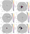 |
Fig. H.1. Continued from Fig. 1. |
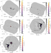 |
Fig. H.1. Continued from Fig. 1. |
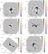 |
Fig. H.2. continued. |
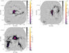 |
Fig. H.2. continued. |
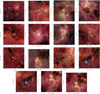 |
Fig. H.3. Overview figure showing the mosaic fields-of-view on Spitzer GLIMPSE 3-color images (Benjamin et al. 2003; Churchwell et al. 2009). In order, they are: G008, G010, G012, G327, G328, G333, G337, G338, G351, G353, W43-MM1, W43-MM2, W43-MM3, W51-E, and W51-IRS2. The Band 3 FOV is shown in orange and Band 6 in cyan. |
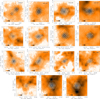 |
Fig. H.4. Overview plot showing individual pointings overlaid on ATLASGAL continuum emission maps. In order, they are: G008, G010, G012, G327, G328, G333, G337, G338, G351, G353, W43-MM1, W43-MM2, W43-MM3, W51-E, and W51-IRS2. |
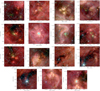 |
Fig. H.5. Overview figure showing the mosaic fields-of-view on Spitzer GLIMPSE 3-color images (Benjamin et al. 2003; Churchwell et al. 2009). In order, they are: G008, G010, G012, G327, G328, G333, G337, G338, G351, G353, W43-MM1, W43-MM2, W43-MM3, W51-E, and W51-IRS2. The B3 FOV is shown in orange and B6 in cyan. Contours are overlaid highlighting the brightest detected sources. |
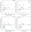 |
Fig. H.6. Excess noise in the images compared to the thermal noise level that was requested in the proposal. The top panels show cleanest continuum data, the bottom show bsens. The Y-axis shows the measured noise level in an image with the requested beam (i.e., σMAD(Ωsyn/Ωreq)1/2; see §3.3.3) divided by the requested noise level; higher values indicate higher measured noise. The horizontal dashed line indicates where the measured noise exactly matches the requested noise. The X-axis gives the total flux in the image (left panels) and peak intensity (right panels). We compare the noise to the total and peak flux to search for correlations that may explain the excess noise as deriving from some form of dynamic range limit, but we do not observe any clear correlation. The excess noise is caused by calibration errors, unresolved structure, and other possibilities discussed in Section 3.3.3 |
 |
Fig. H.7. Band 3 PSF figures. These PSF figures show the difference between the dirty PSF and the synthesized beam in grayscale with the synthesized beam contoured on at levels (0.1, 0.5, 0.9) times the peak in red. The colorscale is on a normalized scale, where the peak response of the PSF is defined to be unity; the peak is not shown on the scale because the central Gaussian representing the synthesized beam has been subtracted. The blue dashed ellipse shows the location of the first minimum in the elliptically-averaged, squared PSF response profile, while green dotted shows the location of the first positive peak (the first sidelobe) in the PSF. The green dotted curve identifies a peak location directly identified from the 2D PSF, not from its elliptical profile. The green dotted curve is not shown if it is beyond the displayed area. |
 |
Fig. H.9. Comparison of the retrieved to requested beam sizes plotted against the ratio of the measured noise to the requested. (left) cleanest continuum (right) bsens continuum. The bottom-left quadrant shows where the beam is smaller (better) and the noise is lower (better) than requested. The bottom-right quadrant shows noise that is higher than requested but a beam smaller than requested; in this quadrant, smoothing the data brings them closer to the target noise. The upper-right quadrant contains those regions whose beam sizes are too large and which have excess noise; see 3.3.3. |
 |
Fig. H.10. Left: ALMA 12m only continuum mosaic of the G328.25 clump in Band 3. White contours show 3 and 5 times the rms noise measured in an emission free region prior to the primary beam correction. Black contours show where the primary beam sensitivity drops to 20%. The synthesized beam is shown in the lower left corner, and the color bar is displayed in the bottom of the image. Right: ALMA 7m and 12m array combined continuum image in B3. Contours are the same as on the left panel, where the corresponding noise is measured on the combined map. The synthesized beam is shown in the lower left corner, and the color bar is displayed in the bottom of the image. |
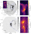 |
Fig. H.11. Inset zoom figures of the B3 (top) and B6 (bottom) images of W51-E. The insets highlight the regions shown in detail in Figure H.12. The central region, containing W51 e1 through e10, is shown in both insets. W51 e1/e8 is the southern part of this region, shown in Fig. H.12a. W51 e2 is the northern part of this region, shown in Fig. H.12b and c. The diffuse HII region W51 Main shown as a zoom panel to the right of the top figure showing the B3 image; its spectral index map is shown in Fig. H.12d. |
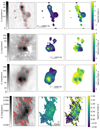 |
Fig. H.12. W51-E B3 Spectral Index maps distinguish HII regions from dust-dominated objects. In each panel, the left image shows the tt0 (Taylor term 0), which is our approximation of the continuum level and is used to create a mask. The middle panel shows the tt1 image. The rightmost panel shows |

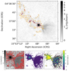 |
Fig. H.13. (top) The G327.29 B3 (cleanest) image is shown in greyscale with contours of the B6 data overlaid (orange: 3 mJy/beam, red: 20 mJy/beam). While the compact sources match well between the two bands, the HII region to the southwest appears only in B3. (lower panels) As in Figure H.12, these panels show Taylor terms 0 (left) and 1 (middle) and the spectral index α (right) of a cutout around the brightest core. The dust-dominated, compact source has a steep α ∼ 4, while the extended, free-free-dominated HII region has a flat index α ∼ 0. See also Fig. 2f of Paper I; Motte et al. (2022). |
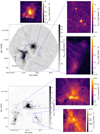 |
Fig. H.14. Inset zoom figures in the B3 (top) and B6 (bottom) images of W51-IRS2. The central inset highlights the region shown in detail in Figure H.15. |
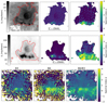 |
Fig. H.15. Spectral index images of W51-IRS2 in band 3 (top), band 6 (middle), and calculated from B3/B6 (bottom). As in Figures H.12 and H.13, for the top two rows, the left panel is the tt0 term, the middle panel is tt1, and the right panel is the derived spectral index α. The compact sources along the south end of the image are clearly dust-dominated, with α ∼ 3 − 4 in both bands. The brightest compact source, W51 north, is evidently optically thick at 1 mm but thin at 3 mm, with α1mm ≈ 2 and α3mm ≈ 4, as has been previously observed (Ginsburg et al. 2017; Goddi et al. 2020). See also Fig. 2m of Paper I; Motte et al. (2022). |
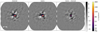 |
Fig. H.16. G351.77 B6 bsens vs cleanest comparison. The bsens (left) and cleanest (middle) self-calibrated images are compared in the bsens-minus-cleanest image (right). Additional figures for the remaining 29 mosaic images are shown in Appendix A |
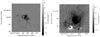 |
Fig. H.17. Difference of bsens minus cleanest images for the two fields that contain strong HII regions against which molecular absorption is observed: G333.60 B6 (left) and W51-IRS2 B3 (right). The absorption regions dominate the integrated flux of the field because of their large spatial extents, but there are also regions where bsens is greater than cleanest because of excess emission from hot cores. |
Appendix I: Observation Table
We include Table I.1 here.
Summary of observations.
All Tables
All Figures
|
Fig. 1. Overview plot showing B3 continuum emission maps. The plots are shown with two colorbars, the first (grayscale) showing −5 to +15 times the noise on a linear scale, then a second (matplotlib’s inferno colorscheme) showing the range +15 times the noise to the peak intensity of the image in an arcsinh stretch. The field names are labeled in the top-right corner. A scalebar in the bottom-left shows the size of 0.5 pc at the target’s distance. The synthesized beam is shown as a blue ellipse in the bottom-left corner; it may be too small to print properly. Only the first four fields in B3 are shown here. The remaining figures are shown in Appendix H. |
| In the text | |
|
Fig. 2. Graphical illustration of the fraction of the bandwidth included in each cleanest continuum band for each field. Empty (white) squares are those where no data were taken in ALMA-IMF, including fields that have only one 12m configuration and W43-MM1 B6, for which data were taken separately in the pilot program (2013.1.01365.S; Motte et al. 2018). |
| In the text | |
|
Fig. 3. Continuum selection figures for band 3 (top) and band 6 (bottom). For each field, there are up to three rows: the first is 7m, the second is the short-baseline configuration of the 12m array, and the third – when present – is the long-baseline configuration of the 12m array. Red shows data included in the continuum, yellow shows data excluded from the continuum, and black shows where no data were taken (for several fields, only one 12m configuration was used). The blue vertical lines show selected bright emission lines doppler shifted to the target velocity in these fields. Selected lines are N2H+ 1-0, SiO 5-4, H2CO 30, 3 − 20, 2, 12CO 2-1, H30α, H41α, and C18O 2-1. The X-axis shows frequency in the kinematic local standard of rest (LSRK) frame. W43-MM1 B6 was observed with a slightly different frequency setup; its spectral coverage continues beyond the right edge of the plot. |
| In the text | |
|
Fig. 4. Histograms of the uv sampling of the observations of G327.29 in Band 6. The left histogram shows the number of visibilities as a function of baseline length. In this panel, the top axis indicates the baseline length in units of kilolambda, that is, thousands of wavelengths. The red highlighted region shows the 25th–75th percentile of baseline lengths: half of the data are in this range, illustrating that scales ≲5″ are well-covered in this data set (the peak of the histogram is near ∼5″). The right histogram shows the fractional weight in the visibilities as a function of baseline length; the similarity of the left and right panels shows that the visibility weighting does not substantially deviate from uniformity. In this panel, the top axis indicates the corresponding angular size scale inferred from the equation θ = λ/B, where λ is the observed wavelength and B is the baseline length. Note that the weights are the per-visibility weights derived from the measurement calibration process; the final weights used for gridding are modified by the CLEAN algorithm gridding. In both panels, the orange highlighted region covers the range from the beam major to minor axis. |
| In the text | |
|
Fig. 5. Summary of observed, but un-weighted, uv spacing in all data sets. B3 is left, B6 is right. Each row shows a box plot in which the “whiskers” at either end show the 5th and 95th percentile, the box ends show the 25th and 75th percentile, and the orange line shows the median of baseline length or angular scale. More detailed histograms are given in Fig. 4, demonstrating that the weighted and unweighted baseline lengths are similar. A similar overview figure scaled to the distance of the individual sources is shown in Fig. 6. |
| In the text | |
|
Fig. 6. Summary of observed, but un-weighted, uv spacing in all data sets scaled to the source distance. B3 is left, B6 is right. Unlike Fig. 5, the scales are shown as physical scales. |
| In the text | |
|
Fig. 7. Top: Estimated dynamic range (peak signal divided by noise estimate) as a function of Briggs robust parameter for the W43-MM3 B3 mosaic. Middle: Estimate of the noise as a function of Briggs robust parameter. Bottom: Beam major axis FWHM in arcseconds as a function of the Briggs robust parameter. In all three figures, the lines show the cleanest (blue squares) and “best sensitivity” (bsens; orange circles) data. The noise is estimated in a relatively signal-free region selected from the robust = 0 maps; the rise in noise to higher robust values is partly or entirely caused by added large-scale signal in these regions. |
| In the text | |
|
Fig. 8. Figures demonstrating the change before amplitude self-calibration (left) vs. after amplitude self-calibration (middle), with the difference of no-amplitude minus with-amplitude self calibration shown on the right to highlight the differences. These three images, G010.62 B3 (top), G012.80 B6 (center), and W51-IRS2 B6 (bottom) showed the greatest structural difference and greatest noise improvement with amplitude self-calibration included. While the noise decreased, and structure moved, the sum of the flux and the peak intensity changed by < 2% in each case. The images use the cleanest spectral selection. |
| In the text | |
|
Fig. 9. Comparison between the bsens and cleanest data sets. The X-axis shows the fraction of the bandwidth used in the cleanest continuum. The Y-axis shows the ratio of the noise in bsens vs. that of cleanest. The data are the MAD-measured standard deviation in the noise measurement regions. The black curve shows the theoretical expectation that the noise goes down as the square root of the bandwidth, σ ∝ Δν−1/2. Points above the curve have excess noise in the bsens data, while points below improved more than expected. |
| In the text | |
|
Fig. 10. Comparison of the imaging results for the region G010.62 before (left) and after (middle) self-calibration. The right panel shows the difference image, self-calibrated minus pre-self-calibrated. The images being compared use the same model, so they are cleaned to the same depth. |
| In the text | |
|
Fig. 11. Histograms of the G351.77 cleanest self-calibrated continuum data, which illustrate the noise distribution. The left panel shows B3, the right B6. The inset shows a linearly-scaled zoom-in to the ±5σ region centered around zero, with the residual of the histogram minus the noise model shown below. The noise model is a Gaussian with width calculated from the median absolute deviation estimated from a signal-free area of the field as described in Sect. 3.3.1. |
| In the text | |
|
Fig. H.1. Continued from Fig. 1. |
| In the text | |
|
Fig. H.1. Continued from Fig. 1. |
| In the text | |
 |
Fig. H.2. Overview plot showing B6 continuum emission maps. See Fig. 1. |
| In the text | |
|
Fig. H.2. continued. |
| In the text | |
|
Fig. H.2. continued. |
| In the text | |
|
Fig. H.3. Overview figure showing the mosaic fields-of-view on Spitzer GLIMPSE 3-color images (Benjamin et al. 2003; Churchwell et al. 2009). In order, they are: G008, G010, G012, G327, G328, G333, G337, G338, G351, G353, W43-MM1, W43-MM2, W43-MM3, W51-E, and W51-IRS2. The Band 3 FOV is shown in orange and Band 6 in cyan. |
| In the text | |
|
Fig. H.4. Overview plot showing individual pointings overlaid on ATLASGAL continuum emission maps. In order, they are: G008, G010, G012, G327, G328, G333, G337, G338, G351, G353, W43-MM1, W43-MM2, W43-MM3, W51-E, and W51-IRS2. |
| In the text | |
|
Fig. H.5. Overview figure showing the mosaic fields-of-view on Spitzer GLIMPSE 3-color images (Benjamin et al. 2003; Churchwell et al. 2009). In order, they are: G008, G010, G012, G327, G328, G333, G337, G338, G351, G353, W43-MM1, W43-MM2, W43-MM3, W51-E, and W51-IRS2. The B3 FOV is shown in orange and B6 in cyan. Contours are overlaid highlighting the brightest detected sources. |
| In the text | |
|
Fig. H.6. Excess noise in the images compared to the thermal noise level that was requested in the proposal. The top panels show cleanest continuum data, the bottom show bsens. The Y-axis shows the measured noise level in an image with the requested beam (i.e., σMAD(Ωsyn/Ωreq)1/2; see §3.3.3) divided by the requested noise level; higher values indicate higher measured noise. The horizontal dashed line indicates where the measured noise exactly matches the requested noise. The X-axis gives the total flux in the image (left panels) and peak intensity (right panels). We compare the noise to the total and peak flux to search for correlations that may explain the excess noise as deriving from some form of dynamic range limit, but we do not observe any clear correlation. The excess noise is caused by calibration errors, unresolved structure, and other possibilities discussed in Section 3.3.3 |
| In the text | |
|
Fig. H.7. Band 3 PSF figures. These PSF figures show the difference between the dirty PSF and the synthesized beam in grayscale with the synthesized beam contoured on at levels (0.1, 0.5, 0.9) times the peak in red. The colorscale is on a normalized scale, where the peak response of the PSF is defined to be unity; the peak is not shown on the scale because the central Gaussian representing the synthesized beam has been subtracted. The blue dashed ellipse shows the location of the first minimum in the elliptically-averaged, squared PSF response profile, while green dotted shows the location of the first positive peak (the first sidelobe) in the PSF. The green dotted curve identifies a peak location directly identified from the 2D PSF, not from its elliptical profile. The green dotted curve is not shown if it is beyond the displayed area. |
| In the text | |
 |
Fig. H.8. Band 6 PSF figures. See Figure H.7. |
| In the text | |
|
Fig. H.9. Comparison of the retrieved to requested beam sizes plotted against the ratio of the measured noise to the requested. (left) cleanest continuum (right) bsens continuum. The bottom-left quadrant shows where the beam is smaller (better) and the noise is lower (better) than requested. The bottom-right quadrant shows noise that is higher than requested but a beam smaller than requested; in this quadrant, smoothing the data brings them closer to the target noise. The upper-right quadrant contains those regions whose beam sizes are too large and which have excess noise; see 3.3.3. |
| In the text | |
|
Fig. H.10. Left: ALMA 12m only continuum mosaic of the G328.25 clump in Band 3. White contours show 3 and 5 times the rms noise measured in an emission free region prior to the primary beam correction. Black contours show where the primary beam sensitivity drops to 20%. The synthesized beam is shown in the lower left corner, and the color bar is displayed in the bottom of the image. Right: ALMA 7m and 12m array combined continuum image in B3. Contours are the same as on the left panel, where the corresponding noise is measured on the combined map. The synthesized beam is shown in the lower left corner, and the color bar is displayed in the bottom of the image. |
| In the text | |
|
Fig. H.11. Inset zoom figures of the B3 (top) and B6 (bottom) images of W51-E. The insets highlight the regions shown in detail in Figure H.12. The central region, containing W51 e1 through e10, is shown in both insets. W51 e1/e8 is the southern part of this region, shown in Fig. H.12a. W51 e2 is the northern part of this region, shown in Fig. H.12b and c. The diffuse HII region W51 Main shown as a zoom panel to the right of the top figure showing the B3 image; its spectral index map is shown in Fig. H.12d. |
| In the text | |
|
Fig. H.12. W51-E B3 Spectral Index maps distinguish HII regions from dust-dominated objects. In each panel, the left image shows the tt0 (Taylor term 0), which is our approximation of the continuum level and is used to create a mask. The middle panel shows the tt1 image. The rightmost panel shows |
| In the text | |
|
Fig. H.13. (top) The G327.29 B3 (cleanest) image is shown in greyscale with contours of the B6 data overlaid (orange: 3 mJy/beam, red: 20 mJy/beam). While the compact sources match well between the two bands, the HII region to the southwest appears only in B3. (lower panels) As in Figure H.12, these panels show Taylor terms 0 (left) and 1 (middle) and the spectral index α (right) of a cutout around the brightest core. The dust-dominated, compact source has a steep α ∼ 4, while the extended, free-free-dominated HII region has a flat index α ∼ 0. See also Fig. 2f of Paper I; Motte et al. (2022). |
| In the text | |
|
Fig. H.14. Inset zoom figures in the B3 (top) and B6 (bottom) images of W51-IRS2. The central inset highlights the region shown in detail in Figure H.15. |
| In the text | |
|
Fig. H.15. Spectral index images of W51-IRS2 in band 3 (top), band 6 (middle), and calculated from B3/B6 (bottom). As in Figures H.12 and H.13, for the top two rows, the left panel is the tt0 term, the middle panel is tt1, and the right panel is the derived spectral index α. The compact sources along the south end of the image are clearly dust-dominated, with α ∼ 3 − 4 in both bands. The brightest compact source, W51 north, is evidently optically thick at 1 mm but thin at 3 mm, with α1mm ≈ 2 and α3mm ≈ 4, as has been previously observed (Ginsburg et al. 2017; Goddi et al. 2020). See also Fig. 2m of Paper I; Motte et al. (2022). |
| In the text | |
|
Fig. H.16. G351.77 B6 bsens vs cleanest comparison. The bsens (left) and cleanest (middle) self-calibrated images are compared in the bsens-minus-cleanest image (right). Additional figures for the remaining 29 mosaic images are shown in Appendix A |
| In the text | |
|
Fig. H.17. Difference of bsens minus cleanest images for the two fields that contain strong HII regions against which molecular absorption is observed: G333.60 B6 (left) and W51-IRS2 B3 (right). The absorption regions dominate the integrated flux of the field because of their large spatial extents, but there are also regions where bsens is greater than cleanest because of excess emission from hot cores. |
| In the text | |
Current usage metrics show cumulative count of Article Views (full-text article views including HTML views, PDF and ePub downloads, according to the available data) and Abstracts Views on Vision4Press platform.
Data correspond to usage on the plateform after 2015. The current usage metrics is available 48-96 hours after online publication and is updated daily on week days.
Initial download of the metrics may take a while.