Fig. H.7.
Download original image
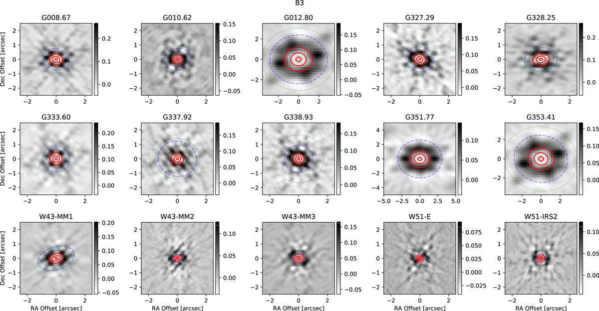
Band 3 PSF figures. These PSF figures show the difference between the dirty PSF and the synthesized beam in grayscale with the synthesized beam contoured on at levels (0.1, 0.5, 0.9) times the peak in red. The colorscale is on a normalized scale, where the peak response of the PSF is defined to be unity; the peak is not shown on the scale because the central Gaussian representing the synthesized beam has been subtracted. The blue dashed ellipse shows the location of the first minimum in the elliptically-averaged, squared PSF response profile, while green dotted shows the location of the first positive peak (the first sidelobe) in the PSF. The green dotted curve identifies a peak location directly identified from the 2D PSF, not from its elliptical profile. The green dotted curve is not shown if it is beyond the displayed area.
Current usage metrics show cumulative count of Article Views (full-text article views including HTML views, PDF and ePub downloads, according to the available data) and Abstracts Views on Vision4Press platform.
Data correspond to usage on the plateform after 2015. The current usage metrics is available 48-96 hours after online publication and is updated daily on week days.
Initial download of the metrics may take a while.