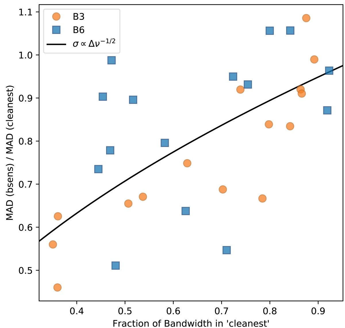
Fig. 9.
Download original image
Comparison between the bsens and cleanest data sets. The X-axis shows the fraction of the bandwidth used in the cleanest continuum. The Y-axis shows the ratio of the noise in bsens vs. that of cleanest. The data are the MAD-measured standard deviation in the noise measurement regions. The black curve shows the theoretical expectation that the noise goes down as the square root of the bandwidth, σ ∝ Δν−1/2. Points above the curve have excess noise in the bsens data, while points below improved more than expected.
Current usage metrics show cumulative count of Article Views (full-text article views including HTML views, PDF and ePub downloads, according to the available data) and Abstracts Views on Vision4Press platform.
Data correspond to usage on the plateform after 2015. The current usage metrics is available 48-96 hours after online publication and is updated daily on week days.
Initial download of the metrics may take a while.