| Issue |
A&A
Volume 699, July 2025
|
|
|---|---|---|
| Article Number | A340 | |
| Number of page(s) | 23 | |
| Section | The Sun and the Heliosphere | |
| DOI | https://doi.org/10.1051/0004-6361/202554578 | |
| Published online | 23 July 2025 | |
Polar faculae and their relationship to the solar cycle
1
Space Weather Research Group, Departamento de Física y Matemáticas, Universidad de Alcalá, Alcalá de Henares, Madrid, Spain
2
Universidad Internacional de Valencia (VIU), Calle Pintor Sorolla 21, 46002 Valencia, Spain
3
Institute for Solar Physics, Department of Astronomy, Stockholm University, Albanova University Centre, SE-106 91 Stockholm, Sweden
4
Institute of Theoretical Astrophysics, University of Oslo, PO Box 1029, Blindern NO-0315, Oslo, Norway
5
Rosseland Centre for Solar Physics, University of Oslo, PO Box 1029, Blindern NO-0315, Oslo, Norway
6
W. W. Hansen Experimental Physics Laboratory, Stanford University, Stanford, CA 94305-4085, USA
7
Swedish National Space Agency, SE-171 04 Solna, Sweden
⋆ Corresponding author: This email address is being protected from spambots. You need JavaScript enabled to view it.
Received:
17
March
2025
Accepted:
20
June
2025
Abstract
Context. The study of magnetic activity in the Sun's polar regions is essential for understanding the solar cycle. However, measuring polar magnetic fields presents challenges due to projection effects and their intrinsically weak magnetic field strength. Faculae, bright regions on the visible solar surface associated with increased magnetic activity, offer a valuable proxy for measuring polar fields.
Aims. This research aims to analyze the magnetic activity of the Sun's polar regions through the use of polar faculae.
Methods. A neural network model (U-Net) was employed to detect polar faculae in images from the Helioseismic and Magnetic Imager (HMI) on board the Solar Dynamics Observatory (SDO). The model was trained on synthetic data, eliminating the need for manual labeling, and was used to analyze 14 years of data from May 2010 to May 2024.
Results. The U-Net model demonstrates superior performance and efficiency over existing methods, enabling automated large-scale studies. We find that polar faculae numbers exhibit cyclical behavior with distinct minima and maxima, showing similar patterns between poles but with notable temporal delays (south pole: minimum early 2014, maximum late 2016; north pole: minimum late 2014, maximum mid-2019). Polar faculae magnetic fields remain consistent in magnitude (∼±75 G) across both poles and throughout the solar cycle. A strong linear correlation was found between the polar faculae count and the overall polar magnetic field strength. The spatio-temporal evolution reveals systematic migration of field polarity reversals from mid-latitudes toward the poles at rates of 3−8 m/s. During solar minimum, we observe a small relative increase in stronger-field faculae compared to solar maximum, suggesting either the coexistence of two magnetic distributions or subtle solar cycle dependence in faculae properties.
Key words: techniques: image processing / techniques: polarimetric / Sun: activity / Sun: faculae, plages / Sun: magnetic fields / Sun: photosphere
© The Authors 2025
 Open Access article, published by EDP Sciences, under the terms of the Creative Commons Attribution License (https://creativecommons.org/licenses/by/4.0), which permits unrestricted use, distribution, and reproduction in any medium, provided the original work is properly cited.
This article is published in open access under the Subscribe to Open model. This email address is being protected from spambots. You need JavaScript enabled to view it. to support open access publication.
1. Introduction
The Sun exhibits a quasi-cyclic variability of approximately 11 years (Schwabe 1844), known as solar activity. It is historically characterized by the fluctuation in the number and area coverage of sunspots, exhibiting maxima and minima. Solar activity was later found to contain a wide variety of other magnetic events, such as flares and coronal mass ejections (Hathaway 2015; Usoskin 2017), closely related to the solar cycle.
Solar activity is asymmetrically distributed across the Sun's surface and characterized by significant differences between the northern and southern hemispheres. Often one hemisphere is favored over the other for a long duration (Hathaway 2015). This asymmetry, discernible in events such as sunspots, faculae, or coronal brightness measurements, is challenging to quantify due to its persistent, cycle-dependent, and fluctuating nature. Moreover, solar activity clusters in “active longitudes” influenced by the Sun's rotation and “active latitudes”, where sunspots appear within specific belts at latitudes ±20° and ±40° (Carrington 1858; Hathaway 2015).
While the imbalances in solar activity have been observed across the entirety of the Sun's surface, this work focuses on the polar regions. The polar magnetic fields of the Sun are thought to play a crucial role in the solar activity cycle, as they are the seed for the toroidal fields, which lead to the formation of sunspots and active regions of the following cycle (Charbonneau 2020; Petrovay 2020). Furthermore, the formation and inversion of the Sun's polar fields are central to the global solar dynamo, an internal mechanism driven by plasma flows in the Sun's convective zone – i.e., its outer layer where turbulent plasma transports heat (Lockwood 2013; Owens & Forsyth 2013; Charbonneau 2020). In this model, differential rotation and meridional circulation (large-scale currents that move poleward near the surface and return toward the equator at depth), twist, stretch, and transport magnetic flux, eventually reversing the Sun's magnetic polarity over the 11-year solar cycle (Petrovay & Szakály 1999; Owens & Forsyth 2013; Charbonneau 2020). Moreover, these polar fields also serve as the headstream of the fast solar wind (Wilson 1992; Jin & Wang 2011), which leads to the heliosphere. During solar minimum, the polar regions often host large coronal holes – areas of open magnetic field lines that channel fast solar wind into interplanetary space (Owens & Forsyth 2013). These outflows shape the heliosphere, influencing space weather and affecting the interplanetary environment, highlighting the importance of studying polar magnetic fields.
Polar fields, however, present unique challenges regarding measurement, as they are weaker than equatorial fields, and they are characterized by small-scale features (high latitudes lack sunspots). Furthermore, from Earth orbit, there is a significant projection angle when observing the poles (Petrie 2015). Hence, it is necessary to rely on alternative ways of measurement. One effective approach is to measure the polar fields by using faculae as proxies, as their magnetic field is stronger. Faculae are bright, visible small-scale features (on the order of tens to hundreds of kilometers) on the photosphere that appear near the solar limbs and are associated with areas of increased magnetic activity (Keller et al. 2004; Okunev 2004; Blanco Rodríguez et al. 2007). At lower latitudes, they can manifest clustered around active regions in plages or associated with the photospheric network, but at the poles, they appear randomly scattered (Keller et al. 2004; Okunev 2004). Historically, various physical scenarios have been proposed to explain their nature, among which include the “hillock” (Schatten et al. 1986), “bright wall” (Keller et al. 2004), and “hot cloud” (Eker 2003) models. These models attribute the brightness of faculae to magnetically uplifted energy flows, high-temperature canyon walls in the photosphere, or high-temperature clouds above the photosphere, respectively. While diverse in their approaches, these models collectively acknowledge the origin of faculae as being a consequence of the interplay between magnetic fields and the Sun's plasma motions. Today, there is ample consensus that the magnetic fields associated with these structures, influenced by buoyancy effects, exhibit a strong preference towards the vertical direction across all observed positions, even those near the edges (Stenflo 2013). Theoretical models provide support for this magnetic field topology (Schüssler 1990).
This research examines polar faculae (PFe), which are faculae typically found in regions with latitudes |φ⊙|≥70°. The close connection between PFe and the Sun's magnetic field and activity makes them a topic of particular interest in solar physics. These features have been found to be correlated to the strength of the Sun's magnetic polar field (Sheeley 1964, 1991, 2008; Schatten 2005; Muñoz-Jaramillo et al. 2012). Polar faculae have also been found to be anti-correlated with the sunspot number (Saito & Tanaka 1957; Sheeley 1964, 1991, 2008). This tight relation between faculae and polar magnetism can be employed to, for example, predict a solar cycle amplitude and some space weather events from PFe counts (Janssens 2021).
Counting faculae is thus an interesting aspect of polar magnetism and, by extension, of the solar cycle, as they allow for an easy and fast connection between these fields. Thus, the process of studying and counting PFe has been the subject of several studies. Sheeley's (1964, 1991, 2008) noteworthy work on PFe stands out among prior studies for its systematic manual counting method that spanned several years. Utilizing photographic images from the Mount Wilson Observatory (MWO), he analyzed a century's worth of data, from 1906 to 2006. However, the study was limited by its manual approach and the lack of complete temporal and spatial coverage data.
More recently Muñoz-Jaramillo et al. (2012) further expanded the field by developing an image processing technique that automated faculae counting from Michelson Doppler Imager (MDI; Scherrer et al. 1995) data. Their method, involving enhancement of the contrast of the images and masking certain regions by thresholding to a previously defined value, was able to yield comparable results to Sheeley's (1964, 1991, 2008) MWO study. This method, however, faces some challenges. One that stands out is the requirement for considerable adjustments and predefined parameter values.
A final example is the work by Hovis-Afflerbach & Pesnell (2022), who developed two new methods of counting PFe. Their PFe detection models rely on computing daily averages of the images taken by the Helioseismic and Magnetic Imager (HMI; Scherrer et al. 2012; Schou et al. 2012) instrument on board NASA's Solar Dynamics Observatory (SDO; Pesnell et al. 2012), thresholding light paths generated by faculae traveling on the Sun's surface throughout the day. This method, while useful for distinguishing and counting faculae, cannot be used to analyze individual faculae sizes, and it faces several challenges. For instance, it requires an entire day's worth of data, making the algorithm slower and limiting the number of analyzed samples. It also struggles to differentiate between overlapping faculae paths, which need to be individually assessed. As a result, their model may not be suitable for standardization.
In this study, we research the relationship between the magnetism of the polar regions and the presence of PFe. To do so, we took advantage of the vast amount of data provided by the HMI@SDO, which encompasses approximately 14 years of data with an unprecedented temporal coverage and with excellent quality and stability. This abundance of data contains a substantial portion of unanalyzed information, partly because its large volume poses considerable challenges.
To overcome these challenges, we have developed a novel method called faculAI1 to detect and count faculae from HMI images. The method is based on state-of-the-art computer vision techniques, which involves the use of a simple yet effective neural network (NN) architecture trained on synthetic data. This approach provides several advantages:
-
Our method is data driven, which means it does not rely on predefined parameters other than the actual data employed. This approach offers flexibility and adaptability for use with various instruments and datasets.
-
It allows for the determination of the physical shape of each individual facula in the image, enabling new studies, such as precise size or area analysis over time.
-
A single image can be processed in seconds at any desired time, thereby offering speed, automation, and scalability. Consequently, it facilitates large-scale data analysis, as evidenced in this study's results.
-
The NN operates well in scenarios with a lack of data since it only needs a single image and does not depend on past measurements.
-
Our method is fully automated and does not need human intervention in any step.
-
Additionally, our method eliminates the need for time-consuming manual data labeling when training the NN, significantly easing the process.
With the help of this new detection model, we conducted a large-scale and very detailed analysis of the polar magnetism of the Sun using faculae as proxies for the polar magnetic field. We also studied how the global solar dynamo shapes the magnetism of the Sun's polar regions throughout the solar cycle.
This paper is organized as follows: In Sect. 2 we describe the data used in this work, elaborate on the structure of the NN detection model, and explain the metrics and techniques employed to train it. After that, the section provides explanation of the rest of the methodology used to compute and process the results. Section 3 presents the results of the research, and we discuss them in Sect. 4. In Sect. 5 we summarize the findings and draw conclusions based on the research, proposing future steps to expand the work. Finally, the Appendices provide further details on supplementary information and research supporting the findings.
2. Data and methodology
2.1. HMI observations and data processing
This study uses observations from the HMI instrument on board the SDO NASA satellite. HMI collects polarized light in six different wavelength points across the photospheric spectral line of FeI 6173.34 Å. For each of those wavelengths it measures the four Stokes parameters: I, Q, U, and V (Hoeksema et al. 2014). HMI also infers BLOS from Stokes V measurements (circular polarization; Couvidat et al. 2012).
This research utilizes the series HMI.S_720s for Stokes parameter measurements, specifically Stokes I for overall intensity and Stokes Q and U for linear polarization, as well as the HMI.M_720s series for magnetograms, BLOS. Both data series are averaged at a cadence of 12 minutes (Couvidat et al. 2016). We employed the available data in the period from May 1st, 2010, to May 24th, 2024 (nearly the entire mission duration) at four specific times: 00:00, 06:00, 12:00, and 18:00 UTC. These times were chosen to maximize or minimize the effects of the geosynchronous orbit of SDO around the Earth, that is, when the line of sight (LOS) projected velocity of the satellite is close to its maximum, minimum, or zero.
With this data, we computed linear polarization, mL, from Stokes parameters (see Eq. A.3 in Appendix A for more details) to detect faculae. This approach is chosen because faculae are known to be magnetic in nature and to have a primarily vertical topology (Stenflo 2013). Thus, the vertical magnetic fields of faculae, when observed from the side – as we observe solar polar regions from Earth's surroundings – generate strong linear polarimetric signals (Tsuneta et al. 2008). Therefore, we specifically chose linear polarization to detect PFe, but it is important to note that if any faculae deviate from this vertical configuration, they may not be detected by our method. Lastly, using only the contrast in intensity images to detect faculae might lead to misidentification of non-magnetic features as magnetic (Calvo et al. 2016). Figure 1 illustrates that linear polarization (bottom image) shows more contrasted features as compared to the intensity image (top).
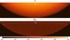 |
Fig. 1. Zoom over the southern solar cap of measurements taken by HMI on January 1, 2017, at 00:00 UTC. Top: Measurements of Stokes intensity I calculated as |

We note here that even though we assume PFe are characterized by predominantly vertical magnetic fields, we use BLOS to capture their magnetic properties, which measures the magnetic field component projected into the line of sight. This apparent contradiction needs justification, as vertical magnetic fields close to the limb will have a minimal (potentially null) line-of-sight component.
We selected BLOS for four primary reasons: First, historical instrumentation, such as the Mount Wilson or Wilcox observatories, used this parameter for such magnetic characterization. Second, BLOS is a magnetic parameter that has no ambiguity, i.e. properly designed and assembled instrumentation should agree in the measurement of this parameter. Third, while the same is true for the vertical field, it lacks extensive historical data series and it is noisier that BLOS (Del Toro Iniesta & Martínez Pillet 2012). Fourth, from the perspective of open magnetic flux characterization, it is far more interesting to estimate the magnetic flux crossing through the solar surface rather than the sky-plane. However, the 180-degree line-of-sight azimuth ambiguity inherent to polarimetric inferences prevents direct estimation of the surface-normal magnetic field topology without making assumptions regarding the magnetic field configuration itself. Common approaches assume a radial magnetic flux profile when only BLOS is available. For example, Svalgaard et al. (1978) provides a symmetric and analytical field model, Wang & Sheeley (1992) offers a theoretically driven motivation for radial assumptions, and Petrie (2022) discusses additional limitations of this approach. Also, for polar photospheric fields, there are alternative disambiguation methods, such as the ones presented in Ito et al. (2010), Jin & Wang (2011), Quintero Noda et al. (2016), or Pastor Yabar et al. (2018). Each method yields different results: radial field assumptions produce only vertical fields, Ito's method identifies vertical, horizontal, and undefined fields, while Jin's method selects configurations closest to divergence-free conditions. These varying approaches make inter-comparison difficult and limit the ability to contextualize results across studies. Therefore, we used BLOS to assess the magnetic nature of PFe and polar magnetism, because although this parameter has inherent limitations, it enables the most straightforward comparisons between studies.
Having established our measurement approach, we must now define the spatial boundaries of our study region. As the focus of this research lies on the polar regions of the Sun, we need to define the latitude values that determine the boundaries of a pole. Typically, solar poles are defined as those areas with latitudes |ϕ⊙|≥70°. However, to maximize the solar surface studied outside the activity belt and to better characterize the migration of magnetism (as traced by PFe), we consider as polar regions those with latitudes |ϕ⊙|≥50°. This extended definition of polar regions introduces the risk of identifying not just faculae in linear polarization images, but also other magnetic structures such as active regions, which are commonly found closer to equatorial regions and are also bright in linear polarization images. We have verified that no active region enter this definition by analyzing the Space-weather HMI Active Region Patches (SHARPs, Bobra et al. 2014) data series. These data include, among other, the tracked and detected active regions on the solar disc, providing the maximum and minimum latitudes of each one. Figure 2 shows these latitude values for all the active regions detected in SHARPs during the period considered (from 2010 to 2024) and it clearly evidences that no SHARPs regions are detected above or below ±50°.
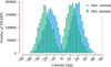 |
Fig. 2. Number of detected SHARPs at each latitude interval in the period from 2010 to 2024. The maximum and minimum latitudes of SHARPs regions are plotted separately, maxima values in blue and minima in green. |
Once the polar regions are defined, the full solar disk's linear polarization images are cropped to focus on latitudes ±50°. This results in two distinct grayscale images representing the north and south poles2. Sections with no data, i.e. zones outside the solar disk and the polar regions, are filled with Not a Number (NaN) values.
Following the acquisition of the two linear polarization images, these images undergo further pre-processing before being inputted into the NN model. The first step involves standardizing the image size, as NN models require a fixed input. To accomplish that, the images are cropped to the extent of useful information, which corresponds to the pixels representing the surface of polar regions under study. This results in images of varying sizes due to the apparent size change of the Sun throughout the year as a consequence of the Earth's ecliptic orbit and inclination. Moreover, most of these images have dimensions around 2000 pixels in width and 500 pixels in height, which is not a practical situation since those dimensions will require a significant amount of memory to be processed. Thus, these images are not yet suitable for use with the NN, and smaller ones are needed.
Therefore, the subsequent step involves dividing these large images into n smaller regular sub-images of 256×256 pixel dimensions3. To split the image into these n sub-images, a systematic approach is taken, progressing from the image's top-left corner to the bottom-right. If the original image size to be divided is not a multiple of 256, which is typically the case, the resulting slices smaller than 256×256 are padded with NaNs until they reach the 256×256 size.
Finally, normalizing the images to a mean of 0 and standard deviation of 1 is another crucial step before feeding them into the model, as it greatly enhances the learning process and mitigates numerical issues caused by extremely small or large values. In fact, the values of mL are in the order of 10−3 to 10−4, which is a small scale4 and would otherwise lead to numerical issues while training. Then, the normalized image can be obtained by using the equation
 (1)
(1)
where μ and σ are the mean and standard deviation of the 256×256 slice, respectively. The mean and standard deviation are not computed from the larger original image, as local areas with higher or lower pixel values could bias the overall statistics by influencing the mean, particularly if outliers are present.
After these steps, the images are ready to be passed through the NN. Once trained, it will produce n binary masks for each pole, one for each 256×256 slice, and then those binary masks are merged back together to the original larger size. This process enables the use of arbitrarily large and variable image sizes, ensuring that no image information is lost, as every pixel with valuable data is utilized. The whole process is illustrated in Fig. 3.
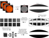 |
Fig. 3. Diagram depicting the steps taken to process HMI images and use them with the NN model to detect PFe. |
2.2. U-Net
The problem of detecting faculae can be stated as follows: given a picture of the linear polarization of the solar poles where there might be PFe, obtain a binary mask image of the same size in which its pixels take two possible values: 1 if the pixel is part of a facula, and 0 otherwise. Achieving this goal would mean it is possible to compute any measurable properties of each facula, by simply multiplying the mask by the measured magnitude image. This is a computer vision problem known as “image segmentation”, and this work tackles it by using an NN model.
For the time being, one may assume the presence of a set of N faculae pictures (i.e., linear polarization images), with N-associated masks. These masks accurately identify pixels belonging to faculae shapes by marking them with a value of 1, while assigning a value of 0 to all other pixels. Having these N samples, the problem of finding an NN to detect PFe becomes a supervised problem, where an NN is trained against the known masks until a desired minimal error is achieved.
To do so, we used an NN model architecture developed by Ronneberger et al. (2015) called U-Net. This NN was developed originally for biomedical image segmentation, concretely for detecting single cells in microscopic pictures, and it has since then been applied to a wide array of problems, achieving remarkable results.
For this work, we modified the original U-Net architecture so that (1) it accepts 256×256 grayscale images, (2) it includes “dropout” layers between each convolution block, and (3) the number of hidden layers has been reduced to just one. Figure 4 depicts a diagram of the final model, and the NN architecture layers are explained in greater detail in Appendix B.
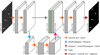 |
Fig. 4. U-Net architecture. |
For the loss function, we used the intersection over union (IoU) metric, as it presents a suitable choice for object detection benchmarks (Rezatofighi et al. 2019). Given two arbitrary shapes (volumes)  , IoU is computed as
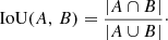 (2)
(2)
The IoU value ranges from 0 to 1, where values close to 0 indicate that A and B have little or no points in common and values close to 1 indicate a high degree of overlap (i.e., they are very similar shapes). In consequence, the aim is to obtain the maximum possible value of IoU for a given model. Since gradient descent (the training) optimizes parameters by minimizing an error, we took the negative value of IoU as the training loss:
 (3)
(3)
This loss function ranges from 1 (poor performance) to 0 (optimal performance).
2.3. Training problem and synthetic image generation
The employed NN requires supervised training. Therefore it is necessary to have samples of already labeled PFe images, that is, masks that can accurately identify every present facula. However, these masks do not exist and are challenging to produce.
One possible alternative to overcome this problem could involve using an unsupervised approach to train the model, but they tend to be much more complex and difficult to construct and evaluate without the masks. Additionally, supervised training models typically achieve better metrics (Chollet 2021). Another alternative would be to manually label a sufficiently big enough set of images by a human, but this poses several setbacks:
-
It consumes a lot of time. For an NN to be efficient, it is necessary to train it with large amounts of data (Chollet 2021; Alzubaidi et al. 2021). Painting each one by hand is a slow process, infeasible for large amounts of data. Moreover, the whole purpose of this work is to automate the process and avoid this precise issue5.
-
It is a process prone to be biased and error ridden. Many of the faculae are very small and difficult to distinguish from the background signal, and one person classifying them may perform differently from another based on many factors such as personal criteria, monitor brightness, and resolution.
To overcome these obstacles, this work presents an alternative way to train the model in a fast and reliable manner using a straightforward supervised approach and without the need to download and store a large amount of HMI data. Our approach consists of generating synthetic PFe images to train the U-Net model. These synthetic images must be generated replicating the statistics of the real images. We achieved this goal by doing the following:
-
We downloaded HMI images for different time periods to cover minimum, maximum, and intermediate solar activity. Each period supplied 39 samples, captured weekly. See details in Appendix C.
-
We calculated their normal and sigma-clipped statistics, which included mean and standard deviation.
-
A synthetic faculae mask was then generated by creating an image with uniform random noise, applying Gaussian blur to distort this noise, cutting off values below a certain arbitrary threshold6, and eroding the result to obtain faculae-like shapes for the final mask, which is discretized to contain only 0 and 1 values.
-
The mask was blurred using HMI's point spread function (PSF), that is, the mask is convoluted with the PSF image. This resulting image is then scaled to contain the same upper sigma-clipped mean and standard deviation as the real images.
-
After that, background noise was added, following a Gaussian distribution using the same lower sigma-clipped mean and standard deviation as the real images. This process emulates data coming from either the north or south polar regions by using each region's own statistics (see Table C.1 in Appendix C), enabling the network to learn to handle both poles. Additionally, the statistics include different phases of the SDO observing timeline, so the network can manage the change in data recalibration that occurred in April 13th, 2016.
-
Lastly, the images were normalized to have 0 mean and unit standard deviation.
This approach allows the model to be trained on an arbitrary number of different images, greatly preventing overfitting and enhancing the model's generalization capabilities. Moreover, the generation of each image requires less than a second, enabling rapid and iterative model training with a large volume of samples until the desired performance levels are met.
2.4. Observational biases
Given that the SDO is in a geosynchronous orbit, it observes the Sun in conjunction with Earth's orbit. From this perspective, the satellite and the Earth orbit together around the Sun, resulting in varying Sun-Earth distances over a year. Additionally, given the inclination of Earth's orbit with respect to the solar rotation axis, the observed polar areas vary along the year.
These varying observing conditions may affect all the studied variables. For instance, the detected number of PFe is deeply affected by yearly seasonal variations, since these changes alter the coverage of the polar cap area. If the PFe density remains constant over time, but at a given moment we observe only half the area observed at another time, then the count of detected PFe would consequently be around half of the prior count. Another less straightforward example that might be affected by seasonal projection effects is the BLOS, the magnetic field component measured along the line of sight. In addition to the number density of structures, there are additional intrinsic effects (related to the magnetic topology and distribution in space and/or time) that might play a role in the time evolution of this parameter.
While it might be possible to correct from some of the observational issues mentioned above with specific modeling, there are others for which a model is difficult to devise. Thus, to account for these projection issues (without explicit modeling of each of the potential contributions), we have chosen to apply a median filter with a window of 365 days to the various time-dependent variables. This approach helps smooth out short-term fluctuations and mitigate the impact of annual variations on the data, resulting in a more stable representation of the underlying trends. Furthermore, to facilitate the visual interpretation of the results, we have normally included a polynomial fit to the time series. Detailed technical information about these corrections can be found in Appendix D. In the following, all the results presented in this work, if not specified otherwise, have been processed with the aforementioned techniques.
3. Results
3.1. U-Net performance
The U-Net was trained for 1000 epochs using a generator that creates an entirely new batch of synthetic images for each training step, ensuring there is no repetition of images. Thus, in this case, validation is not necessary since the generator produces unique images at each step, effectively serving both training and validation purposes. This procedure led to an excellent performance, achieving a high IoU value of approximately 0.94, as seen in Fig. 5.
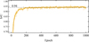 |
Fig. 5. Metric evolution of IoU during the training of the U-Net using synthetic data. |
Upon completing the training, the U-Net was evaluated again on a completely new generated dataset of 10 000 synthetic images, yielding a result of IoU = 0.948. To further evaluate the model's performance on real data, we manually annotated 100 randomly selected HMI data samples. Though limited in size, this sample should suffice for a rough comparison between the U-Net model and human performance. The U-Net achieved an IoU metric of 0.729 compared to human annotations on real data.
It should be noted that human performance might not be optimal due to subjective biases and difficulties in identifying faculae pixels, potentially overlooking many. In contrast, the algorithm was trained on an extensive synthetic database of accurately defined faculae masks, resulting in a high IoU metric. Thus, it likely identifies faculae more effectively than a human, even without training on real images. Figure 6 shows some examples of the U-Net predicted masks on real data, demonstrating a strong alignment in different situations.
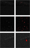 |
Fig. 6. Left column: Three random examples of linear polarization images. Right column: Same images but with the U-Net detections overlayed in red. |
Once the NN generates binary masks for the faculae images, we use the ndimage.label function (Virtanen et al. 2020) to assign a unique integer label to each connected component in the binary mask. In doing so, we can calculate various physical properties such as area, position, magnetic field, and other mean quantities. Finally, to minimize detection error, the study is performed over identified faculae with 4 or more pixels, as smaller sizes risk confusion with background noise.
3.2. Number of detected faculae
To assess periodic behaviors due to the orbit of SDO (Hoeksema et al. 2018), we compared results for four different time sequences individually (data at UTC 00:00, UTC 06:00, UTC 12:00, and UTC 18:00, not shown here). Since no differences were observed across these individual series, we present results based on the aggregate data sequence for all studied variables.
Panel a in Fig. 7 depicts the number of detected faculae over time. The number of faculae exhibits a maximum and a minimum for both the southern and northern poles. These maxima and minima take place at different times for each region; the south pole reaches the minimum in early 2014, and the maximum at the second half of 2016, while the north pole is delayed compared to the south pole, having its minimum point in the second half of 2014 and the maximum peak in the middle of 2019 (see Table 1). In addition, the period of change between minimum and maximum for the south pole is shorter and more abrupt than that of the north pole, which occurs steadily and lasts years longer. Finally, the population of faculae at the south pole was, in general, greater than that at the north pole.
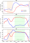 |
Fig. 7. (a) Number of detected PFe over time for each pole and each recorded daily hour. (b) 〈BLOS〉PF of detected PFe over time for both solar poles. (c) Same plot as in panel b but changing the sign of the south pole 〈BLOS〉PF values. Measurements are plotted along with smoothed curves obtained by using polynomial fits. |
Moments when the minimum and maximum of PFe counting occur for each pole.
3.3. Averaged line of sight magnetic field for PFe: Global temporal evolution
Panel b in Fig. 7 depicts the measured daily mean BLOS of detected PFe for both poles over time, a quantity henceforth referred to as 〈BLOS〉PF. This plot presents various attributes; In general terms, the magnetic field of the faculae seems to behave similarly in both poles, except for a change in sign, and it exhibits two distinct modes:
First, a stable period (highlighted in green): from 2016 to mid-2021, the magnetic field appears relatively constant for both poles, around +50 G for the north pole, and −50 G for the south pole. During this stable period (in cycle activity terms, around the activity minimum), both poles exhibit similar evolution of 〈BLOS〉PF values, as appreciated in the panel c of Fig. 7.
And second, a transitory period (highlighted in orange): until 2016, the north pole experienced gradual changes in the polarity, including multi-year oscillations, before stabilizing in early 2016. The south pole's transition occurred more smoothly and quickly, without sign oscillations, from 2012 to 2016, although there was a notable decline in the values observed in the year 2015.
In addition to these polarity trends, similarly to the number of faculae present in each pole (panel a in Fig. 7), there is a phase shift between the 〈BLOS〉PF signals, since sign changes start occurring at distinct stages in different poles.
Finally, according to the trend of the curve of panel b, the polarity (sign) of BLOS began to change again during 2021 for south pole and in 2022 for north pole, although there is a slight drop that started earlier, in 2020.
3.4. PFe number as compared to line of sight magnetic field
An interesting result is that PFe number (panel a of Fig. 7) and 〈BLOS〉PF (including sign flip, panel c of Fig. 7) present an overall similar behavior, but with clear local exceptions. For instance, the temporal evolution of the north polar region between 2012 and 2015 (highlighted in orange color) presented a fairly constant number of PFe, while its 〈BLOS〉PF displayed remarkable variability (approximately 40 G peak-to-peak changes in that time). This behavior could be attributed to two main scenarios: 1 – the fundamental properties of PFe do not change over time, but the polarity balance of each polar region fluctuates, or 2 – PFe properties evolve over time, possibly in relation to the solar cycle.
To test the first hypothesis, we computed the fraction of detected PFe that share the same polarity as the dominant one in a given pole. The dominant polarity is defined as the sign of the mean BLOS value of the whole polar cap at a given time. The results, shown in Fig. 8, indicate that this fraction varies between approximately 0.55 and 0.95 in both poles, and its temporal evolution appears to be closely related to the solar cycle: for instance, during the polar polarity reversal, around 2013−2014 (see Fig. 15), the number of faculae with opposite BLOS signs is nearly balanced, as the fraction takes its minimum values, between 0.6 and 0.55. This time is shortly before or around the solar cycle maximum (beginning of 2015). In contrast, when BLOS is more stable, between 2016 and mid-2021 (see Fig. 15), and the solar cycle is around its minimum point (see Fig. 19), the fraction of faculae with the same polarity as the prevalent one in each pole is maximum, near 0.9.
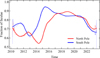 |
Fig. 8. Fraction of detected faculae that have the same polarity as the dominant polarity in each individual pole. |
This relationship between PFe polarity fraction and the solar cycle is also evident on shorter timescales. For example, specific features in the BLOS values (Fig. 15), such as the local maximum in the north polar region in 2013, the minimum in 2014, and the negative maximum in the south polar region during 2015, correspond to higher, lower, and higher values of the PFe polarity fraction, respectively. These observations suggest that the temporal evolution of the PFe number and 〈BLOS〉PF may be explained by this scenario where the polarity balance of each pole changes, but the fundamental properties of faculae remain unchanged.
To investigate the second hypothesis, that is, whether the observed differences in the evolution of PFe properties (e.g., the highlighted region in orange in Fig. 7, panels A and C) could also be explained by the temporal evolution of PFe properties, we produced the Fig. 9. This figure displays a series of histograms of the absolute values of PFe BLOS at both poles during different years. These histograms reveal a similar behavior between the faculae of both poles for all the years considered, which means that there is little (if any) variation in the magnetic nature of PFe with time or in between polar regions. However, there are some observable systematic differences in the values of the faculae's BLOS values from one pole to another; in general, the BLOS for PFe of the north region look more similar between themselves, since histograms are slightly narrower and with a larger mode value (the peak of the histograms is slightly larger) than those of the south pole. These small differences are also appreciated between some consecutive years: for example, the south pole histogram changes from 2015 to 2016 to a narrowed one. To analyze these small differences and assess whether they are quantitatively relevant or not, we use a metric called Jensen–Shannon divergence (JSD; Lin 1991). This metric quantifies the similarity between two probability distributions in a scale from 0 (when the distributions are the same) to 1 (when the two distributions are very dissimilar).
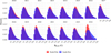 |
Fig. 9. Annual histograms of absolute PFe BLOS values in both poles in the range between 10 G and 200 G. Raw, unprocessed BLOS measurements were used. |
Figure 10 presents the JSD of the comparison, between north and south poles, for the absolute value of PFe BLOS over the years. The absolute value was chosen to remove the intrinsic differences caused by the polar dominant polarity. The results indicate that the JSD values remain consistently low (below 0.025), which means that in a year-by-year basis, northern and southern PFe are characterized by a fairly similar distribution.
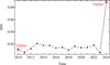 |
Fig. 10. Computed JSD values between the annual distributions of PFe absolute BLOS values of the Sun's north and south poles using unprocessed BLOS measurements. |
At this point, it is important to note that the years 2010 and 2024 are excluded from the forthcoming analysis, as they do not represent complete years, which implies a differential sampling method over the statistical sample as the number of PFe depends on the time of the year. Including them in the analysis could introduce systematic biases, since the sample size is not equivalent, potentially leading to wrong conclusions.
To further investigate the small temporal variations of PFe BLOS, we compared the BLOS distributions for each year with those of other years in the same polar region, as shown in Fig. 11 (panel a for the northern region and panel b for the southern region). The JSD values are consistently below 0.025, which means that the distributions are significantly alike across different years. Interestingly, during the polarity reversal period (mostly 2012 to 2015), a slight increase in JSD is observed, i.e. the distributions are less similar during this phase. This trend is visually evident when comparing, for example, the histogram of the southern polar region (blue) for 2014 with that of 2017 in Fig. 9.
 |
Fig. 11. (a) Computed JSD values between the distributions of the absolute values of PFe BLOS in the north pole using raw, unprocessed BLOS measurements. (b) Same quantity as in (a) but for the south pole. |
From these observations, we conclude that PFe's fundamental properties show a significant coherency over time, because the differences in BLOS distributions are minimal. It is interesting to notice that there is a very subtle result that might be indicative of the opposite, which is clearer seen in Fig. 12. The figure gathers the same histograms shown in Fig. 9 but concatenated in a year by year basis for each polar region separately. As it can be seen, close to the solar activity minimum (2015−2022), when polar regions exhibit the highest averaged magnetic field strength, there are relatively more PFe with smaller BLOS compared to solar maximum periods (2010−2015) when polar regions undergo polarity reversal.
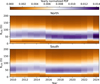 |
Fig. 12. Same histograms as in Fig. 9 but concatenated horizontally by year. The normalization of the histograms has been done on a year basis. |
3.5. Latitudinal temporal evolution of 〈BLOS〉PF
In this section, we focus on one of the most obvious factors that can alter the former result; the polarity reversal takes place in an asymmetrical and gradual fashion, i.e. lower latitudes reverse their polarity earlier than higher latitudes.
Figure 13 shows the temporal evolution of 〈BLOS〉PF together with its latitude dependence over the whole time sequence. The graph highlights, in white color, the polarity changes at the north pole between 2010 and 2016, and from 2022 to the present, as well as at the south pole between 2012 and 2015, and from 2021 to the present. These polarity changes do not occur simultaneously on all of the Sun's surface; instead, they begin at lower latitudes and progressively propagate to higher latitudes (in absolute terms). According to current solar dynamo models (Charbonneau 2020), this “migration” occurs because the magnetic field from the trailing (or “following”) part of active regions spreads out over time and is carried preferentially toward the poles by large-scale plasma flows, known as meridional flow.
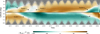 |
Fig. 13. Heatmap displaying the latitude plotted against time for each detected PF at 00:00 UTC. The color of each cell in the heatmap corresponds to the daily mean value of faculae's BLOS. Latitude has been discretized in intervals of 1° and BLOS values are restricted to the range [−100, 100] G. Additionally, there are six identified regions of polarity change, marked with text and arrows. |
If we assume that the neutral lines (white traces in Fig. 13) catch an overall meridional flow velocity, we can estimate this flow by computing the slope of each trace. To do so, for each of the six identified migration paths in Fig. 13, we performed a linear regression fit on latitude position versus time (in days). The slope coefficient of each fit represents the migration rate in degrees per day, which we convert to meters per second using the Sun's radius value of R⊙ = 6.957·108 m (Prša et al. 2016). The resulting six linear fits, along with the computed flow velocity values, are depicted in Fig. 14. The precise latitude and time coordinates of the migration paths were computed by identifying zero-crossings of the magnetic field values; for each latitude bin, we smoothed the 〈BLOS〉PF time series (as described in Appendix D) to reduce noise, and then used linear interpolation to find the exact latitude and time points where the magnetic field changes polarity (crosses zero).
 |
Fig. 14. Linear fits of polarity migration paths for the different regions of the solar poles indicated in Fig. 13. Each panel shows the absolute latitude of magnetic polarity inversions (zero-crossings) as a function of time. The time is calculated in days from the start of each migration at ±50°. Red lines represent linear regression fits, with the corresponding meridional flow velocities and r2 values indicated. Panels a–d show north pole migrations, while panels e and f show south pole migrations. Gray circles indicate outliers excluded from the fits. |
As shown in Fig. 14, we obtain velocity values with high statistical significance. For the north pole, we measure v1 = 3.01±0.02 m/s, v2 = 7.02±0.06 m/s, v3 = 7.67±0.07 m/s, and v4 = 4.030±0.016 m/s across the four migration regions. The south pole exhibits slightly lower velocities of v1 = 4.160±0.015 m/s and v2 = 2.922±0.009 m/s in its two identified migration regions.
Another interesting feature about the 〈BLOS〉PF distribution in Fig. 13, is that from 2015 to 2022, both poles exhibited a clearly defined polarity across almost their entire extent, but with opposite signs between poles. This phenomenon is consistent with the observations depicted in Fig. 7, panel b.
On the one hand, it is interesting to observe the decline in polarity (more negative values) at the southern pole during the year 2015 observed in panel b of Fig. 7, which looking at Fig. 13, occurred predominantly only in regions with latitudes above −60° (closer to the equator). However, that same year, in the rest of the polar area at lower latitudes, the values of 〈BLOS〉PF remained relatively stable, around −50 G, as illustrated in Fig. 13. This highlights the fact that, even if the average polarity of a polar region has reversed, the entire polar cap may not necessarily have fully transitioned, as lower latitudes contribute more to the average due to their larger projected area.
On the other hand, between 2013 and 2015, the north pole of the Sun experienced a second, brief polarity change, as shown in Fig. 13 and panel b of Fig. 7. This second reversal, as with the first, migrated from lower to higher latitudes, but it occurred faster. By 2015, the polarity had fully reversed across the entire polar region. A notable example of this process is observed during the first half of 2013, where high polar latitudes (around 70° and above) were still undergoing polarity changes, while mid-polar latitudes (around 60°) had already completed the reversal, and lower polar latitudes (below 55°) were starting to change again. This phenomenology indicates that the polarity reversal is not always a smooth, progressive process from lower to higher latitudes. Instead, oscillations can occur, where regions may briefly change polarity before fully transitioning. This fact complicates the measurement of a clear migration velocity, as the polarity change does not follow a uniform progression across latitudes.
In the final years of the sequence shown in Fig. 13, the polar magnetic polarity began a new reversal at both poles – around 2022 for the south pole and between 2020 and 2021 for the north pole. This transition appears to be progressing and is expected to be completed by 2024. However, caution is needed when interpreting data from the first and last years of the sequence, as border effects introduced by the mean filter can distort observations. These effects, which complicate drawing reliable conclusions at the sequence boundaries, are particularly noticeable in Figs. 7 and 8, among others.
Finally, two key observations should be noted: First, the magnetic field results presented thus far are specific to the sample of PFe detected by the NN from our dataset, and not to the entire polar region. Consequently, the 〈BLOS〉PF values are higher than those typically observed as the average of the whole polar regions (see the next section and Fig. 15 for further details). Second, as shown in Fig. 13, the magnetic field appears stronger at lower latitudes, with darker colors in regions below 75° for the north pole and above −75° for the south pole. This apparent increase in field strength is, assuming that PFe are mainly associated with vertical magnetic fields, due to projection effects caused by the observational perspective from Earth.
3.6. PFe relation to the polar magnetic field
Figure 15 illustrates the daily average BLOS for the entire polar regions, which includes areas both with and without faculae. Interestingly, this plot exhibits features closely similar to those in panel b of Fig. 7, showing both transition and stable periods, albeit with values that are two orders of magnitude lower. In particular, the global polar magnetic temporal evolution is not as stable as 〈BLOS〉PF between 2016 and 2021. This might shed some uncertainty in the usage of PFe as tracers of the global polar magnetic field (approach that is common when no magnetometer is available).
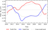 |
Fig. 15. Averaged polar BLOS over time for both solar poles. Measurements are plotted along with smoothed curves obtained by using polynomial fits, and a prediction of the averaged polar BLOS is plotted using the linear model of Fig. 16. |
First, it is important to point out that PFe represent a minor fraction of the polar area (as we have defined it in this work), but their contribution to the average magnetic field is a significantly larger fraction of the global polar magnetic field. Mathematically, the average BLOS over an entire polar cap at a given time can be defined as
 (4)
(4)
where B represents the averaged BLOS of the whole polar region at a given time, Bno−fac denotes the mean BLOS of regions without faculae, nfac is the number of pixels containing faculae, nnofac represents the number of pixels without faculae, and N=nfac+nno−fac is the total number of pixels in the solar pole at that time.
For the period of study, we obtained the mean values  and
and 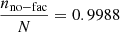 , indicating that faculae's magnetic field area occupation (0.12%) is much smaller than that from non-faculae regions (99.88%). This implies that around 11.5% of the average magnetic field comes from PFe as observed in this study because the median
 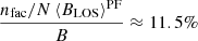 (it might be that higher spatial resolution and/or better spectral and polarimetric sensitivity varies these relative weights). In order to assert if PFe serve as a reliable proxy for the overall polar magnetic field behavior, we have evaluated the Pearson correlation coefficients between 〈BLOS〉PF and B series. This calculation gives a value of 0.966 for the north polar region, 0.967 for the south polar region, and 0.971 for both polar regions combined. These high correlation values suggest that a linear relationship of the form B=a 〈BLOS〉PF+b should provide a robust fit.
Once we have ascertained that PFe average magnetic field is a reasonable tracer of the overall polar region magnetic field, the question to address is whether PFe count is also a good tracer. Following the same methodology as previous studies (Sheeley 1964, 1991, 2008; Muñoz-Jaramillo et al. 2012; Hovis-Afflerbach & Pesnell 2022), we first calibrated the PFe count (Fig. 7, panel a) with the dominant polarity of the polar region. With this calibration, the number of detected faculae is negative when the dominant polarity is negative, and positive otherwise. We then performed a linear fit between the averaged polar BLOS and the calibrated faculae count. The resulting fit, shown in Fig. 16, yields a goodness of fit of r2 = 0.82, with coefficients a = 0.003015±0.000007 G/facula and b = 0.0013±0.0011 G. These results indicate that, despite their small coverage area of the polar region, faculae can effectively trace the behavior of the magnetic field to a significant extent.
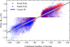 |
Fig. 16. Averaged BLOS over the entire polar region as a function of the calibrated number of facule with the sign of the dominant polarity. A linear fit, y=ax+b, is also shown, where a = 0.003015±0.000007 G/facula and b = 0.0013±0.0011 G. The coefficient of determination is r2 = 0.82, and the Pearson correlation is 0.91. The fit includes all available data from 2010 to 2024. |
In consequence, the relationship between the number of PFe and the averaged polar BLOS (B) can be used to predict the temporal evolution of B (assuming the polarity is known), as shown by the gray dashed lines in Fig. 15. While this prediction captures the overall trend, it exhibits significant deviations, particularly in specific oscillations. For instance, it fails to accurately represent the lower peak of the south pole in 2015 and the sign oscillation of the north pole during 2013 and 2014. The relative mean absolute error over the entire time period for these predictions is 33.5% for the north pole and 28.3% for the south pole. Additionally, a key limitation of this method is that it requires prior knowledge of the polarity (sign) of B, which undermines its utility as a predictive tool.
4. Discussion
4.1. Number of detected faculae
The number of detected PFe identified in this work is significantly higher than those reported in earlier works by Sheeley (1964, 1991, 2008), Muñoz-Jaramillo et al. (2012) and Hovis-Afflerbach & Pesnell (2022). This discrepancy can primarily be attributed to the larger polar region considered here, which encompasses latitudes |φ⊙|≥50°, compared to the smaller regions (typically |φ⊙|≥70°) used in previous studies. A larger observational area naturally results in a higher count of detected faculae. Additionally, differences in instrumentation and methodology can contribute to the variation. Hence, to set a viable comparison, we focus on the study by Hovis-Afflerbach & Pesnell (2022), as it employs the same instrument (HMI) and data timeframe, thereby eliminating uncertainties related to different observables or facilities. Since Hovis-Afflerbach & Pesnell (2022) define polar regions as areas with latitudes |ϕ⊙|≥70°, we limit this analysis to that subset. In particular we aim to reproduce Fig. 7 from Hovis-Afflerbach & Pesnell (2022), which for our results is shown in Fig. 17. This figure presents the number of faculae detected by the U-Net in the polar regions above and below ±70° latitude, averaged for the first week of September (for north pole data) and March (for south pole). Lastly, the faculae count is then multiplied by the average magnetic field sign from the Wilcox Solar Observatory (WSO; Hovis-Afflerbach & Pesnell 2022) during the corresponding months.
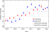 |
Fig. 17. Annual average count of U-Net identified PFe (in solid color) without accounting for projection issues. The annual average was computed by taking the first week of September (for north pole) and March (for south pole) until 2021. Fainter color points shows projection-corrected measurements derived from an entire daily time series, and then taking averages of the first week of September and March as the end value. The sign was adjusted based on the sign of the average WSO polar magnetic field, following the method by Hovis-Afflerbach & Pesnell (2022). The polar regions under consideration were those with |φ⊙|≥70°. |
As displayed in Fig. 17, our results closely match those of Hovis-Afflerbach & Pesnell (2022), with nearly identical values at similar times. This consistency indicates that our detection method performs at a similar level to theirs, and it allows for a systematic application to the whole HMI data sample.
On the one hand, the method introduced in this study offers the advantage of addressing observational biases in PFe count (Sect. 2.4). Limited sampling periods, such as those used by Sheeley (1964, 1991, 2008), Muñoz-Jaramillo et al. (2012), and Hovis-Afflerbach & Pesnell (2022) during certain months of every year when the visible surface of each pole is maximized, can lead to over- or under-estimation of PFe counts with limited capacity for correction. This issue is illustrated in Fig. 17, where projection-corrected data points are displayed in a lighter color. For that estimation, we used the complete daily time series corrected for seasonal effects to calculate the average PFe number for the first week of March (for the north pole) and September (for the south pole). The corrected series differ significantly from the non-corrected ones, with the latter overestimating the PFe count. This effect is likely dominated by the yearly-varying area of the observed polar cap, and so it is plausible to expect that PFe density is a less biased quantity. However, it still requires properly accounting for foreshortening effects, as more faculae are detected further from the limb (see Fig. 18, where it is clear that the PFe counting does not depend on latitude but on heliocentric angle). If these effects are not corrected for, assuming a constant PFe density over time and space can lead to artificially higher PFe counts during favorable observation periods (e.g., March for the southern regions and September for the northern latitudes). This highlights the importance of accounting for projection effects to ensure accurate PFe measurements or using a different metric to the total number of PFe.
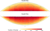 |
Fig. 18. Heatmap displaying the mean number of detected faculae on the Sun's surface over the entire period of time in the north pole (top) and the south pole (bottom). |
On the other hand, the temporal evolution of PFe shown in Fig. 7, panel a, exhibits some known features, consistent with previous studies (e.g., Sheeley 1964, 1991, 2008; Muñoz-Jaramillo et al. 2012). Our results, spanning approximately 13 years, display a pattern of maxima and minima, suggestive of the solar cycle, though that cannot be ensured with the time coverage we have employed (at least one more solar cycle is required).
Another important aspect to consider is the link between PFe and the solar cycle, which can be better understood by relating them to sunspots, one of the main indicators used to quantify the solar cycle. To this end, Fig. 19 displays the number of sunspots recorded by the Royal Observatory of Belgium since 2010 (SILSO World Data Center 1992–2024), alongside the total number of detected PFe in this work. The figure clearly illustrates that when sunspots reach their maximum, PFe are at their minimum, and vice versa. This inverse relationship, or anti-phase behavior, was previously observed in numerous studies (Sheeley 1964, 1991, 2008; Li et al. 2002; Selhorst et al. 2005; Muñoz-Jaramillo et al. 2012), supporting the correct identification of faculae in this work.
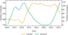 |
Fig. 19. Total number of faculae over time counted at 00:00 UTC along with the number of sunspots measured by the Royal Observatory of Belgium, Brussels (SILSO World Data Center 1992–2024). Measurements are plotted along with smoothed curves obtained by using polynomial fits. |
Additionally, it is worth noting that not only PFe, but also sunspots exhibit a differential behavior between hemispheres (sunspots do not occur at the poles but rather closer to the solar equator), as observed in earlier works by Li et al. (2008), Goel & Choudhuri (2009), Deng et al. (2011), and Veronig et al. (2021). Since sunspots are also markers of magnetic activity, this implies that magnetic activity evolves differently, albeit correlated, between various latitudes and hemispheres, as Goel & Choudhuri (2009) and Veronig et al. (2021) concluded.
Lastly, despite the overall consistent temporal evolution of PFe between both polar regions, there are systematic differences between them (in numbers and delay or phase shift). Moreover, this delay is not consistent over time or between poles, nor between maximum and minimum values of the same pole, which is a known feature of the PFe behavior that might be related to the non-linear behavior of the solar cycle (Li et al. 2008; Deng et al. 2011).
4.2. PFe magnetic field
To avoid confusion, at this point, it is important to note again that the magnetic field values we present here (except for Fig. 15) are higher than the usual averages found in the literature, because they specifically represent the average magnetic field of PFe, not the entire solar pole. The mean magnetic field of PFe, 〈BLOS〉PF, is in the range ±75 G (Fig. 7, panel b), which is significantly higher than the typical mean range of ±1 G reported for the general polar regions (see Fig. 15).
The polarity transition depicted in Figs. 7, panel b, 13, and 15, a phenomenon that has been recorded in numerous other studies such as those of Sheeley (1964, 1991, 2008), Muñoz-Jaramillo et al. (2012), and Hovis-Afflerbach & Pesnell (2022), mirrors a well-documented pattern that recurs every 22 years. This is attributed to the Hale's Polarity law, which, in fact, was first discovered and documented by George Ellery Hale (Hale et al. 1919). According to the global dynamo theory, this polarity shift in the Sun's magnetic field is indicative of a 22-year solar cycle. This cycle is subdivided into two 11-year periods during which the polarity reverses and eventually reverts back to its original state (Kitiashvili et al. 2015; Charbonneau 2020; Petrovay 2020). From this standpoint, it can be inferred that the mentioned figures represent a snapshot of a half-cycle spanning 11 years, showcasing a single polarity reversal for each pole.
4.3. PFe intrinsic properties
Our observations indicate that PFe magnetic field magnitudes behave in a significantly similar fashion, independently of their location or solar cycle phase. However, we found a weak but consistent temporal pattern that might suggest some intrinsic variability; during solar maximum activity (when polar regions change polarity), smaller BLOS values are relatively less abundant compared to periods when polar regions host their strongest average magnetic field (see Fig. 12). Two scenarios could explain this particular observation:
-
Two different magnetic distributions coexist in each pole: strong PFe that define the unipolar character of the polar region and other weaker, but persistent population. In this scenario, the stronger distribution might dominate during solar minima (when polar regions exhibit the strongest unipolar character) and diminish during solar maxima. Multiple studies have previously documented two distinct magnetic populations in polar regions (see for instance; Blanco Rodríguez & Kneer 2010; Ito et al. 2010; Shiota et al. 2012; Pastor Yabar et al. 2018, 2020), although direct comparisons with our work are difficult due to differences in spatial resolution and polarimetric sensitivity.
-
PFe have a subtle dependence on the solar cycle. This seems less likely, but it could have strong implications on the physical mechanisms leading to the formation of PFe and requires further investigation.
These results might also be a consequence of instrumental bias and/or overlooked spatial circumstances. We investigated this by recording both SDO's position relative to the Sun and the heliographic latitude (B0) of the satellite throughout the entire timeframe of our study. We found that when the south pole was more visible (B0<0), SDO's mean distance from the Sun was 0.995 AU, compared to 1.005 AU when the north pole was more visible (B0>0). This proximity difference could account for the observed BLOS differences and explain why we detected generally more faculae in the south pole (see Fig. 7, panel a), as being closer to the Sun can improve feature resolution. Furthermore, in studying the size of PFe, we found a systematic error measurement from one pole to another in the values of linear polarization (see Appendix E.1), which may be associated with the differences in BLOS values.
Nonetheless, the persistence of distinct strong and weak BLOS populations into the new incoming solar minimum, with temporal variations unrelated to Earth's orbit, seems to argue in favor of an intrinsic solar property rather than observational bias.
4.4. Magnetic field with latitude
A distinct characteristic shown in this study is the variation of the polar magnetic field's polarity with latitude throughout the solar cycle (in the same fashion as Ulrich & Tran 2013; Sun et al. 2015; Pastor Yabar et al. 2015, among others). Figure 13 illustrates how the 〈BLOS〉PF changes over time and latitude. From this heatmap, it becomes clear that the polarity reversals at each pole do not occur simultaneously across all latitudes but instead begins at lower latitudes (in absolute terms) and migrates toward higher ones.
This gradual reversal aligns with global dynamo modeling, in which magnetic flux from decaying active regions is carried poleward by the meridional flow (Owens & Forsyth 2013; Charbonneau 2020; Petrovay 2020). It is generally accepted that, when sunspots decay at lower latitudes, they release magnetic flux that is then drifted with a dominant polarity (that of the following part of the AR) towards higher latitudes, leading to this polarity migration phenomenon (Petrovay & Szakály 1999; Ulrich & Tran 2013; Charbonneau 2020). Consequently, latitudinal bands of opposite flux progressively travel toward their respective pole, until the entire high-latitude region switches sign. Our results also reveal that these polarity reversals may happen in discrete or multi-step transitions, as exemplified by the north pole's double sign change between 2013 and 2015 depicted in Fig. 13.
As previously stated, both poles ultimately exhibit the same large-scale flip in polarity, although they do so at slight different times and fashions. For instance, the south pole's change is quicker, with no apparent oscillations, but it started years after the northern one did (see Fig. 13). This hemispheric asymmetry, along with short-lived oscillations in the polarity change, have been documented in other solar cycle studies (Lockwood 2013; Owens & Forsyth 2013; Ulrich & Tran 2013). This asymmetry is generally though to arise from a mix of uneven AR emergence, variations in meridional flow, and other nonlinear dynamo processes, all combining to create the observed north-south discrepancies (Owens & Forsyth 2013; Ulrich & Tran 2013; Charbonneau 2020; Petrovay 2020).
On the other hand, Cycle 24 (the cycle that went from 2008 to 2019) is often regarded as “unusual” (Lockwood 2013) because the southern hemisphere lagged behind the northern one for an extended period. This lag is observed between 2010 and 2012 in Fig. 13. Past studies report that in former cycles the north pole peaked before the south pole, but that there are indications that in the Cycle 25 (from 2019 to 2030) the south pole will be the first to peak (Lockwood 2013; Petrovay 2020). Our results from Fig. 13 also seem to support this hypothesis, since the polarity change in the south pole started a bit earlier (around mid 2021) than the northern one.
Lastly, the measured meridional flow velocities in Fig. 14 help explain the polar field evolution throughout the solar cycle. These measurements confirm that polar polarity inversion occurs progressively, from lower to higher latitudes, at an apparently constant rate at the poles. Previous studies report meridional flow velocities typically in the range between 5 m/s and 15 m/s (lower values are also observed), depending on latitude and phase of the cycle, where the speed decreases towards the poles (Hathaway & Rightmire 2010, 2011; Ulrich 2010). Our results agree with these values, though toward the lower end of the scale. These calculated velocities likely represent a lower limit, as magnetic flux from lower latitudes must first cancel the preceding dominant polarity before establishing the new one.
Overall, our observations of latitude-dependent 〈BLOS〉PF are consistent with the broader picture of a global dynamo that continually regenerates the Sun's large-scale magnetic field on 11-year timescales.
4.5. PFe as tracers of the polar magnetism
Our analysis shows a strong correlation between the faculae magnetic field and the overall mean polar field. Despite faculae only accounting for a mere 0.12% of the solar polar region (≈11.5% of the mean field), their BLOS accurately reflects the general behavior of the pole's magnetic field. A linear relationship between the faculae's field strength (Bfac) and the mean polar field (B) is demonstrated in our results, with a high goodness of fit (r2 = 0.956) and a Pearson correlation coefficient of 0.971. This strong correlation means that we can use the faculae fields as an effective proxy for estimating the mean magnetic field of the polar regions, and vice versa.
Another significant result that has been noted related to PFe, is that the majority of PFe that are present in one pole have the same BLOS sign as the dominant polarity in that pole (Fig. 8). This alignment becomes considerably evident when the polarity achieves a stable value in the solar cycle minimum, but is less distinct during sign transitions (solar cycle maximum). This pattern suggests a correlation between the PFe’ fields and the polar fields, thus providing additional evidence that the pole's magnetic field can be estimated from the faculae fields.
Finally, we have found that PFe counting can be used as a general context proxy for the global polar magnetic field (provided of some mean to assign the correct polarity). Unfortunately, this proxy should be used with extreme caution when addressing precise local dynamics of the polar magnetism, as we have demonstrated that the correlation between PFe counting and global magnetic field is not as high as it would be required for that aim (see Fig. 15). In this sense, it is important to realize that PFe counting, while offering longer timelines for characterizing polar magnetism (systematic filtergrams date back to 1910s; Sheeley 1964), it can only provide an overall characterization of the polar magnetic field in polar regions, requiring the assumption of the magnetic polarity. In contrast, the magnetograph analyses by Babcock (1953), Howard (1974), Livingston et al. (1976), Scherrer et al. (1977), and Pevtsov et al. (2021) provide a more detailed magnetic description of the polar magnetism, though over shorter time periods. Only in recent decades has it been possible to acquire systematic full spectropolarimetric observations of polar regions, (such as the polar program carried out with the SP spectropolarimeter Lites et al. 2001, 2013 at the Solar Optical Telescope Tsuneta et al. 2008 onboard the Hinode satellite Kosugi et al. 2007, or HMI onboard SDO), which should provide the most detailed characterization of the magnetism in the polar regions, as it enables the full magnetic field vector to be observed, rather than only the line-of-sight component of magnetograms. However, obtaining consistent results from these different datasets remains challenging (see for instance Petrie 2022, and references therein).
5. Conclusions and future work
In this study, we have presented a comprehensive analysis of the solar magnetic activity in polar regions of the Sun by means of PFe. We introduced a new method for detecting and analyzing PFe. Through the analysis of images taken by HMI and deep learning techniques, specifically utilizing a modified U-Net model, we developed a novel algorithm, faculAI, capable of efficiently and accurately detecting PFe from linear polarization measurements. The model distinguishes itself as the first (to our knowledge) to enable automatic faculae identification without the requirement of manual counting and the use of linear polarization as a key predictor. The algorithm has the capacity to process individual images rapidly, within mere seconds, and it is only reliant on one image at any selected time, making it faster, scalable, and thus suitable for large-scale analysis7.
Using this algorithm, we were able to study in detail different properties of PFe through a long time period of around 14 years. We observed and reconfirmed known cyclical patterns in the counting of PFe, which inversely correlate with the solar sunspot cycle, and we provided a comprehensive account of the magnetic activity of PFe across both polar regions.
Through this study, we observed the migration in the magnetic field's polarity from equatorial latitudes to polar latitudes, and we were able to analyze the behavior of the magnetic field at different times in a solar cycle at both poles. We found and computed a direct linear relationship between the mean magnetic field of PFe and the mean magnetic field of the polar regions. The nature of this relationship allows for the use of PFe as reliable proxies for assessing magnetic conditions at the solar poles. Our investigation also highlighted a potential difference in the nature of PFe magnetic fields between poles.
Despite these results, our study confronted several limitations that should be noted. These include strong projection and periodical effects due to observing from Earth's orbit. The possibility of detecting aggregations of PFe rather than individual ones, due to the limited spatial resolution of the data employed in this work. Potential instrumental errors that could skew the measurements. As an example, we were unable to obtain conclusive results regarding the size of faculae over time as a consequence of the limitations (see Appendix E).
Multiple strategies can be implemented to mitigate some or all the mentioned issues. For instance, the Solar Orbiter (Müller et al. 2020) – along with the recently proposed Firefly mission (Raouafi et al. 2023), if funded – will enable the use of spectropolarimetric observations of the solar poles from beyond the ecliptic plane for the very fist time, a task that was not achieved by the Ulysses polar passes (see for instance Sanderson et al. 1995). Additionally, one could compare PFe identified in our study with those obtained using higher-resolution tools such as the ones potentially provided by the Daniel K. Inouye Solar Telescope (Rimmele et al. 2020), the European Solar Telescope (Collados et al. 2013; Quintero Noda et al. 2022), or other existing instruments. In this sense, one could assess the correspondence between the likely faculae aggregations we have detected and those observed through the Hinode satellite or even higher-resolution data such as those reported in Okunev (2004), Blanco Rodríguez et al. (2007), Pastor Yabar et al. (2020), Prabhu et al. (2020). By doing so, it might be possible to calibrate a “group factor” for selected observations that refines our actual count of faculae from the “features” identified in HMI measurements. That way one could take advantage of HMI@SDO's superior time coverage and stability in order to set comparisons with future missions. Such comparisons could also address how much of the non-faculae polarity dominance comes from faculae that cannot be detected with the data used in this work. Hence, comparison with instrumentation with better spectral coverage might be extremely beneficial. Instruments that could be used include Solar Optical Telescope on board the Hinode satellite or the Vector Stokes Magnetograph (VSM) on the ground-based Synoptic Optical Long-term Investigation of the Sun (Keller et al. 2003). Another option would be to use spectropolarimetric inversions of PFe with a filling factor (now available for the HMI series by request Griñón-Marín et al. 2021). By combining a filling factor with an assumed PFe size (for example, using estimations from quiet Sun small-scale magnetic elements Lagg et al. 2010), one can estimate the PFe number per identified cluster, thus obtaining a refined number.
We plan to expand our model to allow facula tracking over time. This enhancement will facilitate direct measurements of significant properties, such as the lifetimes of PFe or plasma velocities at the solar poles. Overall, our study presents a significant contribution to the field of solar physics by providing a new and efficient tool for detecting and analyzing PFe, which enhances our understanding of solar magnetism and the solar cycle.
Acknowledgments
APY acknowledges support from the Swedish Research Council (grant 2023-03313). This project has been funded by the European Union through the European Research Council (ERC) under the Horizon Europe program (MAGHEAT, grant agreement 101088184). This work was supported by NASA Contract NAS5-02139 (HMI) to Stanford University. This research is also supported by the Research Council of Norway through its Centres of Excellence Scheme, Project Number 262622. ABGM acknowledges support by the Swedish National Space Agency through the Call 2023-C, project number 31004980. This research has made use of NASA's Astrophysics Data System Bibliographic Services. We are grateful to the HMI@SDO team for their data. We acknowledge the community effort devoted to the development of the following open-source packages that were used in this work: numpy (Harris et al. 2020, numpy.org), matplotlib (Hunter 2007, matplotlib.org), scipy (Virtanen et al. 2020, scipy.org), astropy (Astropy Collaboration 2022, astropy.org), opencv (Bradski 2000, opencv.org), tensorflow (Abadi et al. 2015, tensorflow.org), keras (Chollet 2015, keras.io), ggplot2 (Wickham 2016, ggplot2.tidyverse.org), and data.table (Dowle & Srinivasan 2023, r-datatable.com).
The code developed in this work is available as a Python package called faculai, which can be downloaded and installed from the GitHub repository https://github.com/antonio-reche/faculai
Per-pixel solar latitude and longitude are computed by converting pixel coordinates to Cartesian coordinates using the Carrington heliocentric system (Thompson 2006) and subsequently converting these to spherical coordinates.
The decision to choose a size of 256×256 was mainly driven by hardware limitations of the local computer used. Additionally, it was important to ensure that the chosen size was sufficiently large to encapsulate multiple faculae.
The small mL values stem from the nature of linear polarization, which does not exceed 1 by definition and is typically less in natural scenarios, where light comes polarized in all possible ways. This is especially the case of the Sun (outside sunspots), where only a minimal fraction contributes to linear polarization, resulting in a low scale.
A small set of data were classified by hand to compare the final U-Net performance with that of a human.
Arbitrary parameters for these steps were chosen heuristically, based on real image statistics.
The model has been packaged in a Python library to facilitate its use by other researchers, and it can be found at https://github.com/antonio-reche/faculai
Check also the link http://jsoc.stanford.edu/jsocwiki/ModLRecalibration
Do not confuse these ”clusters” with the fact that what is being measured by HMI might be ”aggregations” of single PFe. These mentioned clusters represent a group of the entities that are being detected by the U-Net in the HMI images as PFe.
References
- Abadi, M., Agarwal, A., Barham, P., et al. 2015, TensorFlow: Large-Scale Machine Learning on Heterogeneous Systems, tensorflow.org [Google Scholar]
- Alzubaidi, L., Zhang, J., Humaidi, A. J., et al. 2021, J. Big Data, 8, 53 [CrossRef] [Google Scholar]
- Astropy Collaboration (Price-Whelan, A. M., et al.) 2022, ApJ, 935, 167 [NASA ADS] [CrossRef] [Google Scholar]
- Babcock, H. W. 1953, ApJ, 118, 387 [NASA ADS] [CrossRef] [Google Scholar]
- Blanco Rodríguez, J., & Kneer, F. 2010, A&A, 509, A92 [NASA ADS] [CrossRef] [EDP Sciences] [Google Scholar]
- Blanco Rodríguez, J., Okunev, O., Puschmann, K., Kneer, F., & Nuño, B. S. -A. 2007, A&A, 474, 251 [NASA ADS] [CrossRef] [EDP Sciences] [Google Scholar]
- Bobra, M. G., Sun, X., Hoeksema, J. T., et al. 2014, Sol. Phys., 289, 3549 [Google Scholar]
- Bradski, G. 2000, Dr. Dobb's Journal of Software Tools, https://pypi.org/project/opencv-python [Google Scholar]
- Calvo, F., Steiner, O., & Freytag, B. 2016, A&A, 596, A43 [NASA ADS] [CrossRef] [EDP Sciences] [Google Scholar]
- Carrington, R. C. 1858, MNRAS, 19, 1 [NASA ADS] [CrossRef] [Google Scholar]
- Charbonneau, P. 2020, Liv. Rev. Sol. Phys., 17, 4 [Google Scholar]
- Chollet, F. 2015, Keras, https://keras.io [Google Scholar]
- Chollet, F. 2021, Deep Learning with Python, Second Edition (Manning Publications Co. LLC), 400 [Google Scholar]
- Collados, M., Bettonvil, F., Cavaller, L., et al. 2013, Mem. Soc. Astron. Ital., 84, 379 [Google Scholar]
- Couvidat, S., Rajaguru, S. P., Wachter, R., et al. 2012, Sol. Phys., 278, 217 [NASA ADS] [CrossRef] [Google Scholar]
- Couvidat, S., Schou, J., Hoeksema, J. T., et al. 2016, Sol. Phys., 291, 1887 [Google Scholar]
- Del Toro Iniesta, J. C., & Martínez Pillet, V. 2012, ApJS, 201, 22 [CrossRef] [Google Scholar]
- Deng, L. H., Song, J. Y., Xiang, Y. Y., & Tang, Y. K. 2011, JApA, 32, 401 [Google Scholar]
- Dowle, M., & Srinivasan, A. 2023, data.table: Extension of ‘data.frame’ https://r-datatable.com, https://Rdatatable.gitlab.io/data.table, https://github.com/Rdatatable/data.table [Google Scholar]
- Eker, Z. 2003, Sol. Phys., 212, 277 [Google Scholar]
- Fortune, S. 1995, Computing in Euclidean Geometry (World Scientific), 225 [Google Scholar]
- Goel, A., & Choudhuri, A. R. 2009, RAA, 9, 115 [Google Scholar]
- Griñón-Marín, A. B., Pastor Yabar, A., Liu, Y., Hoeksema, J. T., & Norton, A. 2021, ApJ, 923, 84 [Google Scholar]
- Hale, G. E., Ellerman, F., Nicholson, S. B., & Joy, A. H. 1919, ApJ, 49, 153 [NASA ADS] [CrossRef] [Google Scholar]
- Harris, C. R., Millman, K. J., van der Walt, S. J., et al. 2020, Nature, 585, 357 [NASA ADS] [CrossRef] [Google Scholar]
- Hathaway, D. H. 2015, Liv. Rev. Sol. Phys., 12, 1 [CrossRef] [Google Scholar]
- Hathaway, D. H., & Rightmire, L. 2010, Science, 327, 1350 [NASA ADS] [CrossRef] [Google Scholar]
- Hathaway, D. H., & Rightmire, L. 2011, ApJ, 729, 80 [NASA ADS] [CrossRef] [Google Scholar]
- Hoeksema, J. T., Liu, Y., Hayashi, K., et al. 2014, Sol. Phys., 289, 3483 [Google Scholar]
- Hoeksema, J. T., Baldner, C. S., Bush, R. I., Schou, J., & Scherrer, P. H. 2018, Sol. Phys., 293, 45 [NASA ADS] [CrossRef] [Google Scholar]
- Homann, T., Kneer, F., & Makarov, V. 1997, Sol. Phys., 175, 81 [Google Scholar]
- Hovis-Afflerbach, B., & Pesnell, W. D. 2022, Sol. Phys., 297, 48 [Google Scholar]
- Howard, R. 1974, Sol. Phys., 38, 283 [NASA ADS] [CrossRef] [Google Scholar]
- Hunter, J. D. 2007, Comput. Sci. Eng., 9, 90 [NASA ADS] [CrossRef] [Google Scholar]
- Ito, H., Tsuneta, S., Shiota, D., Tokumaru, M., & Fujiki, K. 2010, ApJ, 719, 131 [Google Scholar]
- Janssens, J. 2021, J. Space Weather Space Clim., 11, 3 [Google Scholar]
- Jin, C., & Wang, J. 2011, ApJ, 732, 4 [Google Scholar]
- Keller, C. U., Harvey, J. W., & Giampapa, M. S. 2003, SPIE Conf. Ser., 4853, 194 [NASA ADS] [Google Scholar]
- Keller, C. U., Schssler, M., Vgler, A., & Zakharov, V. 2004, ApJ, 607, L59 [NASA ADS] [CrossRef] [Google Scholar]
- Kitiashvili, I. N., Kosovichev, A. G., Mansour, N. N., & Wray, A. A. 2015, ApJ, 809, 84 [NASA ADS] [CrossRef] [Google Scholar]
- Kosugi, T., Matsuzaki, K., Sakao, T., et al. 2007, Sol. Phys., 243, 3 [Google Scholar]
- Lagg, A., Solanki, S. K., Riethmüller, T. L., et al. 2010, ApJ, 723, L164 [NASA ADS] [CrossRef] [Google Scholar]
- Li, K., Irie, M., Wang, J., et al. 2002, PASJ, 54, 787 [Google Scholar]
- Li, K. J., Gao, P. X., Zhan, L. S., Shi, X. J., & Zhu, W. W. 2008, MNRAS, 391, L34 [Google Scholar]
- Lin, J. 1991, IEEE Trans. Inf. Theory, 37, 145 [Google Scholar]
- Lites, B. W., Elmore, D. F., & Streander, K. V. 2001, ASP Conf. Ser., 236, 33 [NASA ADS] [Google Scholar]
- Lites, B. W., Akin, D. L., Card, G., et al. 2013, Sol. Phys., 283, 579 [NASA ADS] [CrossRef] [Google Scholar]
- Livingston, W. C., Harvey, J., Slaughter, C., & Trumbo, D. 1976, Appl. Opt., 15, 40 [NASA ADS] [CrossRef] [Google Scholar]
- Lockwood, M. 2013, Liv. Rev. Sol. Phys., 10, 4 [Google Scholar]
- Müller, D., Cyr, O. S., Zouganelis, I., et al. 2020, A&A, 642, A1 [NASA ADS] [CrossRef] [EDP Sciences] [Google Scholar]
- Muñoz-Jaramillo, A., Sheeley, N. R., Zhang, J., & DeLuca, E. E. 2012, ApJ, 753, 146 [CrossRef] [Google Scholar]
- Nair, V., & Hinton, G. E. 2010, Proceedings of the 27th International Conference on Machine Learning (ICML-10), 807 [Google Scholar]
- Okunev, O. 2004, PhD Thesis, Citeseer [Google Scholar]
- Owens, M. J., & Forsyth, R. J. 2013, Liv. Rev. Sol. Phys., 10, 5 [Google Scholar]
- Pastor Yabar, A., Martinez Gonzalez, M. J., & Collados, M. 2015, MNRAS, 453, L69 [Google Scholar]
- Pastor Yabar, A., Martínez González, M. J., & Collados, M. 2018, A&A, 616, A46 [NASA ADS] [CrossRef] [EDP Sciences] [Google Scholar]
- Pastor Yabar, A., Martínez González, M. J., & Collados, M. 2020, A&A, 635, A210 [NASA ADS] [CrossRef] [EDP Sciences] [Google Scholar]
- Pesnell, W. D., Thompson, B. J., & Chamberlin, P. C. 2012, Sol. Phys., 275, 3 [Google Scholar]
- Petrie, G. J. D. 2015, Liv. Rev. Sol. Phys., 12, 5 [Google Scholar]
- Petrie, G. J. D. 2022, ApJ, 941, 142 [Google Scholar]
- Petrovay, K. 2020, Liv. Rev. Sol. Phys., 17, 2 [Google Scholar]
- Petrovay, K., & Szakály, G. 1999, Sol. Phys., 185, 1 [Google Scholar]
- Pevtsov, A. A., Bertello, L., Nagovitsyn, Y. A., Tlatov, A. G., & Pipin, V. V. 2021, J. Space Weather Space Clim., 11, 4 [NASA ADS] [CrossRef] [EDP Sciences] [Google Scholar]
- Prabhu, A., Lagg, A., Hirzberger, J., & Solanki, S. K. 2020, A&A, 644, A86 [NASA ADS] [CrossRef] [EDP Sciences] [Google Scholar]
- Prša, A., Harmanec, P., Torres, G., et al. 2016, AJ, 152, 41 [Google Scholar]
- Quintero Noda, C., Suematsu, Y., Ruiz Cobo, B., Shimizu, T., & Asensio Ramos, A. 2016, MNRAS, 460, 956 [Google Scholar]
- Quintero Noda, C., Schlichenmaier, R., Bellot Rubio, L. R., et al. 2022, A&A, 666, A21 [NASA ADS] [CrossRef] [EDP Sciences] [Google Scholar]
- Raouafi, N. E., Berger, T., Vourlidas, A., et al. 2023, AAS/Solar Physics Division Meeting, 55, 111.06 [Google Scholar]
- Rezatofighi, H., Tsoi, N., Gwak, J., et al. 2019, Proceedings of the IEEE/CVF Conference on Computer Vision and Pattern Recognition, 658 [Google Scholar]
- Rimmele, T. R., Warner, M., Keil, S. L., et al. 2020, Sol. Phys., 295, 172 [Google Scholar]
- Ronneberger, O., Fischer, P., & Brox, T. 2015, ArXiv e-prints [arXiv:1505.04597] [Google Scholar]
- Saito, K., & Tanaka, Y. 1957, PASJ, 9, 106 [Google Scholar]
- Sanderson, T. R., Bothmer, V., Marsden, R. G., et al. 1995, Geophys. Res. Lett., 22, 3357 [Google Scholar]
- Schatten, K. 2005, Geophys. Res. Lett., 32, L21106 [NASA ADS] [CrossRef] [Google Scholar]
- Schatten, K. H., Mayr, H. G., Omidvar, K., & Maier, E. 1986, ApJ, 311, 460 [Google Scholar]
- Scherrer, P. H., Wilcox, J. M., Svalgaard, L., et al. 1977, Sol. Phys., 54, 353 [NASA ADS] [CrossRef] [Google Scholar]
- Scherrer, P. H., Bogart, R. S., Bush, R. I., et al. 1995, Sol. Phys., 162, 129 [Google Scholar]
- Scherrer, P. H., Schou, J., Bush, R. I., et al. 2012, Sol. Phys., 275, 207 [Google Scholar]
- Schou, J., Scherrer, P. H., Bush, R. I., et al. 2012, Sol. Phys., 275, 229 [Google Scholar]
- Schroeter, E. H., Soltau, D., & Wiehr, E. 1985, Vistas Astron., 28, 519 [CrossRef] [Google Scholar]
- Schüssler, M. 1990, IAU Symp., 138, 161 [Google Scholar]
- Schwabe, H. 1844, Astron. Nachr., 21, 233 [Google Scholar]
- Selhorst, C., Silva, A., & Costa, J. 2005, A&A, 440, 367 [NASA ADS] [CrossRef] [EDP Sciences] [Google Scholar]
- Sheeley, N. R. Jr. 1964, ApJ, 140, 731 [Google Scholar]
- Sheeley, N. R. Jr. 1991, ApJ, 374, 386 [Google Scholar]
- Sheeley, N. R. Jr. 2008, ApJ, 680, 1553 [NASA ADS] [CrossRef] [Google Scholar]
- Shiota, D., Tsuneta, S., Shimojo, M., et al. 2012, ApJ, 753, 157 [Google Scholar]
- SILSO World Data Center 1992–2024, International Sunspot Number Monthly Bulletin and Online Catalogue, http://www.sidc.be/silso [Google Scholar]
- Srivastava, N., Hinton, G., Krizhevsky, A., Sutskever, I., & Salakhutdinov, R. 2014, J. Mach. Learn. Res., 15, 1929 [Google Scholar]
- Stenflo, J. O. 2013, A&A, 555, A132 [NASA ADS] [CrossRef] [EDP Sciences] [Google Scholar]
- Sun, X., Hoeksema, J. T., Liu, Y., & Zhao, J. 2015, ApJ, 798, 114 [NASA ADS] [CrossRef] [Google Scholar]
- Svalgaard, L., Duvall, T. L. Jr., & Scherrer, P. H. 1978, Sol. Phys., 58, 225 [NASA ADS] [CrossRef] [Google Scholar]
- Thompson, W. 2006, A&A, 449, 791 [NASA ADS] [CrossRef] [EDP Sciences] [Google Scholar]
- Trippe, S. 2014, ArXiv e-prints [arXiv:1401.1911] [Google Scholar]
- Tsuneta, S., Ichimoto, K., Katsukawa, Y., et al. 2008, Sol. Phys., 249, 167 [Google Scholar]
- Ulrich, R. K. 2010, ApJ, 725, 658 [NASA ADS] [CrossRef] [Google Scholar]
- Ulrich, R. K., & Tran, T. 2013, ApJ, 768, 189 [NASA ADS] [CrossRef] [Google Scholar]
- Usoskin, I. G. 2017, Liv. Rev. Sol. Phys., 14, 3 [Google Scholar]
- Veronig, A. M., Jain, S., Podladchikova, T., Pőtzi, W., & Clette, F. 2021, A&A, 652, A56 [NASA ADS] [CrossRef] [EDP Sciences] [Google Scholar]
- Virtanen, P., Gommers, R., Oliphant, T. E., et al. 2020, Nat. Meth., 17, 261 [Google Scholar]
- Wang, Y. M., & Sheeley, N. R. Jr. 1992, ApJ, 392, 310 [NASA ADS] [CrossRef] [Google Scholar]
- Wickham, H. 2016, ggplot2: Elegant Graphics for Data Analysis (New York: Springer-Verlag) [Google Scholar]
- Wilson, P. 1992, Sol. Phys., 138, 11 [Google Scholar]
- Zeiler, M. D., & Fergus, R. 2013, ArXiv e-prints [arXiv:1301.3557] [Google Scholar]
Appendix A: Linear polarization: Formula derivation
The linear polarization, mL, is defined by the Stokes parameters I, Q, and U as (Trippe 2014)
 (A.1)
(A.1)
However, since HMI measures six different wavelengths, λ, for each Stokes parameter, the above formula becomes (Pastor Yabar et al. 2020)
 (A.2)
(A.2)
and as the six measurements are equally spaced around the FeI 6173.34 Å line, the computation can be approximated by
 (A.3)
(A.3)
Here, λi are the six different wavelengths measured by HMI around the Fe I line. This is the formula used to compute linearly polarized images in this work.
Appendix B: U-Net architecture
The U-Net model (Ronneberger et al. 2015) consists of an array of chained convolutions layers along with pooling layers. The network takes the input image and applies a series of successive convolutions with an incremental number of feature maps, that is, each successive convolution layer increments the number of kernels – the parameters of the convolution layer – by a power of 2. Then, it does the opposite by doing another sequence of transposed convolutions, hence leading back to the image's original size.
B.1. Convolution layers
The architecture of a convolution layer utilize a kernel, which is a matrix of discrete values that are used to weight the incoming data through a process called the convolution operation. This operation involves performing a mathematical function such as cross-multiplication at each position of the image. The result of these operations forms feature maps – output tensors representing transformed versions of the input data. A convolution layer can have any arbitrary number of kernels, which will produce the same number of feature maps (Chollet 2021; Alzubaidi et al. 2021).
B.2. Max pooling
A pooling layer is a layer that sub-samples (shrinks) the convolution feature maps through a certain operation. In this case, a max pooling layer is a layer that calculates the maximum value of a certain patch or region of the input feature maps. This type of layer is commonly used in convolution architectures. It helps to reduce variability and compress the relevant information for the task at hand (Zeiler & Fergus 2013; Chollet 2021; Alzubaidi et al. 2021).
B.3. Dropout
A dropout layer is a regularization technique that simply ”drops” (randomly ignores) a fraction of connections or nodes during training, which helps to avoid overfitting (over learning a single dataset and being unable to generalize with other datasets). It was developed by Srivastava et al. (2014).
B.4. ReLU and sigmoid activations
An activation function is a key feature in NN layers, as it is applied to the layer's output. This function, typically non-linear, is what provides the NN with its non-linear modeling ability. While there's a broad variety of activation functions available, the Rectified Linear Unit (ReLU; Nair & Hinton 2010; Chollet 2015), is among the most widely used. It is defined as follows:
 (B.1)
(B.1)
Finally, the last activation used in the network is a sigmoid activation, which keeps the output restricted between 0 and 1. It is typically defined as
 (B.2)
(B.2)
Additionally, after the model is trained, to obtain a binary mask, the final output after the sigmoid is thresholded with a value of 0.5, that is, the model's output is processed using
 (B.3)
(B.3)
Appendix C: Synthetic image generation
To develop a suitable image generator, we thoroughly examined the statistical properties of HMI images. As detailed in Sec. 2.3, we utilized various HMI image sets from different dates to obtain general statistics. Those dates were selected to contain periods of minimum and maximum solar activity, as well as intermediate times. The periods were
-
Minimum activity: An image every week at 00:00 UTC from 2020-01-01 to 2020-09-30, comprising a total of 39 samples.
-
Maximum activity: An image every week at 00:00 UTC from 2014-01-01 to 2014-09-30, comprising a total of 39 samples.
-
Intermediate activity: An image every week at 00:00 UTC from 2016-01-01 to 2016-09-30, comprising a total of 39 samples.
From those sets of HMI.S_720s series, we computed the images of linear polarization using Eq. (A.3), and then, we processed and obtained their normal and sigma-clipped statistics (mean and standard deviations). The results are presented in Table C.1. It is possible to distinguish different behaviors for each pole, which is also simulated in the synthetic images. This difference between poles is believed to be caused by a differentiated instrumental error in HMI's cameras (see App. E.1). There is also a variation in the statistics before and after 2016-04-13, which was caused by a recalibration of 720s HMI data products (Hoeksema et al. 2018)8. This recalibration can be seen in Fig. C.1.
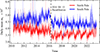 |
Fig. C.1. Daily mean linear polarization of PFe over time for both poles. The recalibration in 2016 of HMI 720s data products is depicted. |
Pixel value statistics for the chosen HMI linear polarization images.
These statistics were employed to produce synthetic images that emulate the attributes of real ones. Ultimately, the images were standardized to a mean of 0 and a standard deviation of 1 to remove any potential biases in the data and provide an unified input for the U-Net.
Appendix D: Data reduction pipelines
As explained in Sect. 2.4, there is a projection issue due to observing from Earth's orbit. Additionally, raw data exhibit high noise and variability. In this appendix, the technical procedures employed to correct the data are outlined.
D.1. Median filter
To address noise and projection effects, a median filter with a 31-day time window was applied. This process involves replacing each data point in the time series with the median value of all points within a one-month window surrounding it. This particular time-window size was selected based on the fact that in most sunspot and facular count studies, the monthly average is commonly utilized.
D.2. Polynomial fit
The majority of results in this study are accompanied by polynomial fits. These fits were computed using the R programming language function loess, which performs a polynomial fit of a given signal, using local fitting. The degree of smoothing is controlled by the span argument, which was set to 0.20 for all cases. Additionally, the polynomial degree was chosen to be 2 for all cases. The fits are calculated from the curves processed with the median filter technique. Figure D.1 displays the various stages involving the processes detailed in this appendix.
 |
Fig. D.1. Top: Number of detected PFe over time at the Sun's south pole. Bottom: Daily mean BLOS of PFe over time at the Sun's south pole. The two graphs display the original raw values, the band-stop filter curve, its correction with a median filter, and a polynomial fit for values at 00:00 UTC. |
Appendix E: Area computation
A variable of considerable interest that was studied in this work is the calculation of the area of each PF, which allows for a measurable size of the PFe. However, due to a strong dependence of projection issues, it was not possible to yield reliable conclusions. The analysis presented in this appendix aims to document all research conducted on the matter, providing a reference to aid future researchers who wish to get into this work.
To obtain the area of a PF is not sufficient to compute the number of pixels or its apparent size, since projection angles must be considered. Therefore, to calculate the area, the spherical coordinates (latitude and longitude) of all the pixels that make up the PF are used, and the Delaunay algorithm from the SciPy (Virtanen et al. 2020) library (spatial.Delaunay) is used for triangulation. The Delaunay algorithm is a method to create a set of triangles from a group of points so that the triangles are ”good” in the sense that they have large angles and do not overlap each other (Fortune 1995). Because of that, these triangles define the surface formed by the 3D coordinates (see Fig. E.1).
 |
Fig. E.1. Left: Binary segmentation mask of a PF, with white squares (value 1) representing PF pixels and black squares (value 0) non-PF pixels. Black dots denote PF pixel coordinates. Middle: Triangles obtained from Delaunay triangulation are depicted in blue color. Right: Three-dimensional PF surface visualization constructed from the triangles. |
After triangulation is carried out, the spherical coordinates are converted to Cartesian coordinates using a solar radius of R⊙ = 6.957·108 m (Prša et al. 2016), and from them, the area of each triangle of vertices a=(xa, ya, za), b=(xb, yb, zb), and c=(xc, yc, zc) is computed as
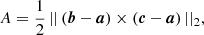 (E.1)
(E.1)
where || ||2 denotes the ℓ2 norm and × is the cross product. Lastly, the total surface area of a PF is calculated as the sum of the areas of all the triangles found by the Delaunay triangulation.
E.1. Results and discussion
At this point, it should be noted that the measurements in this study might not represent individual PFe due to the angular resolution of the HMI telescope. Instead, they could be reflecting aggregations of PFe. Homann et al. (1997) examined various PFe properties, including size, obtaining a size of 2.1″±0.4″ for equatorial PFe and 3.5″±1.3″ (around 2500 km) for PFe. This was measured using the Gregory Coudé Telescope (Schroeter et al. 1985) at the Observatorio del Teide in Tenerife, with an angular resolution around 0.4″. Okunev (2004) briefly analyzed PFe size, and estimated them to be around 0.5″ (300−400 km), using the higher-resolution Vacuum Tower Telescope (Schroeter et al. 1985) at the same observatory, with a resolution of 0.2″. Their works had better angular resolution than HMI, which has an angular resolution of 1″ (Schou et al. 2012), and this may have led them to a more accurate determination of the PFe's physical size. This information suggests the need to consider the possibility that what is being measured in this work may not be individual PFe but rather aggregations of them.
Apart from those studies, there appears to be a scarcity of research on this topic, and no work has been found addressing the temporal evolution of PFe size. As a result, this research could provide a unique contribution to the field.
In calculating PFe sizes, this work computes PFe surface areas, as mentioned earlier. Figure E.2 presents various histograms representing the calculated areas of PFe. The Panel (a) displays an area histogram for each year analyzed, alongside an overall histogram for all years as a reference. Utilizing a logarithmic scale allows minor variations to be more easily distinguished due to the exponential nature of the histograms.
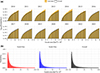 |
Fig. E.2. (a): Histograms of the detected PFe areas for each year in both poles (yellow) alongside the overall histogram (black), in logarithmic scale. (b): Overall histograms of the detected PFe areas in each separated pole and in both poles together, not in logarithmic scale. Solid continuous lines represent linear fits of the power law model defined by Eq. (E.2). Both graphs represent the results measured at 00:00 UTC. |
In general, the annual histograms reveal a relatively stable pattern in PFe areas when compared to the overall trend. However, a difference exists between the years 2011–2014, with larger areas being less frequent – 2014 exhibits the most significant variation, marked by fewer larger PFe. This aligns with the period when PFe numbers are lower (see Fig. 7, Panel a). Additionally, during the years 2017–1019, though less apparent, an opposite pattern is observed, with larger areas being more prevalent. This corresponds with the time when PFe numbers are higher, as illustrated in Panel (a) of Fig. 7. Consequently, it appears that the presence of more PFe is linked to larger sizes and vice versa, as evidenced in Fig. E.3. This conclusion may be a consequence of the methodology employed in this study; if the number of PFe increases, the likelihood of adjacent PFe forming clusters also rises, causing the detection algorithm to identify them as a single larger entity instead of smaller separate ones.
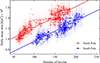 |
Fig. E.3. Daily mean PF area plotted against the daily number of PFe for both solar poles at 00:00 UTC. A linear fit is also represented for each pole. |
Apart from the aforementioned, PFe sizes are generally similar between poles, although the southern pole PFe seem to be slightly smaller than those in the north, as shown in Figs. E.3 and E.4. The difference is more evident in Fig. E.4, showcasing distinct size trajectories for north and south poles. These trajectories mirror the PFe count behavior discussed in Fig. 7, Panel (a), but with the south pole PFe being smaller on average. Figure E.3 captures this linear relationship between PFe count and size, and Table E.1 presents the linear fit results. The slopes of both fits are almost identical, implying that both poles share a similar linear relationship, with the only difference being the intercept values.
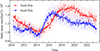 |
Fig. E.4. Daily mean PFe area over time for both solar poles at 00:00 UTC. Continuous lines represent polynomial fits of the time series. |
Coefficients and goodness of fit r2 for the linear fits in Fig. E.3.
As previously mentioned, it is important to consider that the relationship between the number of PFe and their size might be due to detecting clusters9 as individual PFe. However, it should also be noted that the south pole has a higher average number of PFe, yet their sizes are smaller on average (see Fig. E.3), suggesting that some kind of size difference between poles may exist, or some kind of bias in the methodology.
Moving to a different aspect, Fig. E.2, Panel (b) clearly shows a power law behavior in the PFe’ sizes. To prove that, we performed a fit with the following power law equation:
 (E.2)
(E.2)
where p is the probability, x is the area, and a, k are the model's parameters.
The results of the fits are presented in Table E.2, where it is shown that, for all cases, the PFe areas perfectly follow a power law, since values for goodness of fit, r2, are high.
Results of the power law fits presented in Fig. E.2, Panel (b).
This power law behavior implies that smaller-sized PFe are much more prominent. Likewise, since PFe clusters can be detected as single entities by the U-Net, this might indicate that there are fewer clusters, which means that PFe tend to be separately scattered at the Sun's poles, as was observed by Keller et al. (2004) and Okunev (2004). Combined with the previous results, this may suggest that during periods of minimum solar activity (higher PFe count), PFe may cluster more easily, and vice versa.
On the other hand, we investigated the association between PF sizes and their latitude on the solar surface, as depicted in Fig. E.5-Top. The graph illustrates the PFe’ daily mean areas as a function of both time and latitude. Notably, the areas of the PFe tend to be larger at high latitudes than in the rest of the polar region. This dependence can be largely explained by a projection effect. For instance, near 90° a pixel covers a wider surface than in lower latitudes, so its projected area is substantially larger, inflating the observed PF size.
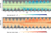 |
Fig. E.5. Top: Heatmap displaying the latitude plotted against time for each detected PF at 00:00 UTC. The color of each cell in the heatmap corresponds to the daily mean value of PFe's area. Bottom: Same heatmap, but the color corresponds to the daily mean value of PFe's number of pixels. Latitude has been discretized in intervals of 1°. Area and number of pixel values are clipped after 4·106 km2 and 10 pixels, respectively. |
Simultaneously, Fig. E.5-Bottom displays the relationship between PF size – represented in pixel count – time, and latitude, revealing a lack of dependence on latitude. However, a discrepancy between the north and south poles is noticeable, with the north pole seeming to house larger PFe. We investigated this discrepancy and traced it to a likely instrumental error in HMI cameras; for instance, Table C.1 shows different statistics in linear polarization values between the poles, which are probably due to a differential noise in HMI images. Since PFe are detected from linear polarization images, it is plausible this discrepancy is the cause of the observed differences in PF sizes between poles. To test this, we designed an experiment utilizing synthetic images:
-
Two identical random synthetic images are created using the same seed. One image incorporates the north pole's statistics while another one incorporates the statistics of the south pole, taking into account the 2016 recalibration (Table C.1). As such, the only differences between the images are the background noise values and the contrast between PFe and background pixel values.
-
The U-Net model is applied to these images, yielding a table that contains the number of detected PFe and pixel size in both images.
-
This operation is repeated with 5000 different seeds, resulting in 10 000 unique images. Among them, 5000 images are based on the north pole's statistics and the remaining 5000 are identical, but with the south pole's statistics.
After this, we examined whether the pixel count per PF differs between images of the south and north poles, given that they are identical except for an error, and there are no influential effects from factors such as the solar cycle. Figure E.6-Left depicts the histogram of the number of pixels of each synthetic PF, differentiated by the northern and southern statistics. It is evident that the sizes vary between the two poles, which can only be explained as a consequence of different linear polarization values. A very similar behavior is observed in the histogram made with real images in Fig. E.6-Right.
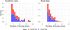 |
Fig. E.6. Left: Histogram of the number of pixels in each detected PF in synthetic images, separated by different linear polarization statistics. Right: Same histogram with real HMI images, separated by northern and southern PFe. |
Furthermore, by computing the ratio of the average pixel count between the north and the south for synthetic images, a value of ∼1.02 was obtained, and ∼1.10 for real images. The detailed statistics can be found in Table E.3. Given these remarkably similar results, it is plausible to conclude that the observed discrepancy in facular sizes between the poles – as seen in Figs. E.3, E.4, and E.5 – is caused by the instrumental error in linear polarization images.
Mean (μ) and standard deviation (σ) of PFe sizes in pixels for real and synthetic images in both poles.
All Tables
Mean (μ) and standard deviation (σ) of PFe sizes in pixels for real and synthetic images in both poles.
All Figures
|
Fig. 1. Zoom over the southern solar cap of measurements taken by HMI on January 1, 2017, at 00:00 UTC. Top: Measurements of Stokes intensity I calculated as |
| In the text | |
|
Fig. 2. Number of detected SHARPs at each latitude interval in the period from 2010 to 2024. The maximum and minimum latitudes of SHARPs regions are plotted separately, maxima values in blue and minima in green. |
| In the text | |
|
Fig. 3. Diagram depicting the steps taken to process HMI images and use them with the NN model to detect PFe. |
| In the text | |
|
Fig. 4. U-Net architecture. |
| In the text | |
|
Fig. 5. Metric evolution of IoU during the training of the U-Net using synthetic data. |
| In the text | |
|
Fig. 6. Left column: Three random examples of linear polarization images. Right column: Same images but with the U-Net detections overlayed in red. |
| In the text | |
|
Fig. 7. (a) Number of detected PFe over time for each pole and each recorded daily hour. (b) 〈BLOS〉PF of detected PFe over time for both solar poles. (c) Same plot as in panel b but changing the sign of the south pole 〈BLOS〉PF values. Measurements are plotted along with smoothed curves obtained by using polynomial fits. |
| In the text | |
|
Fig. 8. Fraction of detected faculae that have the same polarity as the dominant polarity in each individual pole. |
| In the text | |
|
Fig. 9. Annual histograms of absolute PFe BLOS values in both poles in the range between 10 G and 200 G. Raw, unprocessed BLOS measurements were used. |
| In the text | |
|
Fig. 10. Computed JSD values between the annual distributions of PFe absolute BLOS values of the Sun's north and south poles using unprocessed BLOS measurements. |
| In the text | |
|
Fig. 11. (a) Computed JSD values between the distributions of the absolute values of PFe BLOS in the north pole using raw, unprocessed BLOS measurements. (b) Same quantity as in (a) but for the south pole. |
| In the text | |
|
Fig. 12. Same histograms as in Fig. 9 but concatenated horizontally by year. The normalization of the histograms has been done on a year basis. |
| In the text | |
|
Fig. 13. Heatmap displaying the latitude plotted against time for each detected PF at 00:00 UTC. The color of each cell in the heatmap corresponds to the daily mean value of faculae's BLOS. Latitude has been discretized in intervals of 1° and BLOS values are restricted to the range [−100, 100] G. Additionally, there are six identified regions of polarity change, marked with text and arrows. |
| In the text | |
|
Fig. 14. Linear fits of polarity migration paths for the different regions of the solar poles indicated in Fig. 13. Each panel shows the absolute latitude of magnetic polarity inversions (zero-crossings) as a function of time. The time is calculated in days from the start of each migration at ±50°. Red lines represent linear regression fits, with the corresponding meridional flow velocities and r2 values indicated. Panels a–d show north pole migrations, while panels e and f show south pole migrations. Gray circles indicate outliers excluded from the fits. |
| In the text | |
|
Fig. 15. Averaged polar BLOS over time for both solar poles. Measurements are plotted along with smoothed curves obtained by using polynomial fits, and a prediction of the averaged polar BLOS is plotted using the linear model of Fig. 16. |
| In the text | |
|
Fig. 16. Averaged BLOS over the entire polar region as a function of the calibrated number of facule with the sign of the dominant polarity. A linear fit, y=ax+b, is also shown, where a = 0.003015±0.000007 G/facula and b = 0.0013±0.0011 G. The coefficient of determination is r2 = 0.82, and the Pearson correlation is 0.91. The fit includes all available data from 2010 to 2024. |
| In the text | |
|
Fig. 17. Annual average count of U-Net identified PFe (in solid color) without accounting for projection issues. The annual average was computed by taking the first week of September (for north pole) and March (for south pole) until 2021. Fainter color points shows projection-corrected measurements derived from an entire daily time series, and then taking averages of the first week of September and March as the end value. The sign was adjusted based on the sign of the average WSO polar magnetic field, following the method by Hovis-Afflerbach & Pesnell (2022). The polar regions under consideration were those with |φ⊙|≥70°. |
| In the text | |
|
Fig. 18. Heatmap displaying the mean number of detected faculae on the Sun's surface over the entire period of time in the north pole (top) and the south pole (bottom). |
| In the text | |
|
Fig. 19. Total number of faculae over time counted at 00:00 UTC along with the number of sunspots measured by the Royal Observatory of Belgium, Brussels (SILSO World Data Center 1992–2024). Measurements are plotted along with smoothed curves obtained by using polynomial fits. |
| In the text | |
|
Fig. C.1. Daily mean linear polarization of PFe over time for both poles. The recalibration in 2016 of HMI 720s data products is depicted. |
| In the text | |
|
Fig. D.1. Top: Number of detected PFe over time at the Sun's south pole. Bottom: Daily mean BLOS of PFe over time at the Sun's south pole. The two graphs display the original raw values, the band-stop filter curve, its correction with a median filter, and a polynomial fit for values at 00:00 UTC. |
| In the text | |
|
Fig. E.1. Left: Binary segmentation mask of a PF, with white squares (value 1) representing PF pixels and black squares (value 0) non-PF pixels. Black dots denote PF pixel coordinates. Middle: Triangles obtained from Delaunay triangulation are depicted in blue color. Right: Three-dimensional PF surface visualization constructed from the triangles. |
| In the text | |
|
Fig. E.2. (a): Histograms of the detected PFe areas for each year in both poles (yellow) alongside the overall histogram (black), in logarithmic scale. (b): Overall histograms of the detected PFe areas in each separated pole and in both poles together, not in logarithmic scale. Solid continuous lines represent linear fits of the power law model defined by Eq. (E.2). Both graphs represent the results measured at 00:00 UTC. |
| In the text | |
|
Fig. E.3. Daily mean PF area plotted against the daily number of PFe for both solar poles at 00:00 UTC. A linear fit is also represented for each pole. |
| In the text | |
|
Fig. E.4. Daily mean PFe area over time for both solar poles at 00:00 UTC. Continuous lines represent polynomial fits of the time series. |
| In the text | |
|
Fig. E.5. Top: Heatmap displaying the latitude plotted against time for each detected PF at 00:00 UTC. The color of each cell in the heatmap corresponds to the daily mean value of PFe's area. Bottom: Same heatmap, but the color corresponds to the daily mean value of PFe's number of pixels. Latitude has been discretized in intervals of 1°. Area and number of pixel values are clipped after 4·106 km2 and 10 pixels, respectively. |
| In the text | |
|
Fig. E.6. Left: Histogram of the number of pixels in each detected PF in synthetic images, separated by different linear polarization statistics. Right: Same histogram with real HMI images, separated by northern and southern PFe. |
| In the text | |
Current usage metrics show cumulative count of Article Views (full-text article views including HTML views, PDF and ePub downloads, according to the available data) and Abstracts Views on Vision4Press platform.
Data correspond to usage on the plateform after 2015. The current usage metrics is available 48-96 hours after online publication and is updated daily on week days.
Initial download of the metrics may take a while.