| Issue |
A&A
Volume 606, October 2017
|
|
|---|---|---|
| Article Number | A34 | |
| Number of page(s) | 8 | |
| Section | The Sun | |
| DOI | https://doi.org/10.1051/0004-6361/201730767 | |
| Published online | 04 October 2017 | |
Field distribution of magnetograms from simulations of active region formation
1 Mullard Space Science Laboratory, University College London, Holmbury St. Mary, Surrey, RH5 6NT, UK
e-mail: This email address is being protected from spambots. You need JavaScript enabled to view it.
2 Observatoire de Paris, LESIA, UMR 8109 (CNRS), 92195 Meudon-Principal Cedex, France
3 Konkoly Observatory of the Hungarian Academy of Sciences, 1121 Budapest, Hungary
4 US Naval Research Laboratory, 4555 Overlook Avenue, SW Washington, DC 20375, USA
5 NASA Goddard Space Flight Center, Greenbelt MD, USA
6 School of Mathematics and Statistics, University of Glasgow, Glasgow G12 8QW, UK
7 Lockheed Martin Solar and Astrophysics Laboratory, 3251 Hanover Street Bldg. 252, Palo Alto, CA 94304, USA
Received: 11 March 2017
Accepted: 13 July 2017
Abstract
Context. The evolution of the photospheric magnetic field distributions (probability densities) has previously been derived for a set of active regions. Photospheric field distributions are a consequence of physical processes that are difficult to determine from observations alone.
Aims. We analyse simulated magnetograms from numerical simulations, which model the emergence and decay of active regions. These simulations have different experimental set-ups and include different physical processes, allowing us to investigate the relative importance of convection, magnetic buoyancy, magnetic twist, and braiding for flux emergence.
Methods. We specifically studied the photospheric field distributions (probability densities found with a kernel density estimation analysis) and compared the results with those found from observations.
Results. Simulations including convection most accurately reproduce the observed evolution of the photospheric field distributions during active region evolution.
Conclusions. This indicates that convection may play an important role during the decay phase and also during the formation of active regions, particularly for low flux density values.
Key words: magnetic fields / magnetohydrodynamics (MHD) / Sun: photosphere / sunspots / methods: statistical / methods: numerical
© ESO, 2017
1. Introduction
Magnetic flux emergence is an important topic in solar physics, both for its fundamental role in the solar cycle, and for its role in eruptive events. Consequently, strong efforts have been made within the solar physics community to improve our understanding of this topic, both from observational and modelling standpoints. Models that are able to reproduce observations can be particularly informative.
There are many different simulations of flux emergence, and they include or omit different processes. It is currently not clear which processes are most important in recreating different aspects of flux emergence and active region formation. The most commonly used models of flux emergence require a plane-parallel stratification of the background plasma (e.g. Fan 2001; Murray et al. 2006; MacTaggart & Hood 2009) and insert a magnetic field structure, normally a twisted flux tube, into the simulated convection zone. Models of active region formation that include convection (Cheung et al. 2010; Rempel & Cheung 2014) are quite new and have only a fairly shallow convection zone. Models with a deeper convection zone (Stein et al. 2011, 2012), while able to emulate flux emergence, have not yet managed to self-consistently reproduce spot formation. The recent braid model of Prior & MacTaggart (2016) does not include convection, but was inspired by the convective model of Stein et al. (2011, 2012). It inserts a braided field structure, such as those formed by convection, in the simulations.
The different models focus on different aspects of the emergence, with some aiming to reproduce the small-scale structures observed in the photosphere, while others are more concerned with the large-scale structures formed in the corona as a result of the flux emergence. Many different characteristics could also be used to judge how well the models represent observations of flux emergence. For example, comparisons can be made with respect to the evolution of the photospheric magnetic field, in particular, its spatial extent and organisation and its total flux. The amount of twist present in the emerging structure can also be analysed using magnetic tongues (Luoni et al. 2011), and more generally, we can compare maps of injected magnetic helicity (e.g. Démoulin & Pariat 2009, and references therein). Other important characteristics to consider are the formation of realistic sunspots and penumbra (Chen et al. 2017) and the amount of interaction with the background coronal magnetic field (e.g. Török 2008; Archontis & Török 2008).
Dacie et al. (2016) studied the distribution (probability density) of the vertical component of the photospheric magnetic field (or flux density) found in observations of emerging active regions and how this distribution evolves over the lifetime of the regions. The results of this previous study are described in Sect. 2. Here, we aim to use the same analysis on simulated magnetograms, analysing the vertical field component and comparing the results with those of Dacie et al. (2016). Thereby, we can study which processes involved in active region formation produce the observed magnetic field distributions. The different simulation set-ups of the analysed models are described in Sect. 3. These models allow us to investigate the importance of convection for the emergence and dispersion of magnetic flux, and we can also study the effects of magnetic twist, braiding, and the global curvature of the flux tube on the distribution of the emerging fields. Alterations made to the analysis method to accomodate the different model set-ups are described in Sect. 4. We present the results of the analysis in Sect. 5 and compare and discuss them in Sect. 6, and we summarise the main conclusions in Sect. 7.
2. Previous results
The method and results described in this section are taken from the observational study of Dacie et al. (2016). We calculated the magnetic field (flux density) distributions of emerging active regions using the kernel density estimation (KDE) analysis (Silverman 1986) applied to the radialised component of the line-of-sight magnetic field from Helioseismic Magnetic Imager (HMI; Scherrer et al. 2012; Schou et al. 2012) observations. The distributions were plotted in a log-log plot, and examples are shown in Fig. 1 for NOAA 11776 near the beginning of its emergence (left) and around the time of maximum flux (right). The maximum flux was calculated using the radialised field component, and this was done separately for the positive and negative field. All the distributions were found to have some common features, namely two turning points (indicated by vertical straight lines in Fig. 1) and a section between them that could be well approximated by a straight line. The turning points are referred to as the first and second knees and occurred at values of ~10 and 1000 Gauss, respectively.
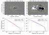 |
Fig. 1 Magnetograms and their distributions (log-log plot) for NOAA 11776 at the start of its emergence (left) and when spots have formed (right). The distribution of the positive (following) polarity is shown in red, and the distribution of the negative (leading) polarity is shown in blue. Dashed lines show the best-fit lines, and the slope values are given in the legend. |
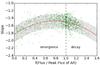 |
Fig. 2 Observed evolution of the slopes. The emerging and decaying phases are distinguished by the function f(F/Fmax) defined by Eq. (1), where F is the magnetic flux averaged between the two magnetic polarities, and Fmax is its maximum value. The green points show individual distribution slope values obtained during the evolution of the leading and following magnetic polarities for 24 active regions. The red line shows the general trend (second-order polynomial least-squares fitted to the data points). The grey shaded area gives an indication of the spread of the data points. This summarises the main results of Dacie et al. (2016). |
The slope of the straight-line section varied, with values in the range [ − 2.2, − 1.5 ] at the start of the emergence that rose to [ − 1.7, − 1.2 ] , with the peak slope value on average occurring just before the time of maximum flux. The evolution of the slope is shown in Fig. 2, with the evolutionary stage characterised by f(F/Fmax), where F is the magnetic flux and Fmax the maximum flux achieved by the region (as defined in Dacie et al. 2016). f(F/Fmax), which is designed to separate the emergence and decay phases as  (1)where t is the time and tmax the time of maximum flux. Figure 2 combines data from 24 active regions, with each point indicating the slope value for a single magnetogram, and the general trend shown by the red line. Data from both the leading and following polarities were combined in Fig. 2, as no significant difference in slope values was found between the two polarities for the regions studied in Dacie et al. (2016).
Analysis of a few older regions and quiet-Sun regions showed that the slope values continue to decrease after the period shown in Fig. 2 towards the quiet-Sun value of ~ − 3. A simple model of classical diffusion was found to produce a slope of − 1 in contradiction to the observations, leading us to conclude that processes other than diffusion, that is to say, convection, play a key role in active region decay.
In the theory section of our previous study, we also considered the distribution formed by magnetic sources placed below the photosphere, which produce similar distributions and slopes regardless of their size and number. This suggests that the topology of the photospheric magnetic field does not necessarily affect the slope, so that bipolar active regions may have the same distributions as more complex regions.
3. Numerical simulations
Seven numerical simulations were analysed. The first of these, published in Cheung et al. (2010), Rempel & Cheung (2014), has a convection zone with a depth of 15.5 Mm and includes convection by solving the magnetohydrodynamics (MHD) and radiative transfer equations self-consistently under the assumption of local thermodynamic equilibrium. The simulation was run until a state of statistical equilibrium was reached, and then a toroidal flux tube was advected through the base of the computational domain. The data we studied come from a simulation run where the flux tube had no twist and was asymmetric, with a torus-aligned flow to represent the influence of angular momentum conservation as a flux tube rises through the solar convection zone (Rempel & Cheung 2014). This is the only simulation considered in this study that includes the decay phase, although the simulation run ended when the active region still contained well-defined negative- and positive-polarity regions.
The next four simulations we analysed used a hydrostatic stratified background plasma, representing the convection zone, photosphere, chromosphere, transition region, and corona. Into this equilibrium, a twisted flux tube (flux rope) was inserted in the convection zone.
Two of these simulations (Leake et al. 2013) used a flux rope with a cylindrical geometry. The first simulation (C1) corresponds to simulation SD of Leake et al. (2013), with an initial flux in the tube of 1.2 × 10¹⁹ Mx and twist of 2.3 × 10⁻⁶ m-1, and the tube was placed at an initial depth of − 2 Mm. The second simulation (C2) has an initial flux in the tube of 2.2 × 10²⁰ Mx, a twist of 7.8 × 10⁻⁷ m-1, and an initial depth of − 6.1 Mm. Total radial pressure balance was assumed. The centre of the tube is made buoyant by decreasing the density, while the side boundaries are line-tied, so that the ends of the flux tube (unperturbed) remained rooted in the convection zone. The subsequent dynamic evolution produced a rising omega-shaped loop that emerged through the surface and produced a sheared bipolar surface structure. In C1 the corona contains an arcade field, whereas in C2, the flux tube emerges into a field-free corona. While these simulations did not include the complete interaction of convection and radiation at the model surface, convective flows were induced beneath the surface in the wake of the rising flux tube. The induced flows affected the buoyancy of the rising tube. Later evolution of this emerging magnetic field produced a sheared coronal arcade and a coronal flux rope above the surface.
The other two simulations with a flux rope have a similar set-up, but they used a twisted flux tube with a toroidal geometry (MacTaggart & Hood 2009; Hood et al. 2012) instead of a cylindrical geometry, allowing plasma to drain more efficiently, so that the flux rope reached the corona more easily. In addition, the spots reached a maximum separation in this model, which is not the case for the model that used a cylindrical flux rope. The flux tube in the first of these simulations (T1) had an initial twist of q = 0.2 /R, and the second flux tube (T2) had a twist of q = 0.4 /R.
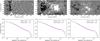 |
Fig. 3 Simulated magnetograms from Rempel & Cheung (2014) and their distributions. The left-hand column shows an example during the emergence phase, the middle panel shows the same at maximum flux, and the right panel shows this during the decay phase at the end of the simulation run. The red line shows the distribution of the positive field (the leading polarity), and the blue line shows the negative field (following). The best-fit lines between 20 and 1000 Gauss are shown as dashed lines, and their slopes are given in the legend. |
Finally, we analysed two braid model simulations (Prior & MacTaggart 2016), which also used a hydrostatic, stratified background plasma, but included a braided rather than twisted initial magnetic field configuration. The large-scale geometry of this magnetic structure is toroidal. Two cases were analysed, one with thick braiding, and the other with fine braiding (referred to as the pigtail and B4 braids, respectively, in Prior & MacTaggart 2016), which had been found to produce very different magnetic configurations in the corona.
Although the emerged magnetic field structures produced by the different models have very different morphologies, that is, spatial organisations, this does not necessarily influence the photospheric distributions (as shown for other cases in Dacie et al. 2016). Thus, comparisons between the different distributions should provide additional information compared to analysing the magnetic field spatial organisation during flux emergence.
4. Analysis methods
We aimed to keep the analysis method as similar as possible to the method used in the observational study, but some adjustments had to be made to take differences into account that arise from the nature of the simulations. These adjustments are discussed below, but for details of the method as a whole, we refer to Sect. 4 of Dacie et al. (2016).
For the simulation of Rempel & Cheung (2014), the resolution is high and the number of pixels large, with a horizontal domain size of 147 × 74 Mm2 and a flux tube with a major radius of 24 Mm and a minor radius of 8 Mm, which expands to fill the domain during the course of the simulation. The width of the kernel used to make the KDEs was reduced by a factor of five. In addition, the large amount of data meant that our statistical analysis could also be performed after reducing the resolution. To reduce the resolution, squares of n × n pixels were replaced by single pixels with the mean value of the square, and the total number of pixels was reduced by a factor n2. We investigated three lower resolution cases, with n values of 2, 4, and 8. The simulation used periodic boundary conditions on the lateral boundaries, which we thought might affect the distribution near the edges of the computational box, therefore we repeated the analysis without pixels within a distance of 8 Mm (40 pixels) from the edge. Otherwise, no area selection procedure was applied to this region, as the active region filled the domain.
For the other sets of simulated data, an area selection procedure was applied. This was very similar to the procedure in the observational study (Sect. 3.2 of Dacie et al. 2016); the data were first smoothed (using a Gaussian kernel with a width of 7 pixels) and only pixels with smoothed values greater than a certain cut-off (20 Gauss) were taken. This region was then enlarged to include the bordering region within a distance of 8 pixels. If necessary, another dilation followed by an erosion was applied to fill any holes in the selected area. This defined the region we studied. Unlike in the observational study, where the selection procedure was necessary to remove neighbouring decaying active regions, for the simulated magnetograms this procedure removed a large number of zero-field (very very small, numerical machine precision) pixels that might have influenced the distribution at low Bz values. In summary, we used the original data of the simulation within the defined active region area.
The simulation with a cylindrical flux rope (Leake et al. 2013) used an irregular grid, and this was taken into account when producing the KDEs, with larger pixels making a correspondingly larger contribution to the distribution. The resolution of all the simulated data was higher than data from HMI, but we did not investigate the effects of this for any of the stratified atmosphere simulations because relatively few pixels make up the small simulated active region.
5. Results
5.1. Simulation with convection
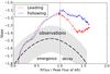 |
Fig. 4 Evolution of the slope for the simulated magnetograms of Rempel & Cheung (2014). The slope values are plotted against the normalised flux, defined in Eq. (1), which characterises the evolutionary phase. For comparison, the observational trend is shown by the thick dashed black line, and the approximate range of the observed slope values is indicated by the grey shaded region. |
Examples of simulated magnetograms from Rempel & Cheung (2014) and their distributions are shown in Fig. 3. The distributions have a shape similar to the distributions in the observational study, with a roughly straight-line section in the middle and a drop off in probability density values at ~1200 Gauss. In the observational study, a distinctive turning point (the first knee) was also observed at ~10 Gauss (e.g. Fig. 1). The distributions from these simulated magnetograms do show a slightly flatter section below ~10 Gauss, particularly at early stages of the evolution, but this is not as clear as in the observational study. The best-fit straight line was calculated between 20 and 1000 Gauss, and the evolution of the slope is shown in Fig. 4, with the evolutionary stage characterised by f(F/Fmax) as defined in Eq. (1).
At the start of emergence, the slopes are steep and negative, they increase to a maximum value of ~ − 1.1 at the time of maximum flux before decreasing again in the decay phase. This behaviour is qualitatively the same as that found in the observational study, but the maximum slope value is slightly greater than the observed values, which were in the range [ − 1.7, − 1.2 ]. Interestingly, the behaviour of the distributions of the two polarities is almost identical in the emergence phase, despite the asymmetry applied to the rising flux tube.
As the resolution of these simulated magnetograms is high and the number of pixels large, we also performed the distribution analysis after reducing the resolution. At half the resolution in both the x and y directions, with pixels of width 384 km, comparable to data from HMI, the slope values showed a small increase (becoming more positive, but generally by less than 0.1). When the resolution was further decreased, the slope values decreased, but the difference was still small, even for a reduction in linear spatial resolution by a further factor of four. Using a rectangular box to exclude the region nearest the boundary, which was affected by the periodic boundary conditions, did not greatly affect the distributions either.
We suggest that the slightly higher (less steep) values of the slopes associated with this simulation compared to the observations (studied in Dacie et al. 2016) could be related to the size of the emerging active region. The simulated region had a peak flux of 1.8 × 10²² Mx, a factor between 3 and 30 higher than the active regions in the observational study. Analysis of a simulation run with a smaller flux tube and an additional observational study of larger active regions and the dependence of the slope values on the peak flux are required to confirm this.
5.2. Simulations with a flux rope
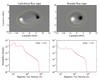 |
Fig. 5 Magnetograms from simulations using a cylindrical flux rope (left, case C1 Leake et al. 2013) and a toroidal flux rope (right, case T1 MacTaggart & Hood 2009; Hood et al. 2012) and their corresponding distributions. These snapshots were taken near the end of their emergence phases, and the magnetograms show a close-up view of the emerging regions. The yellow contours outline the area taken for the distribution analysis. |
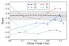 |
Fig. 6 Evolution of the slope for the magnetograms from the simulations with a flux rope. C1 is the cylindrical case shown in Fig. 5, and C2 is the case with higher flux. T1 is the toroidal case shown in Fig. 5, with initial twist q = 0.2 /R, and T2 is the case with stronger twist, q = 0.4 /R, where R is the radius of the flux rope. The slope values are plotted against the normalised flux, defined in Eq. (1), which characterises the evolutionary phase. These simulations do not include the decay phase. The early emergence is not shown, as the distributions had no clear straight-line section at these times. For comparison, the observational trend is shown by the dashed black line, and the approximate range of observed slope values is indicated by the grey shaded region. |
Figure 5 shows example magnetograms and their magnetic field distributions from the simulations with a stratified background and a cylindrical flux rope (left) and a toroidal flux rope (right). Both of these simulations are symmetric, therefore the distributions were identical for the positive and negative spots. The distributions found for the two different simulation set-ups are similar, with a section that runs almost along a straight line between ~80 and ~700 Gauss and a steep drop-off after this. The straight-line section covers a smaller range than in observed active regions, where it is typically between ~10 and ~1000 Gauss. At lower magnetic flux values the distributions have an irregular shape, whose features vary between simulation runs and time steps.
Best-fit lines were fitted between bounds k1 and k2, where k1 is defined as the flux density value > 80 Gauss with the highest probability density and k2 as the first flux density value moving along the KDE from right to left with a slope value > − 2. These values were selected to define the largest approximately straight part of the distribution (in a log-log plot). The evolution of the slopes with time was similar to the observations, starting at steep negative values and increasing over the course of the emergence. However, the first few time steps had unrealistic slope values that did not necessarily fit this pattern, as the distributions had at best very short straight-line sections at these early times. One possible reason for the discrepancy between these simulations and observations at the first few time steps might be the requirements for flux emergence in the simulations, which rely purely on magnetic buoyancy for emergence. Another possible explanation is the influence of the strong azimuthal component of the simulated flux ropes, whose role for the vertical field through the photosphere decreases as emergence progresses.
When we plot the slope value against the normalised flux defined in Eq. (1) (Fig. 6), the increase in slope value appears suddenly and close to the maximum flux (f(F/Fmax) = 0.8 − 0.9). The reason might be that the azimuthal component of the flux rope contributes significantly to the total flux before the region is fully emerged.
Similarly shaped distributions were found from other simulation runs with different parameters. The slopes of these distributions also followed a similar evolutionary trend, but at different slope values. We studied another run using the cylindrical flux rope set-up with a flux rope with a stronger magnetic field (C2 shown in Fig. 6) and another run from the toroidal flux rope set-up with a more strongly twisted flux rope (T2). The field strength and the twist both influenced the slope values, but changes in these parameters did not appear to produce distribution shapes closer to the observed shape (Fig. 1) at low flux values.
5.3. Simulations with braided fields
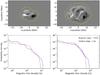 |
Fig. 7 Simulated magnetograms and their distributions from the thick braid (pigtail) model of Prior & MacTaggart (2016). The two time steps are near the beginning (left) and towards the end (right) of the emergence, and the magnetograms show a close-up view of the emerging region. The red line shows the positive-field distribution, and the blue line shows the negative-field distribution. Slope values are indicated in the legend for the latter time step. |
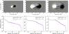 |
Fig. 8 Simulated magnetograms and their distributions from the thin braid (B4) model of Prior & MacTaggart (2016). The three time steps are at the beginning (left), during the middle (middle), and towards the end (right) of the emergence, and the magnetograms show a close-up view of the emerging region. The red line shows the positive-field distribution, and the blue line shows the negative-field distribution. Dashed lines show the best-fit lines, and their slope values are indicated in the legend. |
The thick and the thin braid models (referred to as the pigtail and the B4 braids, respectively, in Prior & MacTaggart 2016) have very different magnetograms. The thick braid produces a swirling pattern of positive and negative flux without strong spots (Fig. 7), whereas the thin braid produces two strong polarities (Fig. 8) that resemble the flux rope models discussed in Sect. 5.2 more strongly. The probability density distributions are also different for the two cases.
Figure 7 shows simulated magnetograms and their distributions at two time steps of the thick braid model. At early times, the distribution appears irregular, with no clear straight-line section. A drop-off in values occurs at ~500 and 900 Gauss for the positive and negative polarities, respectively. At later stages of the emergence, the shape of the distribution develops features similar to those in observations, with a first turning point at ~80 Gauss, a straight-line section up to a few hundred Gauss, and then a second knee (the drop-off). The straight-line section, calculated between the bounds defined in Sect. 5.2, is steep with a slope of ~ − 2.6, which may be due to the first knee being at a high Bz value (~80 Gauss) and the second knee at a relatively low value (~400 and 600 Gauss for the positive and negative polarities, respectively). The slopes are steeper than those observed during the emergence phase, and that the second knee shifts to lower Bz values contradicts observations of active region formation, where coalescence of small magnetic loops creates strong spots that push the second knee to higher Bz values.
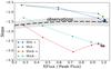 |
Fig. 9 Evolution of the slope for the magnetograms from the braid model simulations of Prior & MacTaggart (2016). The slope values are plotted against the normalised flux, defined in Eq. (1), which characterises the evolutionary phase. These simulations are not symmetric, and the positive (+) and negative (–) distribution slopes are plotted separately for the thick and thin braid models. The observational trend is shown by the dashed black line, and the approximate range of observed slope values is indicated by the grey shaded region. |
Unlike the thick braid model, the thin braid does produce strong spots, and the results from this model are shown in Fig. 8. The distributions show a section that approximates a straight line and a drop-off at ~1500 Gauss, similar to the observed distributions (Fig. 1), except with a higher drop-off value. At later times (middle and right columns of Fig. 8), a distinct turning point can be seen at the low-Bz end of the straight-line portion. This is also in agreement with the observations, although this first knee occurs at ~40 Gauss in this simulation run and ~10 in the observed distributions. A best-fit straight line was calculated between k1 and k2, with k2 defined as in Sect. 5.2 and k1 defined as the flux density value >30 Gauss with the highest probability density. The evolution of the slope, shown in Fig. 9, was opposite to the observed evolution, with the slope steepening (becoming more negative) during the course of the emergence phase.
6. Discussion
None of the simulations studied here perfectly recreated the magnetic field distributions of active regions on the Sun, but all of them have some similarities to observations. The convective model of Rempel & Cheung (2014) produces distributions with a shape and evolution very similar to the observations. The first knee, at low field strength, is not as clear as in the observations, particularly at later times in the evolution, but the distinctness of the first knee in the observations may be a result of uncertainties related to the magnetic field measurements. The evolution of the slope is very similar to the observations, with a slight difference: the peak value of the slope for the observed regions occurred just before the maximum flux, slightly earlier than the peak for this simulated region (compare Figs. 2 and 4).
In addition, it would be interesting to let the simulation run for a longer time to see whether the slopes from the simulated data continue to decrease as the active region continues to decay. Towards the end of the simulation run we studied, the slope for the positive-field distribution shows an increase, which contradicts the expected behaviour, but a longer simulation run may show that this is only temporary. The slope values themselves differ from the observed values, reaching a peak value of ~ − 1.1, compared to a value in the range [ − 1.7, − 1.2 ] for the observed regions (Fig. 2). We suggest that the difference in slopes may be due to the size of the region, with the simulated region having a maximum flux ~10 times that of the active regions analysed by Dacie et al. (2016), or alternatively, it may be inherently related to the simulation set-up.
Slope values in agreement with the observations were found for the flux rope models (Fig. 6), but the distributions produced by these simulations are only a good representation of the observed distributions at medium to high Bz values (>80 Gauss, Fig. 5). The thick braid model of Prior & MacTaggart (2016) also produced distributions with a straight-line section starting at ~80 Gauss (Fig. 7), but in this case, the slope was much steeper than observed (Fig. 9). Neither the flux rope models nor the thick braid model accurately captured the distribution at low Bz values (up to ~80 Gauss) or at early times in the emergence.
The thin braid model (Prior & MacTaggart 2016) was found to better reproduce the observed distributions than the thick braid model, with a clear straight-line section between ~40 and 1500 Gauss (Fig. 8). Compared to the other stratified background simulations, this is closer to the straight-line section of the observational data, which was found between ~10 and 1000 Gauss (Dacie et al. 2016), but still not as good as the fit for the simulated magnetograms from Rempel & Cheung (2014; Fig. 3). The evolution of the slopes for the thin braid model contradicts the observed evolution (Fig. 9). The initially flat slope illustrates the formation of strong polarities much too early in the process, without the coalescence of small flux concentrations.
We expect that the main differences in distribution shape and evolution between the simulations arise as a result of the different simulation set-ups. The differences found in the position of the first knee are not, as one might expect, related to the spatial resolution of the simulations. All the simulations had comparable resolutions, but different turning-point values. Moreover, when we analysed the Rempel & Cheung (2014) simulations also at lower resolutions, we did not find a great change in the range of the straight-line section of the distributions. The first turning point may be related to the necessary field strength and the plasma beta required for the field to break through to the surface. Here the convection simulation (Rempel & Cheung 2014) and the non-convecting simulations (Leake et al. 2013; MacTaggart & Hood 2009; Hood et al. 2012; Prior & MacTaggart 2016) may differ, as the field emerges through a combination of convection and buoyancy in the former, but mainly via the magnetic buoyancy instability in the latter cases. This could explain why the first turning point in the convection simulation occurs at a much lower Bz value (~10 Gauss), which provides a better representation of the observations for low Bz than in the non-convecting simulations (where the first turning point occurs at ~80 Gauss for the flux rope and thick braid models and at ~40 Gauss for the thin braid model).
It would also be important to have an explanation as to why the slopes of the distributions take the values they do. For the simulations with a flux tube (both the convective and stratified atmosphere simulations Rempel & Cheung 2014; Leake et al. 2013; MacTaggart & Hood 2009; Hood et al. 2012), the initial flux tube has a cross section with a Gaussian profile of the axial field strength, which would produce a distribution with a slope of − 1 (Sect. 2.2 of Dacie et al. 2016). Is the initial profile important in producing the photospheric distributions, and how is it transformed during the rise and emergence phases?
During the rise phase, the flux tube expands, but becomes squashed and concentrated as it arrives just below the photosphere. The effects of these processes could be investigated by analysing the flux tube cross-section at different times during its rise for the non-convecting flux tube simulations (Leake et al. 2013; MacTaggart & Hood 2009; Hood et al. 2012).
The field distribution is further transformed during the emergence phase, with the horizontal field beneath the photosphere being converted into the vertical field crossing it. The magnetic buoyancy instability is responsible for the emergence in the non-convecting simulations, and in the flux rope simulation runs studied here, low wavenumber modes dominate, causing the emergence of one or two magnetic bubbles into the atmosphere. Other non-convecting simulation runs with a lower twist of the initial flux tube show a greater expansion of the tube during the pre-emergence stage, resulting in higher wavenumber modes of the buoyancy instability and a multipolar (more sea-serpent like) emergence (e.g. Hood et al. 2012). The tension associated with the azimuthal field plays a key role in maintaining the flux tube’s coherence, which influences which modes are allowed. It is still unclear whether serpentine emergence is due to the effect of vertical flows associated with convection, or due to modes of instability of the sub-surface flux. While previous modelling studies (Hood et al. 2012) have shown that serpentine emergence can be created without convection, granular scale convection increases its presence. We expect that these processes during emergence are important in shaping the distribution, and more so than the initial magnetic field configuration. An indication of this is given by the different results of the simulations studied here, which use similar initial axial field profiles. Despite this, it is still not clear how boundary and initial conditions affect the photospheric field distributions, and additional studies using many more simulation runs are required to help determine their effects. For example, to investigate whether the initial configuration is important for the distributions, an additional analysis could be made using simulation runs with different initial magnetic field configurations of the flux tube.
The twist of the flux tube is expected to influence the distribution, not only through its importance for the mode of the magnetic buoyancy instability and the emergence, but also because of the relative contributions of the azimuthal and axial flux to the magnetogram. A large portion of the emerged flux comes from the azimuthal component of the twisted flux tube during the early stages of the emergence. Changing the twist of the flux rope in the toroidal flux rope model caused a significant change in the slope values, as did a change in the maximum flux in the cylindrical model (Fig. 6). We expect these and other factors to have a strong influence both in these simulations and in others, and further studies are required to investigate the effects of these parameters. In particular, it would be interesting to analyse a simulation run using the Rempel & Cheung (2014) convective model and a flux tube of lower maximum flux to see whether this brings the slope values closer to the observed values.
7. Conclusions
Overall, the simulation of Rempel & Cheung (2014) produced the best representation of observations of active region formation in terms of the magnetic field distribution shape, particularly at low flux density values and at the start of the emergence processes. This suggests that convective processes play an important role during the emergence phase of active region evolution and especially in areas of relatively low magnetic field strength. This simulation also mostly reproduced the observed decrease in slope values during the decay phase, therefore we conclude that convection provides a better explanation for active region dispersion than classical diffusion.
Field distributions in good agreement with observations were also found for the non-convective simulations for flux values >80 Gauss for the middle to later parts of the emergence phase. In this range, buoyancy-driven emergence appears to be just as effective at reproducing the observed magnetic field distributions.
Many additional studies might be performed to further investigate how the different processes affect the distributions (e.g. studying the distribution at different depths in the convection zone) and how certain parameters, such as twist, influence the distributions. Furthermore, it would be interesting to perform the same analysis on simulations of magnetic flux emergence with a deeper convection zone, which may be considered more realistic.
Acknowledgments
The authors would like to thank Vasilis Archontis for his insightful comments and the referee for their comments and suggestions. S.D. acknowledges STFC for support via her studentship. L.v.D.G. is partially funded under STFC consolidated grant number ST/H00260X/1 and the Hungarian Research grant OTKA K-109276. J.E.L. and M.G.L. were funded by NASA’s Heliophysics Supporting Research and Living With a Star Program, and the Chief of Naval Research’s 6.1 program. The cylindrical flux rope simulations we analysed were performed with a grant of computational time from the DoD’s High Performance Computing Program.
References
- Archontis, V., & Török, T. 2008, A&A, 492, L35 [NASA ADS] [CrossRef] [EDP Sciences] [Google Scholar]
- Chen, F., Rempel, M., & Fan, Y. 2017, ApJ, 846, 149 [NASA ADS] [CrossRef] [Google Scholar]
- Cheung, M. C. M., Rempel, M., Title, A. M., & Schüssler, M. 2010, ApJ, 720, 233 [NASA ADS] [CrossRef] [Google Scholar]
- Dacie, S., Démoulin, P., van Driel-Gesztelyi, L., et al. 2016, A&A, 596, A69 [NASA ADS] [CrossRef] [EDP Sciences] [Google Scholar]
- Démoulin, P., & Pariat, E. 2009, Adv. Space Res., 43, 1013 [NASA ADS] [CrossRef] [Google Scholar]
- Fan, Y. 2001, ApJ, 554, L111 [NASA ADS] [CrossRef] [Google Scholar]
- Hood, A. W., Archontis, V., & MacTaggart, D. 2012, Sol. Phys., 278, 3 [NASA ADS] [CrossRef] [Google Scholar]
- Leake, J. E., Linton, M. G., & Török, T. 2013, ApJ, 778, 99 [NASA ADS] [CrossRef] [Google Scholar]
- Luoni, M. L., Démoulin, P., Mandrini, C. H., & van Driel-Gesztelyi, L. 2011, Sol. Phys., 270, 45 [NASA ADS] [CrossRef] [Google Scholar]
- MacTaggart, D., & Hood, A. W. 2009, A&A, 507, 995 [NASA ADS] [CrossRef] [EDP Sciences] [Google Scholar]
- Murray, M. J., Hood, A. W., Moreno-Insertis, F., Galsgaard, K., & Archontis, V. 2006, A&A, 460, 909 [NASA ADS] [CrossRef] [EDP Sciences] [Google Scholar]
- Prior, C., & MacTaggart, D. 2016, Geophys. Astrophys. Fluid Dyn., 110, 432 [NASA ADS] [CrossRef] [Google Scholar]
- Rempel, M., & Cheung, M. C. M. 2014, ApJ, 785, 90 [Google Scholar]
- Scherrer, P. H., Schou, J., Bush, R. I., et al. 2012, Sol. Phys., 275, 207 [Google Scholar]
- Schou, J., Scherrer, P. H., Bush, R. I., et al. 2012, Sol. Phys., 275, 229 [Google Scholar]
- Silverman, B. W. 1986, Density estimation for statistics and data analysis (London: Chapman and Hall) [Google Scholar]
- Stein, R. F., Lagerfjärd, A., Nordlund, Å., & Georgobiani, D. 2011, Sol. Phys., 268, 271 [NASA ADS] [CrossRef] [Google Scholar]
- Stein, R. F., Lagerfjärd, A., Nordlund, Å., & Georgobiani, D. 2012, in 4th Hinode Science Meeting: Unsolved Problems and Recent Insights, eds. L. Bellot Rubio, F. Reale, & M. Carlsson, ASP Conf. Ser., 455, 133 [Google Scholar]
- Török, T. 2008, in COSPAR Meeting, 37th COSPAR Scientific Assembly, 37, 3194 [Google Scholar]
All Figures
|
Fig. 1 Magnetograms and their distributions (log-log plot) for NOAA 11776 at the start of its emergence (left) and when spots have formed (right). The distribution of the positive (following) polarity is shown in red, and the distribution of the negative (leading) polarity is shown in blue. Dashed lines show the best-fit lines, and the slope values are given in the legend. |
| In the text | |
|
Fig. 2 Observed evolution of the slopes. The emerging and decaying phases are distinguished by the function f(F/Fmax) defined by Eq. (1), where F is the magnetic flux averaged between the two magnetic polarities, and Fmax is its maximum value. The green points show individual distribution slope values obtained during the evolution of the leading and following magnetic polarities for 24 active regions. The red line shows the general trend (second-order polynomial least-squares fitted to the data points). The grey shaded area gives an indication of the spread of the data points. This summarises the main results of Dacie et al. (2016). |
| In the text | |
|
Fig. 3 Simulated magnetograms from Rempel & Cheung (2014) and their distributions. The left-hand column shows an example during the emergence phase, the middle panel shows the same at maximum flux, and the right panel shows this during the decay phase at the end of the simulation run. The red line shows the distribution of the positive field (the leading polarity), and the blue line shows the negative field (following). The best-fit lines between 20 and 1000 Gauss are shown as dashed lines, and their slopes are given in the legend. |
| In the text | |
|
Fig. 4 Evolution of the slope for the simulated magnetograms of Rempel & Cheung (2014). The slope values are plotted against the normalised flux, defined in Eq. (1), which characterises the evolutionary phase. For comparison, the observational trend is shown by the thick dashed black line, and the approximate range of the observed slope values is indicated by the grey shaded region. |
| In the text | |
|
Fig. 5 Magnetograms from simulations using a cylindrical flux rope (left, case C1 Leake et al. 2013) and a toroidal flux rope (right, case T1 MacTaggart & Hood 2009; Hood et al. 2012) and their corresponding distributions. These snapshots were taken near the end of their emergence phases, and the magnetograms show a close-up view of the emerging regions. The yellow contours outline the area taken for the distribution analysis. |
| In the text | |
|
Fig. 6 Evolution of the slope for the magnetograms from the simulations with a flux rope. C1 is the cylindrical case shown in Fig. 5, and C2 is the case with higher flux. T1 is the toroidal case shown in Fig. 5, with initial twist q = 0.2 /R, and T2 is the case with stronger twist, q = 0.4 /R, where R is the radius of the flux rope. The slope values are plotted against the normalised flux, defined in Eq. (1), which characterises the evolutionary phase. These simulations do not include the decay phase. The early emergence is not shown, as the distributions had no clear straight-line section at these times. For comparison, the observational trend is shown by the dashed black line, and the approximate range of observed slope values is indicated by the grey shaded region. |
| In the text | |
|
Fig. 7 Simulated magnetograms and their distributions from the thick braid (pigtail) model of Prior & MacTaggart (2016). The two time steps are near the beginning (left) and towards the end (right) of the emergence, and the magnetograms show a close-up view of the emerging region. The red line shows the positive-field distribution, and the blue line shows the negative-field distribution. Slope values are indicated in the legend for the latter time step. |
| In the text | |
|
Fig. 8 Simulated magnetograms and their distributions from the thin braid (B4) model of Prior & MacTaggart (2016). The three time steps are at the beginning (left), during the middle (middle), and towards the end (right) of the emergence, and the magnetograms show a close-up view of the emerging region. The red line shows the positive-field distribution, and the blue line shows the negative-field distribution. Dashed lines show the best-fit lines, and their slope values are indicated in the legend. |
| In the text | |
|
Fig. 9 Evolution of the slope for the magnetograms from the braid model simulations of Prior & MacTaggart (2016). The slope values are plotted against the normalised flux, defined in Eq. (1), which characterises the evolutionary phase. These simulations are not symmetric, and the positive (+) and negative (–) distribution slopes are plotted separately for the thick and thin braid models. The observational trend is shown by the dashed black line, and the approximate range of observed slope values is indicated by the grey shaded region. |
| In the text | |
Current usage metrics show cumulative count of Article Views (full-text article views including HTML views, PDF and ePub downloads, according to the available data) and Abstracts Views on Vision4Press platform.
Data correspond to usage on the plateform after 2015. The current usage metrics is available 48-96 hours after online publication and is updated daily on week days.
Initial download of the metrics may take a while.