Fig. 3
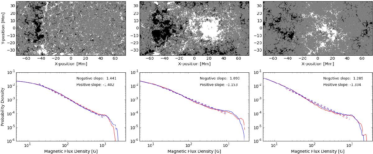
Simulated magnetograms from Rempel & Cheung (2014) and their distributions. The left-hand column shows an example during the emergence phase, the middle panel shows the same at maximum flux, and the right panel shows this during the decay phase at the end of the simulation run. The red line shows the distribution of the positive field (the leading polarity), and the blue line shows the negative field (following). The best-fit lines between 20 and 1000 Gauss are shown as dashed lines, and their slopes are given in the legend.
Current usage metrics show cumulative count of Article Views (full-text article views including HTML views, PDF and ePub downloads, according to the available data) and Abstracts Views on Vision4Press platform.
Data correspond to usage on the plateform after 2015. The current usage metrics is available 48-96 hours after online publication and is updated daily on week days.
Initial download of the metrics may take a while.