Fig. 7
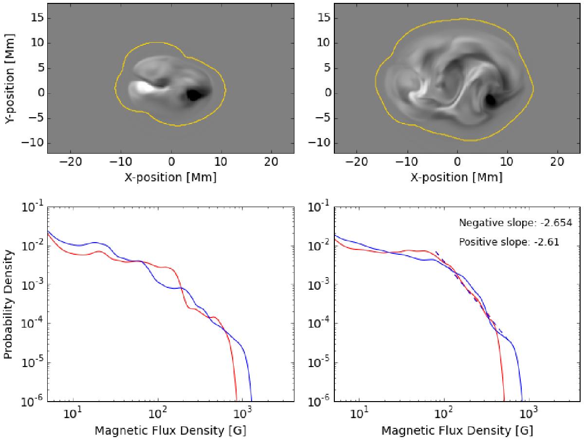
Simulated magnetograms and their distributions from the thick braid (pigtail) model of Prior & MacTaggart (2016). The two time steps are near the beginning (left) and towards the end (right) of the emergence, and the magnetograms show a close-up view of the emerging region. The red line shows the positive-field distribution, and the blue line shows the negative-field distribution. Slope values are indicated in the legend for the latter time step.
Current usage metrics show cumulative count of Article Views (full-text article views including HTML views, PDF and ePub downloads, according to the available data) and Abstracts Views on Vision4Press platform.
Data correspond to usage on the plateform after 2015. The current usage metrics is available 48-96 hours after online publication and is updated daily on week days.
Initial download of the metrics may take a while.