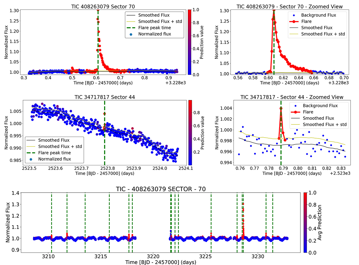
Fig. 1.

Download original image
Examples of flare events identified in the light curve by the program. Top panel: Flares classified as genuine, accompanied by a zoomed-in view of the light curve. Middle panel: Flare-like event that was deemed non-genuine and subsequently excluded from the analysis. Bottom panel: All flares flagged by the program, indicated by green vertical lines. The colour of the points on the light curve represents the average prediction values from the 10 CNN models, with the colour bar indicating the corresponding values. Dashed vertical green lines mark the peak times of the identified flares.
Current usage metrics show cumulative count of Article Views (full-text article views including HTML views, PDF and ePub downloads, according to the available data) and Abstracts Views on Vision4Press platform.
Data correspond to usage on the plateform after 2015. The current usage metrics is available 48-96 hours after online publication and is updated daily on week days.
Initial download of the metrics may take a while.


