Fig. 3
Download original image
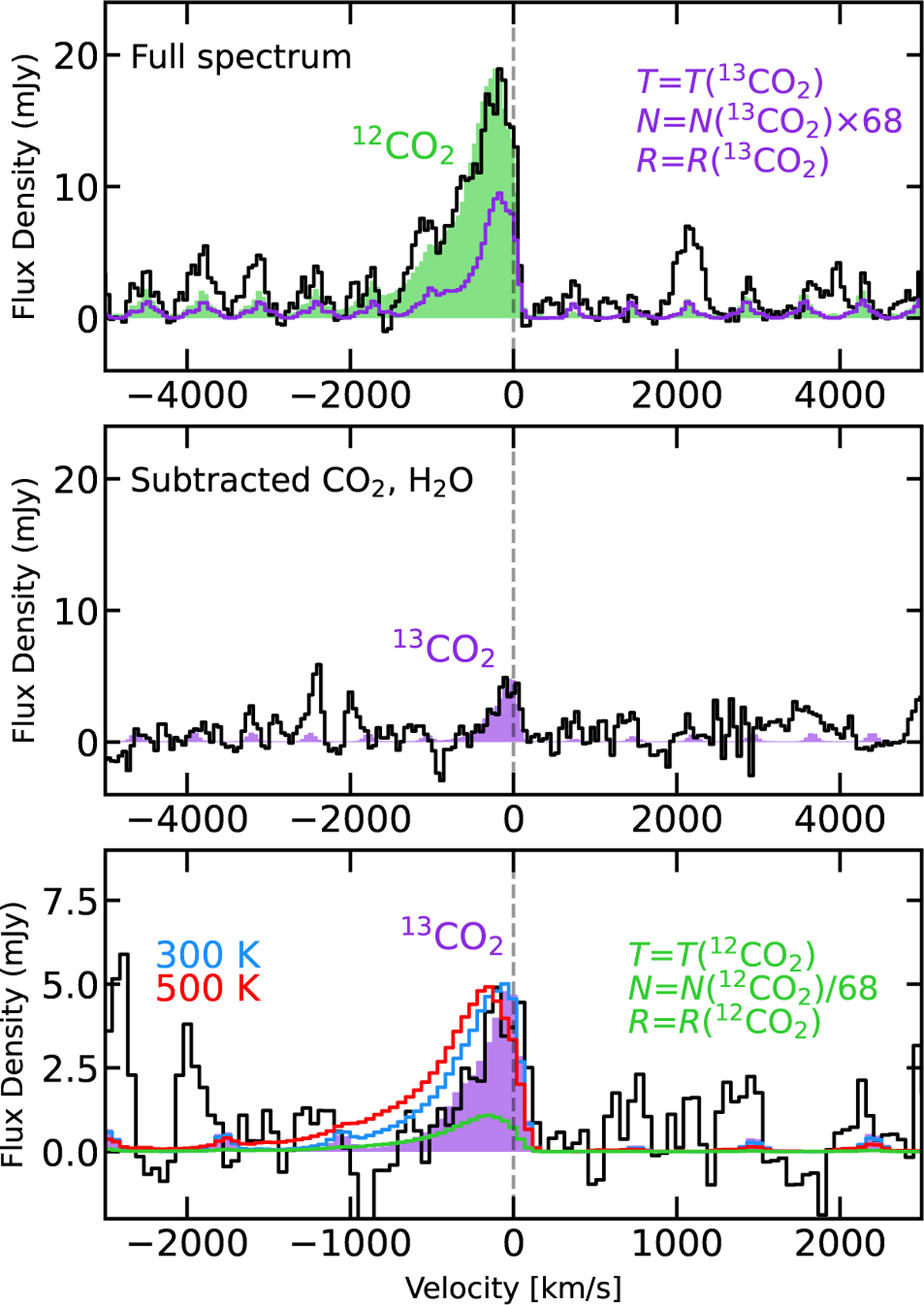
Comparison of the 12CO2 (green) and 13CO2 (purple) Q branch shapes. Top: a zoom-in of the 12CO2 Q branch with the best-fit slab model plotted in the green shaded region. A model with the derived 13CO2 parameters is plotted in purple (see text). Middle: a zoom-in of the 13CO2 Q branch on the same vertical scale as the top panel, where the emission from 12CO2 and H2O has been subtracted. The best-fit slab model is plotted in the purple shaded region. Bottom: a further zoomin of the middle panel where the best-fit model (180 K; purple shaded region) and slab models of 300 K (blue line) and 500 K (red line) are shown. The latter two models have their emitting radius scaled to produce the same peak flux. In green, a slab model with the derived 12CO2 parameters (see text) is shown.
Current usage metrics show cumulative count of Article Views (full-text article views including HTML views, PDF and ePub downloads, according to the available data) and Abstracts Views on Vision4Press platform.
Data correspond to usage on the plateform after 2015. The current usage metrics is available 48-96 hours after online publication and is updated daily on week days.
Initial download of the metrics may take a while.