| Issue |
A&A
Volume 691, November 2024
|
|
|---|---|---|
| Article Number | A119 | |
| Number of page(s) | 10 | |
| Section | The Sun and the Heliosphere | |
| DOI | https://doi.org/10.1051/0004-6361/202451393 | |
| Published online | 01 November 2024 | |
Solar active region evolution and imminent flaring activity through color-coded visualization of photospheric vector magnetograms
1
Leibniz-Institut für Astrophysik Potsdam (AIP), Germany, An der Sternwarte 16, 14482 Potsdam, Germany
2
Centre for Mathematical Plasma Astrophysics, Department of Mathematics, KU Leuven, Celestijnenlaan 200B, B-3001 Leuven, Belgium
3
Plasma Dynamics Group, School of Electrical and Electronic Engineering, University of Sheffield, Sheffield S1 3JD, UK
⋆ Corresponding author; ikontogiannis@aip.de
Received:
5
July
2024
Accepted:
12
August
2024
Context. The emergence of magnetic flux, its transition to complex configurations, and the pre-eruptive state of active regions are probed using photospheric magnetograms.
Aims. Our aim is to pinpoint different evolutionary stages in emerging active regions, explore their differences, and produce parameters that could advance flare prediction using color-coded maps of the photospheric magnetic field.
Methods. The three components of the photospheric magnetic field vector are combined to create color-combined magnetograms (COCOMAGs). From these, the areas occupied by different color hues are extracted, creating appropriate time series (color curves). These COCOMAGs and color curves are used as proxies of the active region evolution and its complexity.
Results. The morphology of COCOMAGs showcases typical features of active regions, such as sunspots, plages, and sheared polarity inversion lines. The color curves represent the area occupied by photospheric magnetic field of different orientation and contain information pertaining to the evolutionary stages of active regions. During emergence, most of the region area is dominated by horizontal or highly inclined magnetic field, which is gradually replaced by more vertical magnetic field. In complex regions, large parts are covered by highly inclined magnetic fields, appearing as abrupt color changes in COCOMAGs. The decay of a region is signified by a domination of vertical magnetic field, indicating a gradual relaxation of the magnetic field configuration. The color curves exhibit a varying degree of correlation with active region complexity. Particularly the red and magenta color curves, which represent strong, purely horizontal magnetic field, are good indicators of future flaring activity.
Conclusions. Color-combined magnetograms facilitate a comprehensive view of the evolution of active regions and their complexity. They offer a framework for the treatment of complex observations and can be used in pattern recognition, feature extraction, and flare-prediction schemes.
Key words: techniques: image processing / Sun: activity / Sun: flares / Sun: magnetic fields / sunspots
© The Authors 2024
 Open Access article, published by EDP Sciences, under the terms of the Creative Commons Attribution License (https://creativecommons.org/licenses/by/4.0), which permits unrestricted use, distribution, and reproduction in any medium, provided the original work is properly cited.
This article is published in open access under the Subscribe to Open model. Subscribe to A&A to support open access publication.
1. Introduction
The emergence of magnetic flux in the solar atmosphere often leads to the formation of highly complex magnetic field configurations called active regions (van Driel-Gesztelyi & Green 2015). The interaction of the emerging magnetic field with both the convection and the flow field in the photosphere results in numerous manifestations in the continuum, and thus active regions often contain groups of sunspots, pores, and plages (see definitions in Cretignier et al. 2024) of varying complexity and size (Hale et al. 1919). Active regions host highly energetic phenomena such as Ellerman bombs (Ellerman 1917; Georgoulis et al. 2002; Watanabe et al. 2011), flares (Hirayama 1974; Fletcher et al. 2011), and coronal mass ejections (CMEs; see e.g., Webb & Howard 2012, for comprehensive reviews of their properties). Both flares and CMEs are facets of the solar eruptive activity and cause adverse space weather effects (Eastwood et al. 2017). Therefore, providing alternative ways to describe the evolution of active regions has the potential to reveal the details of flux emergence and provide potentially useful tools for the prediction of eruptions.
Emerging magnetic flux initially appears as patches of opposite polarities (seen as circular polarization with opposite signs), which start to grow and separate, while in between, linear polarization betrays the presence of the horizontal magnetic field that connects the two polarities. As the polarities separate, the region in between fills with the so-called serpentine field structure with alternating opposite polarities separated with horizontal magnetic field (Pariat et al. 2004). This undulatory structure has also been revealed in the highest resolution possible to date (Campbell et al. 2023) and is seen in small-scale flux emergence events (Kontogiannis et al. 2020). If the emerging flux develops further into complex regions, shearing and twisting motions become more evident through features such as magnetic tongues (López Fuentes et al. 2003) and complex magnetic polarity inversion lines (PILs), which demarcate regions of strong interaction with shearing flows and flux cancelation (Toriumi et al. 2017; Verma 2018; Chintzoglou et al. 2019; Pietrow et al. 2024a). Furthermore, PILs are the most prominent indicators of imminent flare productivity and eruptive activity (Schrijver 2007), implying a complex magnetic morphology. These manifestations greatly rely on the horizontal component of the photospheric magnetic field, and therefore a simultaneous monitoring of all three components of the magnetic field could be important for studies focusing on active region evolution.
Ever since photospheric magnetograms became easily accessible, this morphological complexity of active regions has been parameterized using appropriate metrics derived from the magnetic field measurements (see Kontogiannis 2023, for a detailed account of these efforts and some of the future challenges). In summary, these metrics can be physical quantities (magnetic flux, electric current, magnetic energy, and various types of helicity) or intuitive quantities that encapsulate the accumulated empirical and theoretical knowledge on eruption initiation. This approach is not limited to magnetograms, but can also be extended to coronal observations (see e.g., Gontikakis et al. 2020; Hudson 2024). Manipulating the information contained in observations in creative and intuitive ways is crucial to finding concise methods of parameterizing the evolution of active regions towards eruptions and thereby improving forecasts (see, e.g., Georgoulis et al. 2021). Moreover, different approaches can also bring out hitherto overlooked aspects of the magnetic field evolution. Recognition of relevant patterns could then be carried out either by experts – as humans have a highly developed capacity for visual perception and pattern recognition (Kandel et al. 2014; Gonzalez & Woods 2008) – or by properly trained machine learning (ML) algorithms.
A recent example of bringing out important information is provided by the work of Denker & Verma (2019), who introduced the background-subtracted activity maps (BaSAMs) to highlight regions of intense variability within time series of images. Application to high-resolution images of pores at different atmospheric layers revealed regions of prominent changes in active regions and facilitated the establishment of the connectivity of intense variability between various heights (Kamlah et al. 2023). This method can also be used to pinpoint significant variations in time series of spectral imaging, thus offering a way to parse data summarily and reduce dimensionality (Denker et al. 2023). Complex spectral data can also be summarized and analyzed through grouping with other “similar” profiles, as judged through some heuristic technique. One example of this method is the K-means clustering method (MacQueen 1967), which has seen extensive use in solar physics, as was concisely summarized in a recent paper by Moe et al. (2023). Another is the t-distributed stochastic neighbor embedding method (Van der Maaten & Hinton 2008, t-SNE) recently employed in solar physics applications by Verma et al. (2021).
An alternative way to examine spectral imaging data was proposed by Druett et al. (2022). The color collapsed plotting software (COCOPLOTS) projects a spectrum into the RGB vector, thus transforming spectral information into color. The color-coded maps resulting from spectral imaging data sets can then be used to study dynamic evolution and pinpoint features of interest. Both COCOPLOTS and BaSAMS were used to locate the observed chromospheric changes as a result of two X-class flares (Pietrow et al. 2024a). Subsequent analysis of the localized regions of interest detected through COCOPLOT facilitated the categorization of the diverse structures found in flare ribbons (Pietrow et al. 2024b). A similar color-coding process was employed by Osborne & Fletcher (2022) to study the wavelength-dependent changes to contribution functions induced by flaring.
Motivated by these works, in this study we propose an alternative method to visualize photospheric vector magnetograms, aiming to showcase new ways of studying the evolution of active regions and assessing their eruptive potential. The proposed method combines the three cartesian components of the photospheric magnetic field using the methodology of COCOPLOTS. The resulting color-combined magnetograms (COCOMAGs) encapsulate information from all three components, enabling their simultaneous monitoring during flux emergence and decay. The information in the RGB color space is used to create time series, which parameterize the evolution of the active regions (or any type of spatial distribution of the magnetic field vector) in terms of different colors. We then use the proposed methodology to explore aspects of flux emergence and magnetic complexity development as well as examine the potential use of COCOMAGs in the prediction of imminent flaring activity.
2. Data and analysis
COCOPLOTS (Druett et al. 2022) offers a quick way to summarize spectral information by making use of the RGB color space, or a similar colorblind-friendly map (Osborne & Fletcher 2022). Typically, this is applied to spectral lines, which are convolved with three equally spaced Gaussian wavelength filters, creating three filtergrams centered on the line center and the red and blue line wings. When combined into an RGB image, the relative pixel value of each of these three filtergrams is expressed as a color, which acts as a summary of the profile in the spectral dimension. For example, a purple pixel represents a typical absorption profile with higher intensities in the wings (red and blue filters) than in the line core (green filter) and a nonshifted emission profile will appear green (see Sect. 2.2 of Druett et al. 2022, for further examples).
The concept of color-collapsed plots can be generalized to include any type of information or vector of at least three elements, convolved with three filters. In this case, we apply the method to the Bx, By, and Bz components of the photospheric magnetic field. We use the vector magnetograms provided by the Helioseismic and Magnetic Imager (HMI; Scherrer et al. 2012; Schou et al. 2012) on board the Solar Dynamics Observatory (SDO; Pesnell et al. 2012). For the purposes of our study, we use the Space Weather HMI Active Region Patches (SHARP; Bobra et al. 2014), which contain cut-outs around high-polarization regions such as active regions and plages. More specifically, we utilize the definitive cylindrical equal area (CEA) product, which contains the three components of the magnetic field, remapped and de-projected to the solar disk center. The data are accompanied by an assembly of quantities suitable for operational space weather prediction and are appropriate for the derivation of additional parameters that characterize the complexity and eruptive potential of active regions (Kontogiannis 2023). We gathered a sample of 33 randomly selected active regions of Solar Cycle 24, which exhibit varying levels of flaring activity (Table 1).
As there are no spectra to convolve, we use the COCOPLOT method to simply scale the absolute values of each magnetogram pixel to a value between 0 and 255 and then combine the three images into an RGB figure. The maximum value is set at two times the standard deviation of the map, with everything above it being clipped, and the minimum value is set to 0 G. In addition, these COCOMAGs can be used to study the evolution of certain regions by means of “color spheres”, which are three-dimensional shapes in RGB space that can be used to isolate pixels with certain colors from the color plots. Overall, the approach also enables feature extraction by means of color manipulation in RGB or via transformation to other color spaces, such as hue-saturation-value (HSV).
Examples of how different colors are associated with diverse magnetic information are shown in Table 2. The color coordinates of the fully saturated primary (red, green, blue) and secondary (cyan, magenta, yellow) colors of the RGB color system, along with white and black, are given in terms of scaled values of the magnetic field vector components. The three primary colors correspond to pixels where one of the components is maximum (according to the conditions described earlier) and the rest are zero. For each of the secondary colors, which are produced by combinations of the primary ones, two of the components are maximum and the third is equal to zero. Thus, magenta contains contributions only from the horizontal components, while cyan and yellow are combinations of the vertical component and one of the two horizontal ones.
Color coordinates and magnetic field components in the COCOMAG representation.
Using the absolute values of the magnetic field allows us to exploit the full 8-bit range to map the strength of magnetic field components. The implication is that the polarity information is missing from the maps, but they still retain significant geometric information on the magnetic field vector and present it concisely and intuitively. This is made evident in the following sections by the fact that COCOMAGs bring out important structures and morphological features of active regions.
In our implementation of the method, we did not choose a fixed and invariable magnetic field value range in order to avoid unnaturally dark or saturated maps at the beginning or end of the time series. The variable scaling of the magnetic field through these adaptive thresholds allows us to infer properties of the magnetic field vector at a glance, with no other prior assumptions. Setting the minimum value to 0 G ensures that the primary and secondary saturated colors correspond truly to pixels where respectively two or one of the magnetic field components are zero. The choice of 2σ results in a cut-off ranging from 20 to 800 G, depending on the emergence stage and the size of the active region. The selected cut-off ensures that the active region is always enclosed as it grows and that the upper range of the RGB coordinates always corresponds to the strongest magnetic field. At the early stages of emergence, the low cut-off value corresponds mostly to the stochastic noise of the three components, the combination of which results in mostly low saturation colors. This choice does not introduce high values in the beginning of the derived color curves (see the description of color maps and curves in the following section). Although the results presented in the following sections were produced using the aforementioned compression of the magnetic field values, the method can be adapted to facilitate different needs and types of data.
3. Results
3.1. COCOMAGs and the magnetic field vector
Figure 1 shows an example COCOMAG comprising a snapshot from the evolution of the active region National Oceanic and Atmospheric Administration (NOAA) 11072 several days after its emergence, containing a symmetric round spot (panel a). Visible in the Bz map (panel b) is the strong, positive magnetic field of the umbra, which weakens towards the penumbra. Next to it, smaller scattered polarities are found, mainly of negative magnetic polarity. The maps of Bx and By (panels c and d) indicate the horizontal direction of the sunspot magnetic field: the sign of Bx (By) changes midway through the sunspot, from positive to negative along the horizontal (vertical) direction and, as a result, the sunspot region appears to be divided into two sectors in each panel. The components of the magnetic field can be used to derive the total horizontal component, 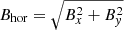 , the azimuth ϕ = arctan(By/Bx), and the inclination of the magnetic field Bz/Bhor. It should be noted that the two latter are in fact the ones provided in the non-CEA version of SHARPS, as the azimuth and the inclination are the typical products of spectropolarimetric inversions. Figure 1e shows that the stronger horizontal magnetic field is found at the penumbra, while it is predominantly weak over the small-scale magnetic fields of the plage. The azimuth map shows the 180° discontinuity that traverses the sunspot vertically, whereas the inclination map shows the transition from positive to negative inclinations (white and black, correspondingly) over the two well-separated magnetic polarities of the active region.
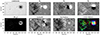 |
Fig. 1. Active region NOAA 11072. The upper row shows information contained in the SHARPS CEA data, namely (a) the maps of the continuum intensity, provided here for context, (b) the vertical component, Bz, and (c and d) the horizontal Bx and By components of the photospheric magnetic field. The magnetic field values were scaled to ±500 G for the vertical component and ±400 G for the horizontal ones. The lower row contains (e) the measure of the horizontal field Bhor, (f) the azimuth ranging from −180° to 180°, (g) the inclination ranging between −90° and 90°, and (h) the COCOMAG produced by Bx, By, and Bz. Contours of the continuum intensity were added to mark the boundaries of the umbra and the penumbra of the spot for context. |
The COCOMAG of the region (Fig. 1h) provides the aforementioned information in one colored map (except for the polarity of the components). The white parts of the umbra and inner penumbra region correspond to regions where all three components, Bx, By, and Bz, are higher than the 2σ cut-off. The periphery of the penumbra as well as the surrounding region, where the vertical component is weaker, transitions from red to magenta and then to blue, depending on which of the two horizontal components is prevalent. For the same reason, the sunspot is crossed by two roughly perpendicular stripes, a vertical cyan and a horizontal yellow one, reflecting the division of the sunspot seen in the Bx and By maps. As yellow is produced by combining green and red (i.e., Bz and Bx, see Table 2), this strip runs along the sign-reversal line of By (panel c in Fig. 1), where this component is zero or very weak. Similarly, the cyan strip in panel (h) of Fig. 1 marks the region where the Bx component is close to zero and corresponds to the sign-reversal region of Bx seen in panel (d) of Fig. 1, and corresponds to the azimuth discontinuity (panel (f) in Fig. 1). Many of the small-scale magnetic elements of the active region are seen in green (predominantly vertical photospheric magnetic field) with parts seen in blue and cyan. Due to the higher noise level of the horizontal components, the noise pattern in the COCOMAG appears blue, red, and magenta.
In the more general case of a highly complex region with asymmetric sunspots and overall magnetic field distribution, the appearance of sunspots and the magnetic field distribution differs. In Fig. 2, we present two such examples, NOAA 12673 and 12192, to illustrate how COCOMAGs can be used to probe the morphological complexity of active regions. Both of them were complex δ-regions (Künzel 1965) with high flare productivity. Due to their strong and highly deformed flux systems, their COCOMAGs are dominated by hues around the red, magenta, yellow, and cyan colors, indicative of the strong presence of horizontal components in the photospheric magnetic field. In active region NOAA 12673 (Fig. 2 top), a thin magenta strip crosses the magnetic field distribution, indicating the region of interaction where a PIL has formed as a result of polarity collision (Verma 2018). Consequently, the neighboring polarities have developed considerable twist and shear, hence the abrupt transition between different colors at these locations, depending on the local orientation of the magnetic field vector. Active region NOAA 12192 (Fig. 2 bottom) is so far the region with the largest sunspot area since the beginning of Solar Cycle 24. Its COCOMAG exhibits similarities and differences with that of active region NOAA 12673. The distorted procession of colors over the main polarities as well as the similarly distorted cyan strips crossing them indicate the existence of twist. The regions between the main footpoints also exhibit strong photospheric components and twist, evident as a smooth transition between different colors. However, unlike active region NOAA 12673, there are no abrupt color changes, that is, there is no clearly developed and/or detectable PIL. This result is in line with reports of the relatively weak nonpotentiality of the region, which resulted in a low CME output despite its strong flaring (Sun et al. 2015).
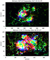 |
Fig. 2. COCOMAGs for active regions NOAA 12673 (top) and NOAA 12192 (bottom). |
The three exemplary cases of active regions presented so far showcase the capability of the COCOMAGs to reveal fundamental characteristics of the magnetic field vector. Even lacking polarity information, the morphology of the color-coded maps reflects intricate details regarding the complexity of active regions, ranging from regions with symmetric sunspots with clear yellow and cyan strips, to those with clearly formed sunspots but with distorted strips – indicating twist–, and finally to those without symmetry end/or with abrupt changes in color, with thin strips of magenta and red.
3.2. COCOMAGs and the emergence of magnetic flux
Now, we study the dynamic evolution from emergence to decay in terms of COCOMAGs, starting with the familiar example of active region NOAA 11072 (Fig. 3). The COCOMAG in Fig. 3a corresponds to the first instance of emergence provided by the SHARP data. The region starts as a compact colored patch consisting of two separating crescent-shaped green-yellow-cyan patches, both of them associated with strong vertical magnetic field, in combination with strong Bx and to a lesser extent By. The red patch between the two main polarities indicates the emergence of horizontal magnetic field, predominantly in the x-direction. The dipole orientation aligns with the horizontal axis of the map, and therefore red colors prevail over blue ones in all SHARP data. The following day, on 21 May 2010 (Fig. 3b), more of the horizontal part of the structure appears and the two polarities separate; they start to build up and contain more white, with the yellow-cyan strips in between indicating the formation of roughly circular pores or spots. There is still red between the two polarities, but some of the parts are also cyan, as the polarities also start to separate in the y-direction and a significant By component appears. On 22 May 2010 (Fig. 3c), the positive polarity located to the right has developed the well-formed sunspot already described in Fig. 1. The negative polarity to the left is more dispersed, with the rather vertical magnetic fields of the more compact parts of the polarity (green patches) surrounded by more inclined ones (cyan, yellow, and white in the periphery). There is still considerable emergence of magnetic flux betrayed by the red and magenta regions, which results in more flux accumulation in the two polarities of the region. Notable also are the mixed, small-scale magnetic polarities in between the main polarities, as the magenta and red regions are separated by green patches at solar x ∼ 70″. Two days later, the active region has the appearance seen in Fig. 3d and described in Fig. 1, with a well-formed, well-separated, symmetrical sunspot to the right and a plage dominated by green pixels to the left.
 |
Fig. 3. Evolution of active region NOAA 11072 in COCOMAG. |
In Fig. 4, we plot the color curves of the region. These are derived by measuring the number of pixels in each map, which in the RGB coordinate system are found within a Euclidean distance of 60 from the coordinates given in Table 2. For the following discussion, it should be kept in mind that the color curves do not represent a flux content but rather the number of pixels where combinations of the components are maximized according to Table 2, and hence the area covered by those colors. We do not discuss the black color because its variation depends on the variable background noise of the magnetogram and it is only indirectly related to the evolution of the region, as it represents pixels where all three components are close to zero.
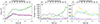 |
Fig. 4. Comparative overview of the evolution of the magnetic flux components and the color curves for active region NOAA 11072. (a) Total unsigned Bz (green), Bx (red), and By (blue), (b) total number of pixels with red, green, blue, and white color (red, green, blue, and black, respectively), and (c) total number of pixels with cyan, magenta, and yellow color. The vertical dashed lines indicate the times of B-class flares. |
Before discussing the color curves, we provide the evolution of the three components of the magnetic field for reference (Fig. 4a). They exhibit the typical evolutionary trends relevant to flux emergence and decay (see e.g., Norton et al. 2017, and references therein) with a brief increase, a short plateau, a more intense increase – which for this particular case led to a local maximum at around t = 1.5 days–, and a global maximum at t = 2.2 days. The magnetic flux of the vertical component is higher, while the two horizontal ones exhibit almost the same magnetic flux. The peak magnetic flux is followed by a slow decline, which is evident in all three components. The increase observed after a central meridian distance of 40° is a systematic effect due to the asymmetric noise pattern of HMI (Bobra et al. 2014; Hoeksema et al. 2014).
The color curves in Fig. 4 (panels b and c) contain more intricate information regarding the evolution of the emerging region. The number of white pixels (Fig. 4b, black curve) generally increases, but shows deviations, reaching a maximum value at t = 3 days immediately after all components reached their maxima. The red curve has overall higher values in comparison to the green and blue and exhibits discrete peaks at the start of the observations as well as at t = 1.2 days and t = 2.2 days, indicating emergence events. Thus, at the beginning, most of the region was occupied by mainly horizontal magnetic field and the prevalence of red over blue is due to the orientation of the emerging bipole, which aligned very well with the x-axis of the SHARP cut-out (see also Figs. 3a and b). The blue curve, on the other hand, exhibited the lowest values at all times, as well as the most subtle variation, because there were only a few pixels with purely By magnetic field. The blue curve balanced the red curve after t = 2.5 days, when the symmetric spot formed, and then it overtook the red one after t = 4 days. At that point, no more horizontal flux was injected and thus the prevalence of red had ceased. The green curve exhibited a continuous increase during the entire span of observations, with a distinct peak at around t = 0.8 days at the onset of the main emergence phase (see also Fig. 3a), and another one at t = 1.8 days during the local maximum of the vertical magnetic flux. It continued to increase rather monotonously after t = 3 days until the region reached the limb, where it was also affected by projection effects. During its late evolutionary stages, the region consisted of a plage and a well-formed spot. The green curve dominated, and it was more than twice as high as the red and blue curves combined because most of the active region area contained pixels closer to the vertical direction, whereas far fewer pixels contained purely Bx and By fields. During the decay phase, this development also had an impact on the cyan, magenta, and yellow curves (Fig. 4d).
As in the RGB color system, the cyan, magenta, and yellow are secondary colors, the corresponding color curves represent the number of pixels where two out of the three components reach maximum values (Table 2) and the third one is minimal. All three curves (Fig. 4d) exhibit peaks at the beginning of the observations; yellow and cyan then increase continuously, with the former peaking at around t = 2.2 days and the latter saturating already after the first day. The yellow curve declines after the peak, whereas the cyan one is almost constant throughout the observations. The magenta curve exhibits distinct peaks – which coincide with peaks in red and green (since magenta represents pixels with both Bx and By maxima) – and then acquires very low values again.
In summary, the temporal variation of the color curves appears to reflect important stages in the evolution of active regions, such as emergence, transition to a more relaxed or potential state, and decay. To further support the diagnostic value of COCOMAGs for flux emergence, we also present two well-studied examples of active regions, NOAA 12118 and NOAA 12673 (Fig. 5). The former was studied by Verma et al. (2016) from its emergence to its decay, whereas the latter produced the strongest flare of Solar Cycle 24 and its evolution has been extensively studied (see Pietrow et al. 2024a, for a comprehensive review of the literature).
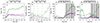 |
Fig. 5. (a–b) Magnetic flux evolution and color curves for active region NOAA 12118. The vertical dashed lines mark the transitions between different evolutionary stages (see text). (c–d) Magnetic flux evolution and color curves for active region NOAA 12673. Vertical lines indicate flares and thick vertical lines indicate X-class flares. The time is in decimal days measured from the beginning of their observation, that is, at 17 July 2014 16:34 UT for NOAA 12118 and at 28 August 2017 08:58 UT for NOAA 12673. |
Figures 5a and b present the temporal evolution of Bx, By, and Bz and the six color curves deduced from the COCOMAGs for active region NOAA 12118. They present similar evolutionary characteristics as the ones described earlier for NOAA 11072, although NOAA 12118 was much weaker. Verma et al. (2016) distinguished four phases in the lifetime of this active region, that is the emergence phase, exhibiting a fast expansion (“a”), followed by a slowing down of the expansion (“b”) after t = 0.6 days, its halt starting at t = 1.3 days (“c”), and the onset of decay at t = 2.1 days (“d”). The corresponding times were derived using 17 July 2014 at 16:34 UT for reference. Comparing these times with the temporal evolution of the color curves in Fig. 5b, we note the following: (a) during the fast emergence, all curves increased with a dominance of red and white, (b) the bipole expansion slowed down when green, cyan, and yellow overtook red and white (t ∼ 0.5 days), and (c) was slowed when green marginally overtook yellow and cyan curves (t ∼ 1.3 days). (d) Finally the onset of decay coincided with green dominating and initiating a fast increase (t ∼ 2.1 days), while all the other color curves declined. In summary, as the active region emerged and decayed, the area occupied by magnetic field of different orientation changed accordingly. Horizontal magnetic flux was injected into the photosphere during emergence, which accumulated to form pores, exhibited some twist, and gradually relaxed to a more vertical state during decay.
Active region NOAA 12673 is another interesting example, substantiating the previous description. The region rotated into view and had the appearance of an already evolved region with a well-formed sunspot and trailing plage. In this case, the dominance of green and white observed in (Fig. 5d) is in agreement with the previous description. When the region was closer to the disk center, the white pixels dominated because the region consisted of a well-formed symmetric spot. With the intense emergence events of 2 September 2017 (t ∼ 5 days) and the subsequent interactions between polarities (Verma 2018), the area occupied by strong horizontal magnetic field increased substantially. During the same time, red, and more prominently yellow and cyan, exhibited a strong increase as a result of the injection of new horizontal magnetic flux and the development of strong shear (see also the top panel of Fig. 2). Decay set in 4 days later, while the region rotated out of view. This period of intense emergence and interaction was also accompanied by heavy and repeated flaring, culminating to two X-class flares on 9 September 2017. The implied relationship between the color curves, the magnetic complexity, and flaring are discussed in the following sections.
These examples demonstrate that the COCOMAG plots allow visualization of the typical structure of the magnetic fields during the different evolutionary stages of an active region. Initially, during the formation of the region, horizontal components of the magnetic field are dominant. This is in agreement with the simulations of Rempel & Cheung (2014), which show that during the early stages of active region formation, horizontal fields rise toward the surface and emerge through the photosphere. Subsequently, these horizontal fields gradually evolve into a mixture of weak magnetic fields and more vertical fields (see van Driel-Gesztelyi & Green 2015, and references therein). This stage is also well captured in the COCOMAG plots and subsequent color curves, where the dispersed vertical magnetic field dominates the decaying regions.
3.3. Color curves and magnetic complexity
Figure 6 shows four selected magnetic properties, namely the integral of the total unsigned vertical electric current density, a proxy for the mean photospheric excess energy, the absolute value of the net current helicity, and the mean angle of the magnetic field with respect to the radial direction, for active region NOAA 11072. These four parameters, which are provided with the SHARP data product, quantify the nonpotentiality of active regions and were chosen due to their relevance to fundamental physical quantities (electric current, magnetic energy, current helicity) and the “geometry” of the magnetic field (mean angle of the magnetic field). Formulas for their calculation are given in Bobra et al. (2014) and all involve combinations of the magnetic field components.
 |
Fig. 6. Temporal evolution of four selected SHARP parameters for the active region NOAA 11072. From left to right: Total vertical electric current (TOTUSJZ), the proxy for mean photospheric excess energy (MEANPOT), the absolute value of the net current helicity (ABSNJZH), and the mean angle of the magnetic field from the radial (MEANGAM). |
All parameters exhibit an increasing trend up to a maximum value until t = 2.2 days, following the evolution of emerging flux and the trend indicated by the total unsigned magnetic flux. Notwithstanding this similarity, the four parameters exhibit different characteristics, which depend on their association with different aspects of complexity, which is a typical feature of these parameters (see, e.g. Kontogiannis et al. 2018). Thus, the integrated vertical electric current and the current helicity tend to exhibit narrower peaks due to their association with the Bx and By, while the magnetic energy excess builds up rather continuously, although it also exhibits peaks. For all three parameters, these peaks are co-temporal with the peaks seen in the red and magenta color curves (Figs. 4c,d). These peaks are more subtle for the mean angle of the field from the radial direction, which still resembles the yellow color curve (Fig. 4d). This is reasonable, as the yellow curve represents the area with pixels where Bx and Bz are maximum, for which the vector of the magnetic field can deviate significantly from the vertical.
Based on these observations, we examine the correlations between the color curves and the four SHARP parameters of Fig. 6 for each of the 33 active regions (see Table 1). The correlations calculated for each region are presented in Fig. 7. The correlation coefficients between nonpotentiality parameters and color curves differ, despite some systematic behavior. On average, we find a weak to moderate correlation between the red, cyan, magenta, and yellow curves with the four parameters and this correlation is strong in many individual cases. The green and particularly the blue component are weakly correlated or anticorrelated with the parameters. The geometrical reasoning invoked above to explain the orientation of the emerging bipole applies here as well, and can also explain the strong anti-correlation with the γ-angle. The latter is, on average, strongly correlated with the white color curve, because it represents pixels where all magnetic field components are equally strong and therefore the magnetic field is inclined.
3.4. Color curves and flaring activity
Although active region NOAA 11072 was a rather quiet region at the beginning of Solar Cycle 24, it produced some weak flaring activity when it reached maximum complexity. Out of the four B-class flares it produced in total, two of them took place during the third day, as indicated by the vertical dashed lines in Fig. 4. Panels (c) and (d) of the same figure show that the two flares coincided with or followed peak values in the red, yellow, and magenta color curves, all reflecting changes in the horizontal component, in association with strong vertical magnetic field. Similarly, active region NOAA 12673 (Fig. 5d) exhibited its strong flaring activity after t = 6 days, with the onset of fast flux emergence. As discussed earlier, all color curves increased, exhibiting multiple peaks after that time. In the previous sections, we establish the response of emergence and also of the twisting and shearing of the magnetic field that ensued due to opposite polarity motions from the behavior of the color curves, and we see a moderate correlation between some of the color curves and common nonpotentiality parameters. Motivated by these observations, here we examine the potential use of the color curves as predictors of flaring activity.
We calculated the COCOMAGs and derived the color curves for the active regions of Table 1. For each value of the color curve, we measured the number of flares that took place within a 24h window and belonged to the following categories based on their magnitudes: higher than or equal to X1.0, higher than or equal to M1.0, and higher than or equal to C1.0. We then calculated the Bayesian flaring probabilities using the formulas presented in Kontogiannis et al. (2018) for a set of thresholds chosen appropriately so that each parameter bin contains the same number of values. The flaring probabilities were compared with the ones calculated for the time series of the total unsigned magnetic flux, which represents the most rudimentary complexity parameter. All thresholds are normalized to their maximum value to facilitate comparison between the different parameters and are presented in Fig. 8.
 |
Fig. 7. Correlations between the six color curves and the four parameters of Fig. 6, calculated for each active region. Each hexagon represents the individual correlation coefficient between parameter and color curve, coded according to the color bar. Printed on top of each set of correlations are the average and standard deviation for the active region sample. |
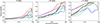 |
Fig. 8. Bayesian flaring probabilities and accompanying errors calculated for the 33 active regions in Table 1 as a function of normalized thresholds. Each color denotes probabilities calculated for the corresponding color curves (the gray color denotes probabilities for the “w” color curve). |
Three groups of color curves can be distinguished. Blue and cyan are associated with the lowest flaring probabilities. White, green, and yellow exhibit higher flaring probabilities and are largely comparable with the total unsigned magnetic flux. Finally, red and magenta exhibit the highest probabilities, surpassing in most cases the total unsigned magnetic flux. Therefore, the area occupied by strong, purely horizontal magnetic field – as quantified by the red and magenta color curves derived from COCOMAGs – could be used as a predictor of imminent flaring activity. Through their specific association to Bx (red) and Bx − By (magenta), these color curves are particularly sensitive to the emergence of new flux and to the development of twist and shear, which trigger intense activity.
We conclude that the color curves derived from COCOMAGs quantify the part of the region occupied with magnetic field components of prescribed strength, and combine area, magnetic field strength, and orientation information. This information is related to evolutionary aspects of the emerging magnetic flux and to the amount of the developed nonpotentiality. These empirical facts, combined with their association with imminent flaring activity and their relatively simple derivation, render COCOMAGs promising for probing the evolution of active regions and advancing the prediction of their erupting activity.
4. Conclusions and discussion
In this study, we used HMI vector magnetograms to study magnetic flux emergence and active region evolution through a method that transforms the magnetic field vector into a vector in the RGB color space. The produced COCOMAGs, essentially color maps encapsulating all three Cartesian components of the magnetic field, represent valid magnetic field information in a concise way. The Cartesian components represent flux density and therefore are suitable for such a treatment, in contrast with spherical components, where one would have to combine both magnetic flux density and angles. In the context of our methodology, the RGB primary colors red, green, and blue represent regions where one of the three components Bx, Bz, and By prevail, while the secondary colors cyan, magenta, and yellow represent regions where two out of three components are significant. Measuring the area occupied by each color, we created the corresponding color curves, which can be used along with the COCOMAGs to probe active region evolution.
A comparison with known, well-studied examples shows that the COCOMAGs and the derived color curves can be used as diagnostics of different evolutionary stages of active regions. The emergence of Ω-loops is evident as a considerable area covered by horizontal magnetic field in between separating patches of rather vertical magnetic field. During the first days of emergence, most of the region area is covered with moderately to highly inclined magnetic field, also developing some degree of twist, as the two polarities separate and build up. A higher degree of twist is indicated by more asymmetric colored patterns over sunspots, as well as progression of colors in between, whereas shear is betrayed by thin strips of red and magenta colors and abrupt color transitions in regions of interactions. The initiation of the decay process can be determined as the time when most of the area of the region is covered by rather vertical magnetic field, indicated by prevailing green pixels.
Motivated by this diagnostic capability of the color curves, we compared them with typical nonpotentiality parameters, such as the vertical electric current density, the free energy, the electric current helicity, and the shear angle. A correlation analysis reveals a generally moderate correlation between the nonpotentiality parameters and some of the color curves, particularly the red, magenta, cyan, yellow, and white. This correlation indicates that the COCOMAG methodology offers an alternative to characterize active region complexity, since the color curve essentially represents a combination of geometric information of the photospheric magnetic field and area coverage.
We examined the potential of the color curves as predictors of imminent flaring. The red and magenta color curves, which represent the area occupied by strong, purely horizontal magnetic field, exhibit the highest flaring probabilities, surpassing the flaring probabilities of the total unsigned magnetic flux. The yellow and white ones, which correspond to the area occupied by strongly inclined magnetic field also compete well with the total magnetic flux, while green, blue, and cyan are associated with the lowest flaring probabilities. This is a first indication that there is potential for adapting and including the COCOMAG methodology in the characterization of active-region complexity and in eruption-prediction schemes using conventional statistics or machine learning (ML).
Indeed, the abundance of solar observational data makes it an excellent candidate for ML processing. One of the most popular tasks is space weather prediction. One can distinguish between two types of forecasting scheme, namely image based and parameter (feature) based. The latter is more common (see Georgoulis et al. 2024), mostly for historical reasons and energy efficiency. Currently, however, image-based models are also gaining popularity for forecasting extreme events, such as vision transformers (e.g., Dosovitskiy et al. 2020; Grim & Gradvohl 2024), deep convolutional neural networks (Jiang et al. 2022; Pandey et al. 2021), and autoencoders (Wang et al. 2022). Due to their high information content, especially with respect to morphology, the COCOMAGs are a suitable candidate for some of the aforementioned algorithms. Furthermore, the by-product of COCOMAGs, that is, color curves, could be used in conventional feature-based prediction schemes, such as support vector machines (SVMs) and long short-term memory (LSTM) neural networks. As mentioned above, these show promising flare-prediction potential, and so a logical next step will be to implement them in such flare forecasting models along with existing empirical parameters.
Additionally, with the increasing abundance of multiwavelength, multilayer spectropolarimetric observations, we expect that more height-resolved magnetic field products will become available (Yadav et al. 2019; Borrero et al. 2021). The COCOMAG methodology can be adapted to scrutinize this type of data, as well as to treat data cubes resulting from modeling or simulations (Jarolim et al. 2024), bringing out subtle differences in the magnetic field per height and/or per component. Although the method relies on colors, it is a first step towards alternative representations of information regarding magnetic field. These representations can be adapted to user needs by choice of appropriate color tables, facilitate the transformation to various color systems, and further lead to products based on tactile perception and sonification.
Acknowledgments
We would like to thank the anonymous referee for providing comments which contributed to the clarity of the manuscript. I. Kontogiannis is supported by the Deutsche Forschungsgemeinschaft (DFG) project number KO 6283/2-1. A.G.M. Pietrow and M.K. Druett are supported by the European Research Council (ERC) under the European Union’s Horizon 2020 research and innovation programme (grant agreement No. 833251 PROMINENT ERC-ADG 2018). E. Dineva thanks the Belgian Federal Science Policy Office (BELSPO) for the provision of financial support in the framework of the Brain-be program under contract B2/202/P1/DELPH and the Belgian Defence – Royal Higher Institute for Defence (RHID) through contract 22DEFRA006.
References
- Angryk, R. A., Martens, P. C., Aydin, B., et al. 2020, Sci. Data, 7, 227 [NASA ADS] [CrossRef] [Google Scholar]
- Bobra, M. G., Sun, X., Hoeksema, J. T., et al. 2014, Sol. Phys., 289, 3549 [Google Scholar]
- Borrero, J. M., Pastor Yabar, A., & Ruiz Cobo, B. 2021, A&A, 647, A190 [NASA ADS] [CrossRef] [EDP Sciences] [Google Scholar]
- Campbell, R. J., Keys, P. H., Mathioudakis, M., et al. 2023, ApJ, 955, L36 [NASA ADS] [CrossRef] [Google Scholar]
- Chintzoglou, G., Zhang, J., Cheung, M. C. M., & Kazachenko, M. 2019, ApJ, 871, 67 [NASA ADS] [CrossRef] [Google Scholar]
- Cretignier, M., Pietrow, A. G. M., & Aigrain, S. 2024, MNRAS, 527, 2940 [Google Scholar]
- Denker, C., & Verma, M. 2019, Sol. Phys., 294, 71 [NASA ADS] [CrossRef] [Google Scholar]
- Denker, C., Verma, M., Pietrow, A. G. M., Kontogiannis, I., & Kamlah, R. 2023, Res. Notes Am. Astron. Soc., 7, 224 [Google Scholar]
- Dosovitskiy, A., Beyer, L., Kolesnikov, A., et al. 2020, arXiv e-prints [arXiv:2010.11929] [Google Scholar]
- Druett, M. K., Pietrow, A. G. M., Vissers, G. J. M., Robustini, C., & Calvo, F. 2022, RASTI, 1, 29 [NASA ADS] [Google Scholar]
- Eastwood, J. P., Biffis, E., Hapgood, M. A., et al. 2017, Risk Anal., 37, 206 [NASA ADS] [CrossRef] [Google Scholar]
- Ellerman, F. 1917, ApJ, 46, 298 [NASA ADS] [CrossRef] [Google Scholar]
- Fletcher, L., Dennis, B. R., Hudson, H. S., et al. 2011, Space Sci. Rev., 159, 19 [Google Scholar]
- Georgoulis, M. K., Rust, D. M., Bernasconi, P. N., & Schmieder, B. 2002, ApJ, 575, 506 [Google Scholar]
- Georgoulis, M. K., Bloomfield, D. S., Piana, M., et al. 2021, J. Space Weather Space Clim., 11, 39 [CrossRef] [EDP Sciences] [Google Scholar]
- Georgoulis, M. K., Yardley, S. L., Guerra, J. A., et al. 2024, Adv. Space Res., in press, https://doi.org/10.1016/j.asr.2024.02.030 [Google Scholar]
- Gontikakis, C., Kontogiannis, I., Georgoulis, M. K., et al. 2020, arXiv e-prints [arXiv:2011.06433] [Google Scholar]
- Gonzalez, R. C., & Woods, R. E. 2008, Digital Image Processing (Upper Saddle River, N.J.: Prentice Hall) [Google Scholar]
- Grim, L. F. L., & Gradvohl, A. L. S. 2024, Sol. Phys., 299, 33 [CrossRef] [Google Scholar]
- Hale, G. E., Ellerman, F., Nicholson, S. B., & Joy, A. H. 1919, ApJ, 49, 153 [NASA ADS] [CrossRef] [Google Scholar]
- Hirayama, T. 1974, Sol. Phys., 34, 323 [Google Scholar]
- Hoeksema, J. T., Liu, Y., Hayashi, K., et al. 2014, Sol. Phys., 289, 3483 [Google Scholar]
- Hudson, H. S. 2024, arXiv e-prints [arXiv:2407.04567] [Google Scholar]
- Jarolim, R., Tremblay, B., Rempel, M., et al. 2024, ApJ, 963, L21 [NASA ADS] [CrossRef] [Google Scholar]
- Jiang, J., Huang, Z.-G., Grebogi, C., & Lai, Y.-C. 2022, Phys. Rev. Res., 4, 023028 [NASA ADS] [CrossRef] [Google Scholar]
- Kamlah, R., Verma, M., Denker, C., & Wang, H. 2023, A&A, 675, A182 [NASA ADS] [CrossRef] [EDP Sciences] [Google Scholar]
- Kandel, E., Schwartz, J., Jessell, T., et al. 2014, Principles of Neural Science, Fifth Edition (New York, NY: McGraw-Hill Education) [Google Scholar]
- Kontogiannis, I. 2023, Adv. Space Res., 71, 2017 [NASA ADS] [CrossRef] [Google Scholar]
- Kontogiannis, I., Georgoulis, M. K., Park, S.-H., & Guerra, J. A. 2018, Sol. Phys., 293, 96 [NASA ADS] [CrossRef] [Google Scholar]
- Kontogiannis, I., Tsiropoula, G., Tziotziou, K., et al. 2020, A&A, 633, A67 [NASA ADS] [CrossRef] [EDP Sciences] [Google Scholar]
- Künzel, H. 1965, Astron. Nachr., 288, 177 [NASA ADS] [Google Scholar]
- López Fuentes, M. C., Démoulin, P., Mandrini, C. H., Pevtsov, A. A., & van Driel-Gesztelyi, L. 2003, A&A, 397, 305 [NASA ADS] [CrossRef] [EDP Sciences] [Google Scholar]
- MacQueen, J. 1967. Proceedings of the Fifth Berkeley Symposium on Mathematical Statistics and Probability, 1, 281 [Google Scholar]
- Moe, T. E., Pereira, T. M. D., Calvo, F., & Leenaarts, J. 2023, A&A, 675, A130 [NASA ADS] [CrossRef] [EDP Sciences] [Google Scholar]
- Norton, A. A., Jones, E. H., Linton, M. G., & Leake, J. E. 2017, ApJ, 842, 3 [NASA ADS] [CrossRef] [Google Scholar]
- Osborne, C. M. J., & Fletcher, L. 2022, MNRAS, 516, 6066 [NASA ADS] [CrossRef] [Google Scholar]
- Pandey, C., Angryk, R. A., & Aydin, B. 2021, 2021 IEEE International Conference on Big Data (Big Data), 1725 [CrossRef] [Google Scholar]
- Pariat, E., Aulanier, G., Schmieder, B., et al. 2004, ApJ, 614, 1099 [Google Scholar]
- Pesnell, W. D., Thompson, B. J., & Chamberlin, P. C. 2012, Sol. Phys., 275, 3 [Google Scholar]
- Pietrow, A. G. M., Cretignier, M., Druett, M. K., et al. 2024a, A&A, 682, A46 [NASA ADS] [CrossRef] [EDP Sciences] [Google Scholar]
- Pietrow, A. G. M., Druett, M. K., & Singh, V. 2024b, A&A, 685, A137 [NASA ADS] [CrossRef] [EDP Sciences] [Google Scholar]
- Rempel, M., & Cheung, M. C. M. 2014, ApJ, 785, 90 [Google Scholar]
- Scherrer, P. H., Schou, J., Bush, R. I., et al. 2012, Sol. Phys., 275, 207 [Google Scholar]
- Schou, J., Scherrer, P. H., Bush, R. I., et al. 2012, Sol. Phys., 275, 229 [Google Scholar]
- Schrijver, C. J. 2007, ApJ, 655, L117 [Google Scholar]
- Sun, X., Bobra, M. G., Hoeksema, J. T., et al. 2015, ApJ, 804, L28 [Google Scholar]
- Toriumi, S., Schrijver, C. J., Harra, L. K., Hudson, H., & Nagashima, K. 2017, ApJ, 834, 56 [Google Scholar]
- Van der Maaten, L., & Hinton, G. 2008, J. Mach. Learn. Res., 9, 2579 [Google Scholar]
- van Driel-Gesztelyi, L., & Green, L. M. 2015, Liv. Rev. Sol. Phys., 12, 1 [Google Scholar]
- Verma, M. 2018, A&A, 612, A101 [NASA ADS] [CrossRef] [EDP Sciences] [Google Scholar]
- Verma, M., Denker, C., Balthasar, H., et al. 2016, A&A, 596, A3 [Google Scholar]
- Verma, M., Matijevič, G., Denker, C., et al. 2021, ApJ, 907, 54 [NASA ADS] [CrossRef] [Google Scholar]
- Wang, J., Luo, B., & Liu, S. 2022, Front. Astron. Space Sci., 9, 1037863 [NASA ADS] [CrossRef] [Google Scholar]
- Watanabe, H., Vissers, G., Kitai, R., Rouppe van der Voort, L., & Rutten, R. J. 2011, ApJ, 736, 71 [NASA ADS] [CrossRef] [Google Scholar]
- Webb, D. F., & Howard, T. A. 2012, Liv. Rev. Sol. Phys., 9, 3 [Google Scholar]
- Yadav, R., de la Cruz Rodríguez, J., Díaz Baso, C. J., et al. 2019, A&A, 632, A112 [NASA ADS] [CrossRef] [EDP Sciences] [Google Scholar]
All Tables
All Figures
|
Fig. 1. Active region NOAA 11072. The upper row shows information contained in the SHARPS CEA data, namely (a) the maps of the continuum intensity, provided here for context, (b) the vertical component, Bz, and (c and d) the horizontal Bx and By components of the photospheric magnetic field. The magnetic field values were scaled to ±500 G for the vertical component and ±400 G for the horizontal ones. The lower row contains (e) the measure of the horizontal field Bhor, (f) the azimuth ranging from −180° to 180°, (g) the inclination ranging between −90° and 90°, and (h) the COCOMAG produced by Bx, By, and Bz. Contours of the continuum intensity were added to mark the boundaries of the umbra and the penumbra of the spot for context. |
| In the text | |
|
Fig. 2. COCOMAGs for active regions NOAA 12673 (top) and NOAA 12192 (bottom). |
| In the text | |
|
Fig. 3. Evolution of active region NOAA 11072 in COCOMAG. |
| In the text | |
|
Fig. 4. Comparative overview of the evolution of the magnetic flux components and the color curves for active region NOAA 11072. (a) Total unsigned Bz (green), Bx (red), and By (blue), (b) total number of pixels with red, green, blue, and white color (red, green, blue, and black, respectively), and (c) total number of pixels with cyan, magenta, and yellow color. The vertical dashed lines indicate the times of B-class flares. |
| In the text | |
|
Fig. 5. (a–b) Magnetic flux evolution and color curves for active region NOAA 12118. The vertical dashed lines mark the transitions between different evolutionary stages (see text). (c–d) Magnetic flux evolution and color curves for active region NOAA 12673. Vertical lines indicate flares and thick vertical lines indicate X-class flares. The time is in decimal days measured from the beginning of their observation, that is, at 17 July 2014 16:34 UT for NOAA 12118 and at 28 August 2017 08:58 UT for NOAA 12673. |
| In the text | |
|
Fig. 6. Temporal evolution of four selected SHARP parameters for the active region NOAA 11072. From left to right: Total vertical electric current (TOTUSJZ), the proxy for mean photospheric excess energy (MEANPOT), the absolute value of the net current helicity (ABSNJZH), and the mean angle of the magnetic field from the radial (MEANGAM). |
| In the text | |
|
Fig. 7. Correlations between the six color curves and the four parameters of Fig. 6, calculated for each active region. Each hexagon represents the individual correlation coefficient between parameter and color curve, coded according to the color bar. Printed on top of each set of correlations are the average and standard deviation for the active region sample. |
| In the text | |
|
Fig. 8. Bayesian flaring probabilities and accompanying errors calculated for the 33 active regions in Table 1 as a function of normalized thresholds. Each color denotes probabilities calculated for the corresponding color curves (the gray color denotes probabilities for the “w” color curve). |
| In the text | |
Current usage metrics show cumulative count of Article Views (full-text article views including HTML views, PDF and ePub downloads, according to the available data) and Abstracts Views on Vision4Press platform.
Data correspond to usage on the plateform after 2015. The current usage metrics is available 48-96 hours after online publication and is updated daily on week days.
Initial download of the metrics may take a while.