Fig. 8
Download original image
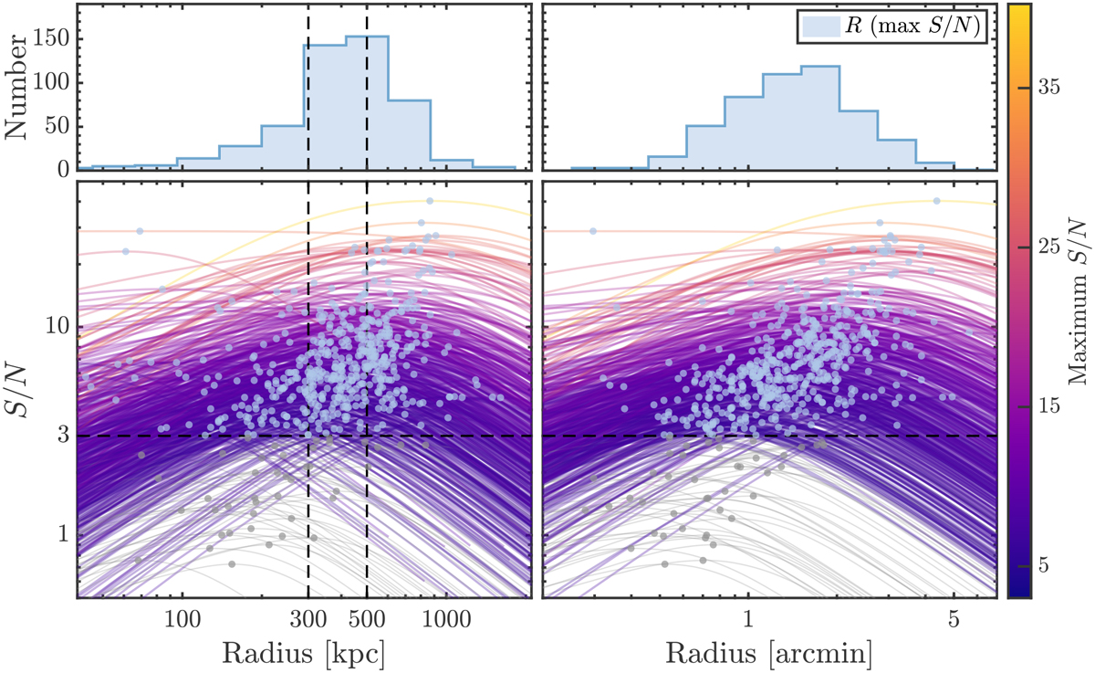
Signal-to-noise ratio profiles for all the clusters. The net count rates are computed from the best-fit model of the soft-band image (see Sect. 4.1 for more details). For each cluster, the S/N as a function of radius is shown as a curve color-coded by its maximum value. The maximum S/N and the corresponding radii for all clusters are marked with blue dots. Clusters with maximum S/N lower than 3 are plotted in dark gray. The histogram in the upper left panel shows the distribution of the maximum S/N, only considering clusters with maximum S/N higher than 3, in order to remove the contamination from low-significance clusters.
Current usage metrics show cumulative count of Article Views (full-text article views including HTML views, PDF and ePub downloads, according to the available data) and Abstracts Views on Vision4Press platform.
Data correspond to usage on the plateform after 2015. The current usage metrics is available 48-96 hours after online publication and is updated daily on week days.
Initial download of the metrics may take a while.