Fig. 1
Download original image
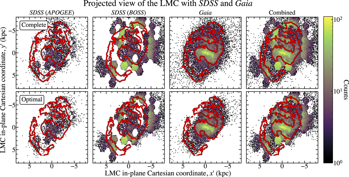
Comparison of the density maps between the different LMC clean samples. Top: LMC complete sample. Bottom: LMC optimal sample. From left to right, APOGEE, BOSS, Gaia, and Combined sample. We display bins containing three or more stars; otherwise, we display individual stars as a scatter plot. The brighter colours correspond to the higher density zones. A red line splitting the overdensities (LMC bar and spiral arm) from the underdensities is plotted. All maps are shown in the LMC in-plane (x′, y′) Cartesian coordinate system. To mimic how the LMC is seen in the sky, the plotted data has both axes inverted.
Current usage metrics show cumulative count of Article Views (full-text article views including HTML views, PDF and ePub downloads, according to the available data) and Abstracts Views on Vision4Press platform.
Data correspond to usage on the plateform after 2015. The current usage metrics is available 48-96 hours after online publication and is updated daily on week days.
Initial download of the metrics may take a while.