Fig. 2.
Download original image
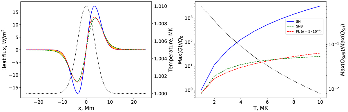
Comparison between the SH, FL, and SNB thermal transport models. Left panel: initial Gaussian perturbation of temperature (black dotted curve) and heat fluxes corresponding to this perturbation for the case of the SH (blue solid curve), SNB (green dashed curve), and FL (red dashed curve) thermal transport models. The orange shading denotes the regions where pre-heating takes place (the effective width of the heat flux predicted by SNB is greater than that by SH and than the width of the initial temperature perturbation). Right panel: peak SH (blue solid curve), SNB (green dashed curve), and FL (red dashed curve) heat fluxes measured in units of maximum SH heat flux at 1 MK (Q0). The black dotted curve denotes the relation of maximum SNB heat flux over the corresponding maximum SH heat flux.
Current usage metrics show cumulative count of Article Views (full-text article views including HTML views, PDF and ePub downloads, according to the available data) and Abstracts Views on Vision4Press platform.
Data correspond to usage on the plateform after 2015. The current usage metrics is available 48-96 hours after online publication and is updated daily on week days.
Initial download of the metrics may take a while.