Fig. 4.
Download original image
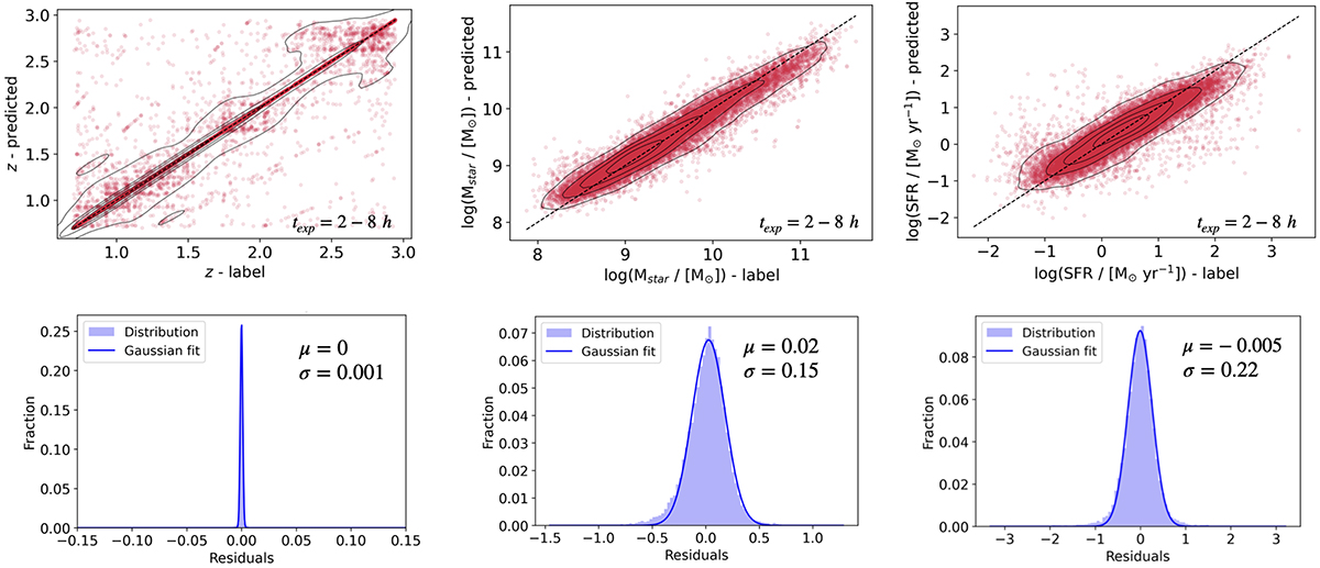
Comparison of predicted and labelled values for redshift, Mstar, and SFR for all simulated MOONS galaxy spectra in the test set with exposure times of 2 h, 4 h, and 8 h. Upper panels: Scatter plots of predicted versus labelled values, with the dashed black line indicating perfect agreement. Solid black lines represent the contours of the joint probability density, corresponding to the 20th, 50th, 75th, and 95th percentiles of the distribution, estimated using a Gaussian kernel density estimator. Lower panels: Histograms of the residuals (‘predicted value – labelled value’; see Sect. 4) with Gaussian fits, showing the mean (μ) and standard deviation (σ) of the distributions.
Current usage metrics show cumulative count of Article Views (full-text article views including HTML views, PDF and ePub downloads, according to the available data) and Abstracts Views on Vision4Press platform.
Data correspond to usage on the plateform after 2015. The current usage metrics is available 48-96 hours after online publication and is updated daily on week days.
Initial download of the metrics may take a while.