Fig. C.1.
Download original image
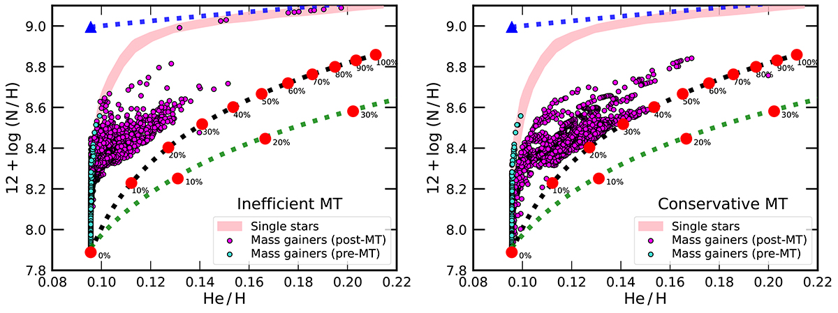
Location of single and binary evolutionary models from Jin et al. (2024, and in prep.) in the N vs. He diagram. The extended pink line covers the evolutionary tracks of the SSEM described in Appendix C. Mass gainers predictions are depicted immediately before mass transfer (MT; cyan dots), and after mass transfer at a time when thermal equilibrium is restored (magenta dots). Left and right panels depict MESA calculations assuming an inefficient or conservative mass transfer, respectively. The dotted-blue line shows abundance ratios under the assumption of complete CNO-equilibrium at any given He abundance. The dotted-green line has the same meaning but assuming a mixture between matter with the initial chemical composition and matter consisting of pure He and the CNO-equilibrium value of N (with a mass fraction indicated by along the red dots). Both dotted lines frame the allowed space for evolutionary models. The dotted-black line refers to a mixture of matter with the initial abundances with matter with a He mass fraction of Y = 0.63, corresponding to the average in the He-enriched part of the donor envelopes, and the CNO-equilibrium value of N.
Current usage metrics show cumulative count of Article Views (full-text article views including HTML views, PDF and ePub downloads, according to the available data) and Abstracts Views on Vision4Press platform.
Data correspond to usage on the plateform after 2015. The current usage metrics is available 48-96 hours after online publication and is updated daily on week days.
Initial download of the metrics may take a while.