Fig. 9
Download original image
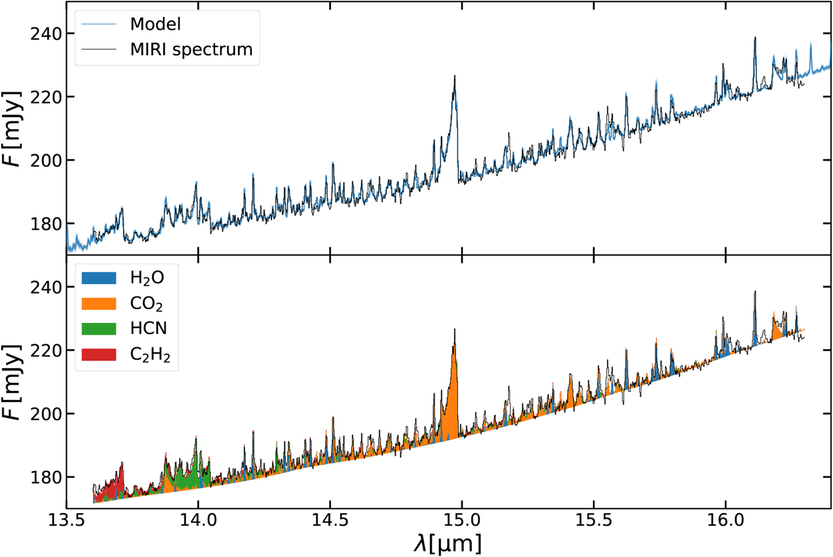
Comparing the MIRI spectrum of GW Lup to the retrieved DuCKLinG models. Upper panel: spectral posterior distribution for a fit of the GW Lup MIRI spectrum. The black line represents the MIRI spectrum. The blue line shows the median fluxes from the models of the posterior distribution. The blue lines consist of contours that represent the 1σ, 2σ and 3σ level of the fluxes. Lower panel: median probability model. The black line represents the MIRI spectrum. The lower edge of the coloured region shows the continuum emission of the model, with the cumulative molecular emission shown in different colours.
Current usage metrics show cumulative count of Article Views (full-text article views including HTML views, PDF and ePub downloads, according to the available data) and Abstracts Views on Vision4Press platform.
Data correspond to usage on the plateform after 2015. The current usage metrics is available 48-96 hours after online publication and is updated daily on week days.
Initial download of the metrics may take a while.