Fig. 6
Download original image
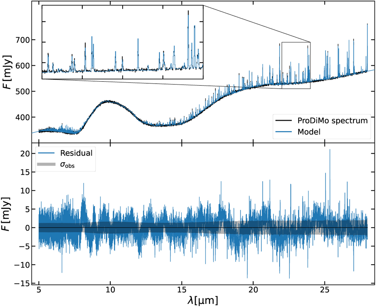
Comparing the ProDiMo spectrum to the posterior of DuCK-LinG models. Upper panel: posterior distribution of the fit of a ProDiMo mock spectrum. The black line is the ProDiMo spectrum. The blue line shows the median fluxes from the models of the posterior distribution. The zoom-in on the upper left shows an enlarged version of the wavelength region from 22 to 24 µm. Lower panel: residual between the model fluxes and the ProDiMo spectrum. The blue line shows the median residual of all posterior models. The black area denotes the noise that was used to create the mock spectrum.
Current usage metrics show cumulative count of Article Views (full-text article views including HTML views, PDF and ePub downloads, according to the available data) and Abstracts Views on Vision4Press platform.
Data correspond to usage on the plateform after 2015. The current usage metrics is available 48-96 hours after online publication and is updated daily on week days.
Initial download of the metrics may take a while.