Fig. 10.
Download original image
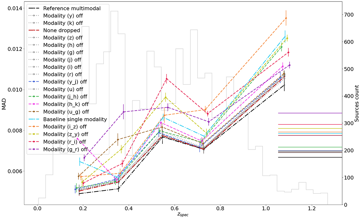
Evolution of the MAD as a function of redshift for the multimodal model with one modality dropped at a time. All the single-band modalities dropped are shown with gray lines as they show similar performances. We also include, for comparison, the baseline model (single modality, dash-dotted cyan line), the reference multimodal model (dash-dotted black line), and the multimodal model trained with dropout but with no modality dropped in the test (dash-dotted dark red line). Finally, we have the different two-band modalities dropped one at a time. Labels on the left panel are ranked according to their mean MAD. The gray histogram shows the redshift distribution of the HSC nine-band test sample. The test objects are evenly distributed between the line points, which are slightly shifted on the x axis for better visual distinctiveness. The horizontal lines on the right represent the mean MAD of each experiment.
Current usage metrics show cumulative count of Article Views (full-text article views including HTML views, PDF and ePub downloads, according to the available data) and Abstracts Views on Vision4Press platform.
Data correspond to usage on the plateform after 2015. The current usage metrics is available 48-96 hours after online publication and is updated daily on week days.
Initial download of the metrics may take a while.