Fig. 2
Download original image
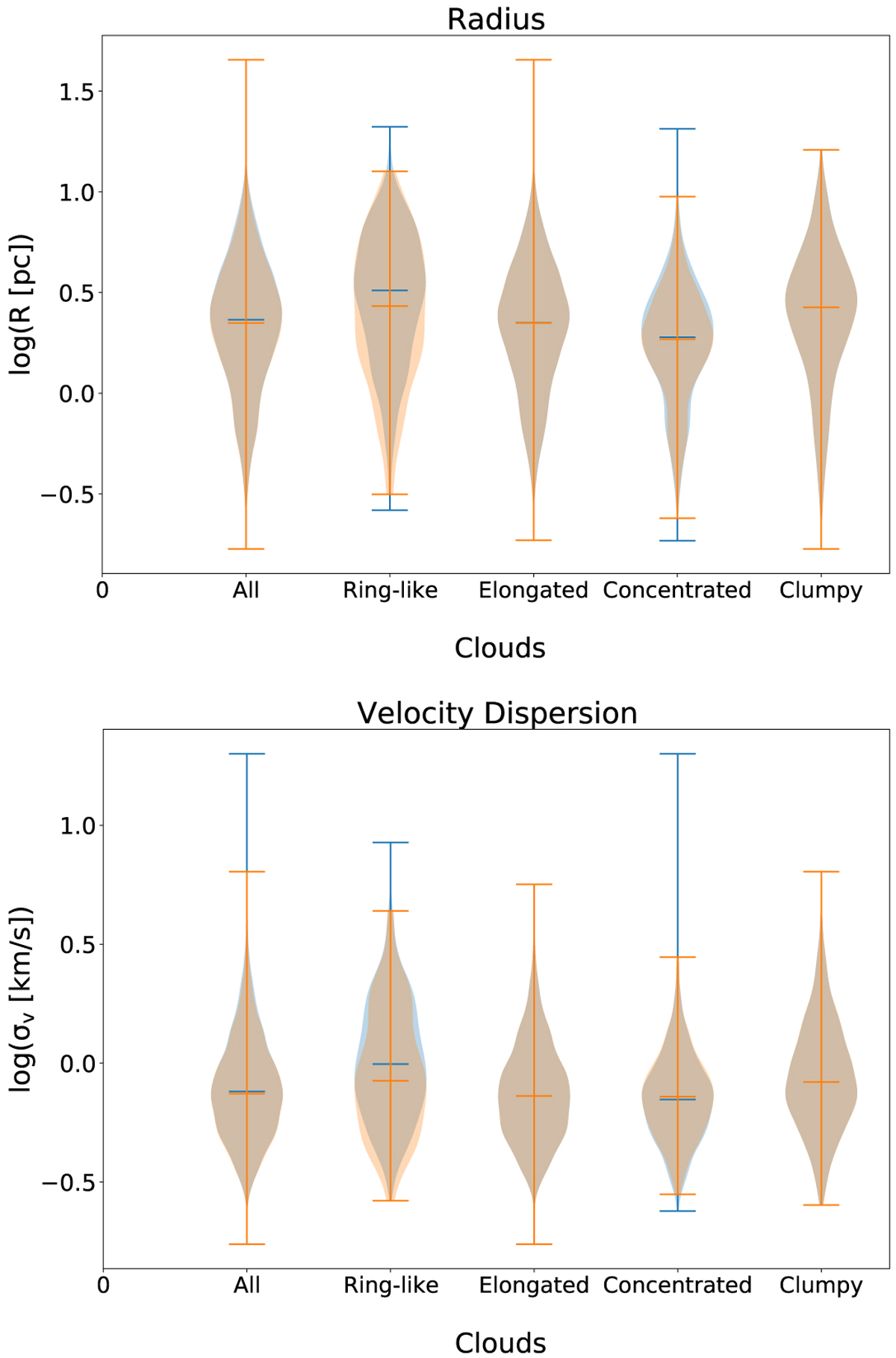
Distribution of radius (top) and velocity dispersion (bottom) for the VC (blue) and MR (orange) samples. The violin plots present the density of the data at different values, which is smoothed through kernel density estimation. The horizontal lines at the ends and middle of the plots represent the extreme and the median values of the distributions, respectively.
Current usage metrics show cumulative count of Article Views (full-text article views including HTML views, PDF and ePub downloads, according to the available data) and Abstracts Views on Vision4Press platform.
Data correspond to usage on the plateform after 2015. The current usage metrics is available 48-96 hours after online publication and is updated daily on week days.
Initial download of the metrics may take a while.