Fig. 66.
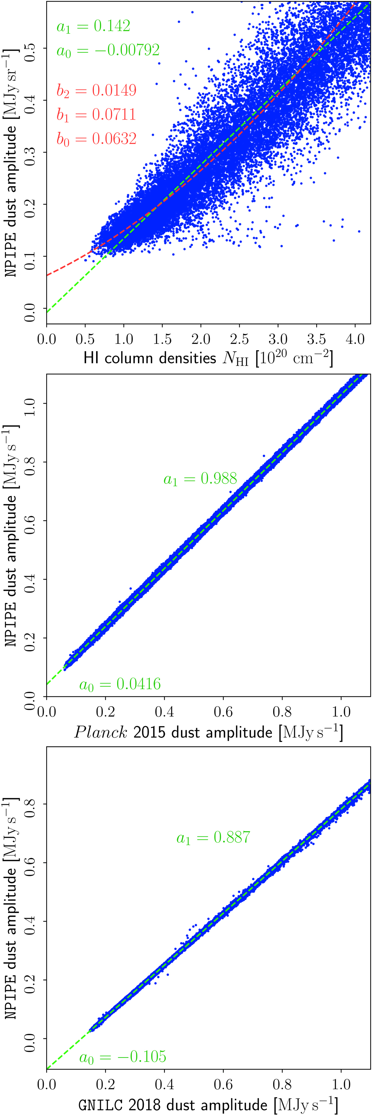
T–T scatter plots between the NPIPE dust amplitude map at 545 GHz and three alternative thermal dust estimates. The panels show, from top to bottom, correlations with respect to: the HI4PI survey (Lenz et al. 2017); the Planck 2015 thermal dust amplitude map; and the GNILC 2018 thermal dust amplitude map. The top and middle panels show maps smoothed to a common resolution of 60′ FWHM, while the bottom panel employs a smoothing scale of 80′ FWHM, determined by the resolution of the GNILC map. The numbers marked by b2, b1, and b0 (first plot) correspond to the best-fit polynomial parameters of a quadratic model (red dashed line, b0 being the intercept), while a1 and a0 (all plots) correspond to the slope and intercept of the best fit line (green dashed line) through each distribution of points.
Current usage metrics show cumulative count of Article Views (full-text article views including HTML views, PDF and ePub downloads, according to the available data) and Abstracts Views on Vision4Press platform.
Data correspond to usage on the plateform after 2015. The current usage metrics is available 48-96 hours after online publication and is updated daily on week days.
Initial download of the metrics may take a while.