Fig. 1.
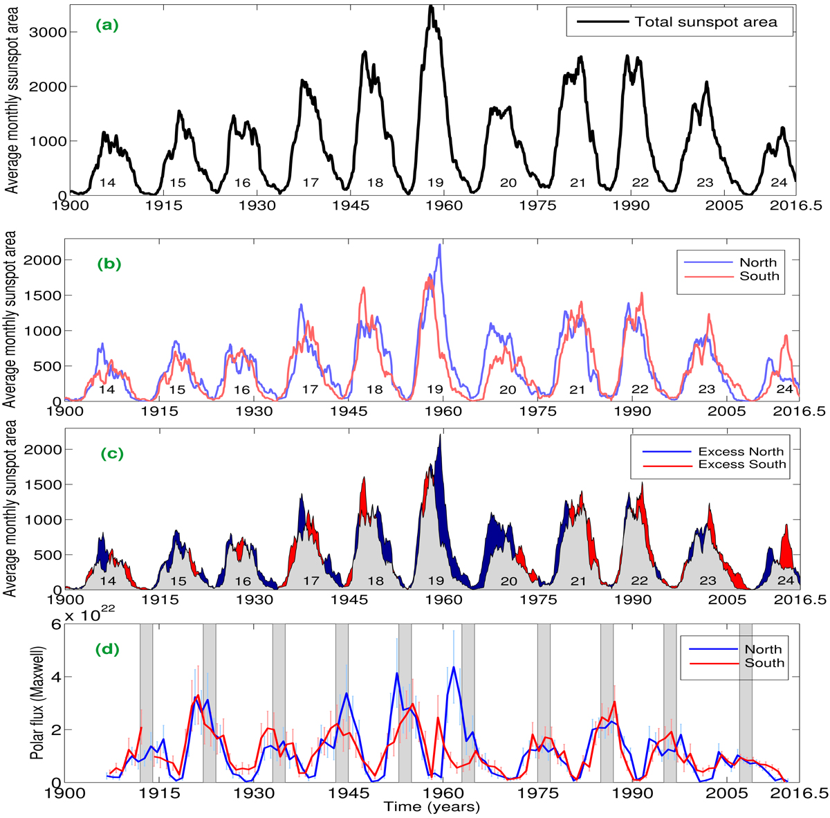
Panel a: time variation of averaged monthly (total) sunspot area during solar cycles 14–24 after performing 13-month running average. Panel b: same in the northern (blue curve) and southern (red curve) hemispheres, respectively, during that period. Panel c: hemisphere-wise excess activity: the blue-filled colour indicates the total area associated with the north hemispheric sunspots to be higher than the southern hemispheric total sunspot area and the red-filled colour depicts the opposite scenario. Panel d: variation of unsigned polar flux with error bars in two hemispheres. The rectangular grey bars depict episodes of solar minimum during 1906–2016.5.
Current usage metrics show cumulative count of Article Views (full-text article views including HTML views, PDF and ePub downloads, according to the available data) and Abstracts Views on Vision4Press platform.
Data correspond to usage on the plateform after 2015. The current usage metrics is available 48-96 hours after online publication and is updated daily on week days.
Initial download of the metrics may take a while.