Fig. 2
Download original image
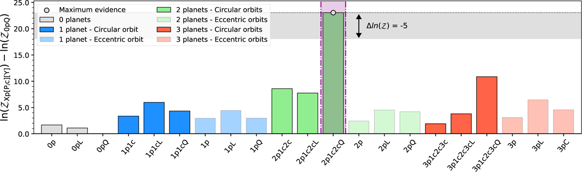
Bar chart showing the differences of the log-evidences of the 21 tested models, which are labelled on the X axis. The grey, blue, green, and red bars represent models with zero, one, two, and three planets, respectively. The vertical magenta shade highlights the simplest model that best represents our data set (2plc2cQ). The horizontal grey shade indicates the 0 ≥ Δ ln (𝒵) ≥ –6 region from the model with the largest evidence.
Current usage metrics show cumulative count of Article Views (full-text article views including HTML views, PDF and ePub downloads, according to the available data) and Abstracts Views on Vision4Press platform.
Data correspond to usage on the plateform after 2015. The current usage metrics is available 48-96 hours after online publication and is updated daily on week days.
Initial download of the metrics may take a while.