Fig. 4
Download original image
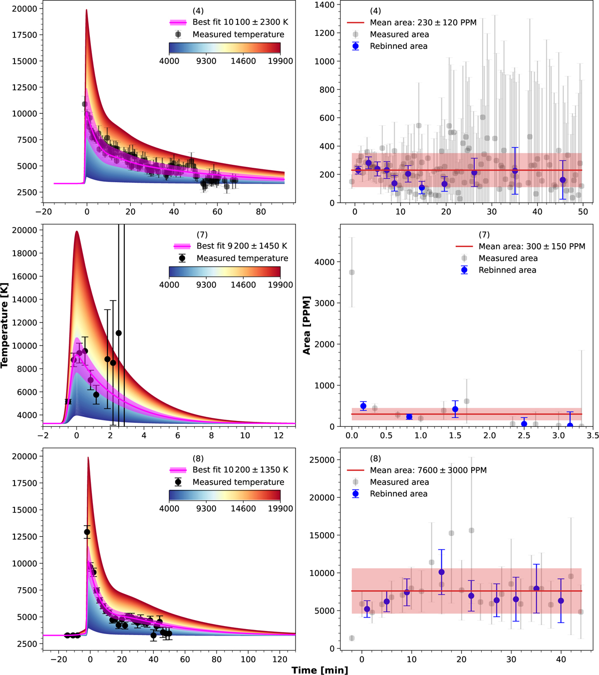
Measured temperature evolution (left), and the evolution of the flare areas (right) for the Flares 4 (top panels), 7 (middle panels), and 8 (bottom panels). In the left panels, the black dots represent the temperature evolution determined from the multi-color observations. The color gradient area depicts the blackbody temperature evolution throughout the event for various peak temperatures of the flares. The magenta line and the shaded interval indicate the best fit and its associated uncertainty range. In the right panels, the gray dots show the flare area evolution over the entire event, with the red line representing the mean area and the shaded red interval indicating its uncertainty. Blue points with error bars show the rebinned area measurements throughout the event. The values on abscissa show time in minutes from the peak of the flare. The number in the upper part of each panel represents the number of the flare in this paper (Table 3).
Current usage metrics show cumulative count of Article Views (full-text article views including HTML views, PDF and ePub downloads, according to the available data) and Abstracts Views on Vision4Press platform.
Data correspond to usage on the plateform after 2015. The current usage metrics is available 48-96 hours after online publication and is updated daily on week days.
Initial download of the metrics may take a while.