Fig. 8.
Download original image
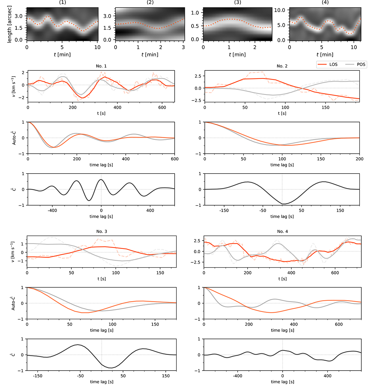
Comparison of the velocity oscillations of the four examples marked with numbers in Fig. 2. These examples represent four different groups of oscillations in our sample of Ca II K fibrillar oscillations. The top row shows time slices of the example fibrils, with the smoothed fitted POS motion overplotted with dotted red curves. Below, we show three plots for each of the four fibrils. The top plot shows the POS velocity (red), and the LOS velocity (grey) with a solid curve for the smoothed data and a dotted curve for the unsmoothed data. The middle plot shows the auto-correlation function of the POS (grey) and the LOS (red) velocity. The bottom plot shows the normalised cross-correlation function (![]() ) of the POS and LOS velocity. For an interpretation of the above plots and more details on the different fibrillar groups, see Sects. 4.2.1 and 4.2.2. An animation of this figure is available online that shows all 468 fibrils in the subsample.
) of the POS and LOS velocity. For an interpretation of the above plots and more details on the different fibrillar groups, see Sects. 4.2.1 and 4.2.2. An animation of this figure is available online that shows all 468 fibrils in the subsample.
Current usage metrics show cumulative count of Article Views (full-text article views including HTML views, PDF and ePub downloads, according to the available data) and Abstracts Views on Vision4Press platform.
Data correspond to usage on the plateform after 2015. The current usage metrics is available 48-96 hours after online publication and is updated daily on week days.
Initial download of the metrics may take a while.