Fig. 2.
Download original image
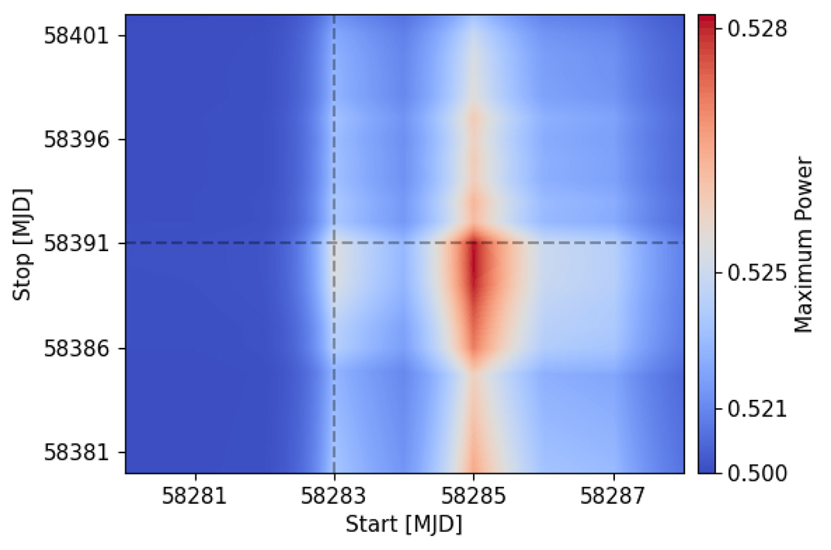
Power of the highest peak in the LS diagram of the V-band light curve after detrending the data and considering different starting and ending dates. This plot was computed to understand which temporal interval to use for searching the best timing solution of the system by means of fitting the sinusoid from Eq. (1) to the data. The power increases from blue to red. A vertical straight line marks the time (MJD 58283) at which the power starts to rise, while a horizontal straight line marks the time (MJD 58391) at which the power starts to decrease.
Current usage metrics show cumulative count of Article Views (full-text article views including HTML views, PDF and ePub downloads, according to the available data) and Abstracts Views on Vision4Press platform.
Data correspond to usage on the plateform after 2015. The current usage metrics is available 48-96 hours after online publication and is updated daily on week days.
Initial download of the metrics may take a while.