Fig. 16
Download original image
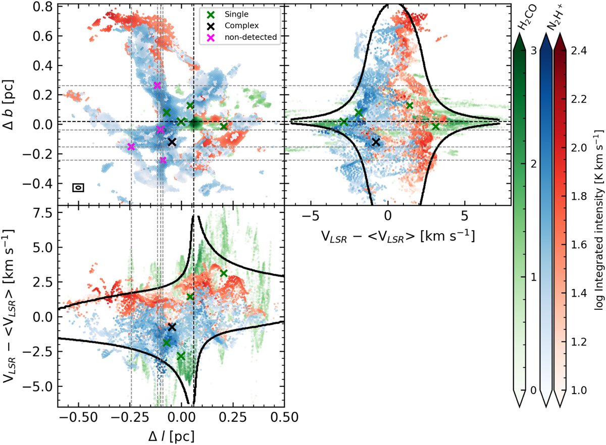
Integrated intensity and PV diagrams of the blue (blue color bar) and red (red color bar) velocity components seen in N2H+ (1–0), and of the H2CO (2–1) emission (green color bar). Top left: spatial distribution of N2H+ and H2CO emission in G351.77. Markers and dashed gray lines are the same as in Fig. 11. The intersection of the dashed black lines represent the center of the rotating and infalling modeled sphere (see Appendix F). The ellipse in the bottom left represents the beam size of the N2H+ data. Top right and bottom left: PV diagrams along the two perpendicular directions. The black contours represent the shapes shown by the rotating and infalling modeled sphere in the PV diagram.
Current usage metrics show cumulative count of Article Views (full-text article views including HTML views, PDF and ePub downloads, according to the available data) and Abstracts Views on Vision4Press platform.
Data correspond to usage on the plateform after 2015. The current usage metrics is available 48-96 hours after online publication and is updated daily on week days.
Initial download of the metrics may take a while.