Fig. 3
Download original image
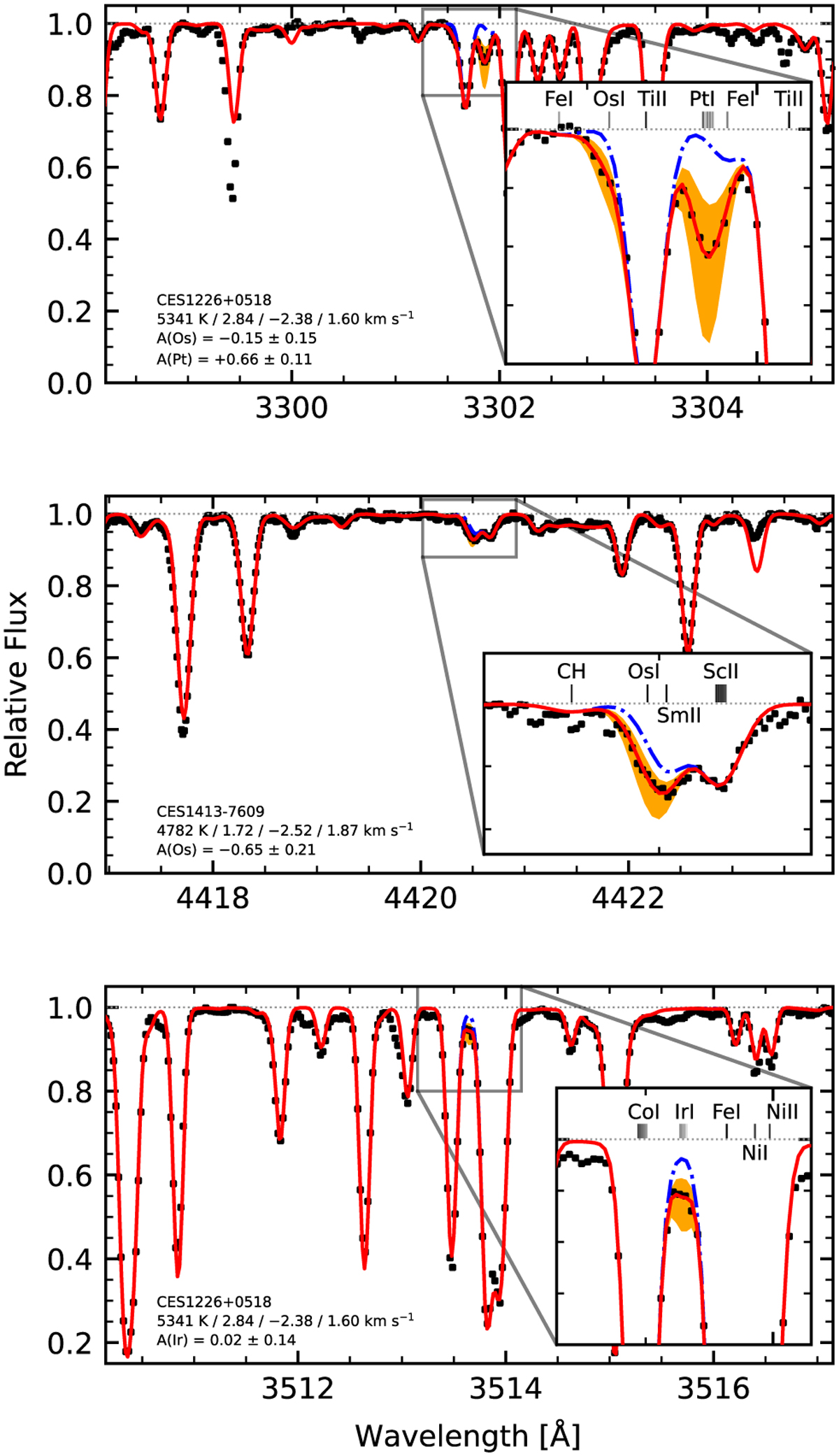
Examples of a spectral fit in Os, Ir, and Pt lines. Black markers show observed spectra. The red solid line indicates the best fit. The blue dash-dotted line shows the spectrum with the species of interest removed. Orange shaded areas are the ±0.3 dex interval around the best fit. Species creating the strongest surrounding lines are labelled in the insets, with the hyperfine–isotopic splitting marked when considered in the line list. The darkest shades of grey indicate the strongest lines.
Current usage metrics show cumulative count of Article Views (full-text article views including HTML views, PDF and ePub downloads, according to the available data) and Abstracts Views on Vision4Press platform.
Data correspond to usage on the plateform after 2015. The current usage metrics is available 48-96 hours after online publication and is updated daily on week days.
Initial download of the metrics may take a while.