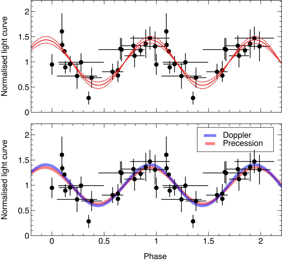
Fig. 11.
Download original image
Folded Swift and NICER light curve. The upper panel shows the light curve of Fig. 10 folded at the best-fitting period of 19.9 d. Two cycles are shown for visual clarity, and the distinction between Swift and NICER data points has been removed. The solid red line represents the sinusoidal modulation with 1σ uncertainties in its amplitude shown as dotted lines. In the lower panel, we show the predicted modulation from Doppler boosting (blue) as well as one possible realisation of the disc precession model (red) corresponding to a disc misalignment of idisc = 20° and observer inclination iobs = 45°.
Current usage metrics show cumulative count of Article Views (full-text article views including HTML views, PDF and ePub downloads, according to the available data) and Abstracts Views on Vision4Press platform.
Data correspond to usage on the plateform after 2015. The current usage metrics is available 48-96 hours after online publication and is updated daily on week days.
Initial download of the metrics may take a while.