Fig. 3.
Download original image
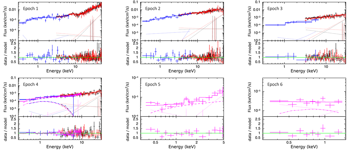
Best–fit results based on the spectral analysis presented in Table B.3. For each figure, in the upper panel we present the spectrum and the best–fit models, and in the lower panel we present the ratio between the observed number of counts (data) and the best–fit predicted number of counts in each spectral bin (model). In all figures, the solid, dashed, dot–dashed, and dotted lines represent the best–fit source+background model, the power–law spectral component, the slim-disk component, and the background models, respectively; the blue, black, red, and magenta data are from Swift/XRT, NuSTAR/FPMA, NuSTAR/FPMB, and XMM-Newton/EPIC-pn, respectively. The y-axes in the upper panels have different scales in each figure.
Current usage metrics show cumulative count of Article Views (full-text article views including HTML views, PDF and ePub downloads, according to the available data) and Abstracts Views on Vision4Press platform.
Data correspond to usage on the plateform after 2015. The current usage metrics is available 48-96 hours after online publication and is updated daily on week days.
Initial download of the metrics may take a while.