Fig. 5.
Download original image
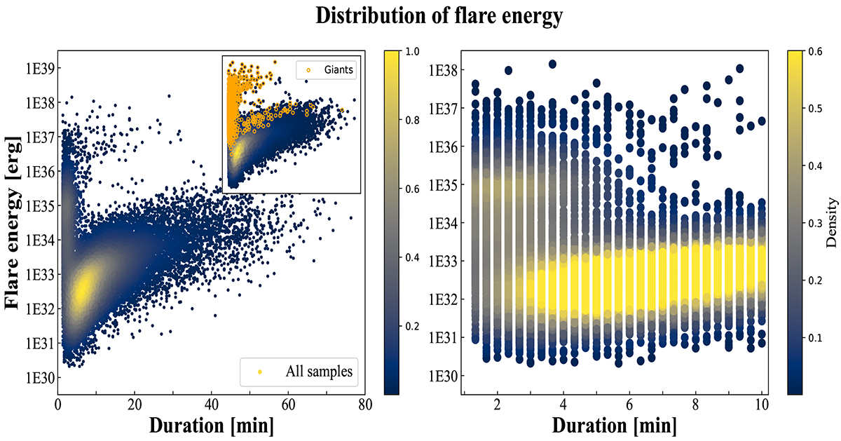
Distribution of flare energies in different duration intervals. Left: relationship between flare energy and duration. The color of the points represents the number density in different regions, with brighter colors indicating a higher number of data points. Note that we use yellow circles to represent the distribution of giants in the small panel, but it does not mean that only giants exist in the positions covered by the yellow circles. Right: details of the flare duration in the 0–10 minute range of the left panel. We have narrowed the scope of the color chart.
Current usage metrics show cumulative count of Article Views (full-text article views including HTML views, PDF and ePub downloads, according to the available data) and Abstracts Views on Vision4Press platform.
Data correspond to usage on the plateform after 2015. The current usage metrics is available 48-96 hours after online publication and is updated daily on week days.
Initial download of the metrics may take a while.