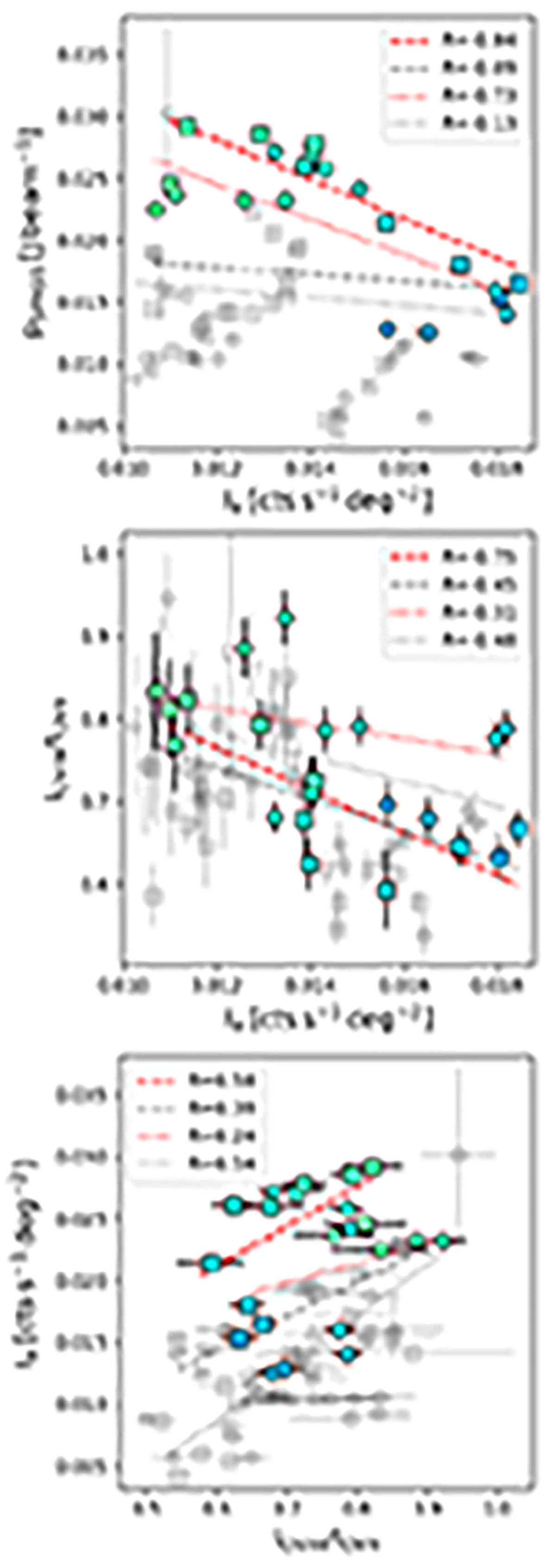
Fig. 11.
Download original image
Scatter plots of the quantities presented in Fig. 9. The symbols and colors of all the points correspond to those of Fig. 9. Only the points included in the region of loop XII (see the hatched region in Fig. 9) are plotted with color in order to highlight their trends. The sets of points are fit with a linear relation. The corresponding Pearson correlation coefficients (R) are reported in the legend. The dashed and dotted lines fit the south (squares) and southwest (circles) points, respectively. The gray and red lines show the fit for all and for the loop XII region points, respectively.
Current usage metrics show cumulative count of Article Views (full-text article views including HTML views, PDF and ePub downloads, according to the available data) and Abstracts Views on Vision4Press platform.
Data correspond to usage on the plateform after 2015. The current usage metrics is available 48-96 hours after online publication and is updated daily on week days.
Initial download of the metrics may take a while.