Fig. 2.
Download original image
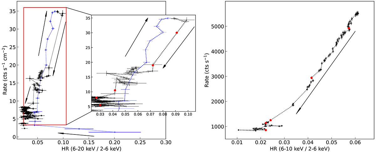
Hardness-intensity diagrams from MAXI/GSC (left panel) and Insight-HXMT/LE (right panel). The blue dotted line represents the rising phase before the outburst peak, while the black line shows the decay phase. The red dots represent the five data sets used in this paper. If there are no simultaneous MAXI data for some data sets, the MAXI data in approximate date are indicated.
Current usage metrics show cumulative count of Article Views (full-text article views including HTML views, PDF and ePub downloads, according to the available data) and Abstracts Views on Vision4Press platform.
Data correspond to usage on the plateform after 2015. The current usage metrics is available 48-96 hours after online publication and is updated daily on week days.
Initial download of the metrics may take a while.