Fig. 3
Download original image
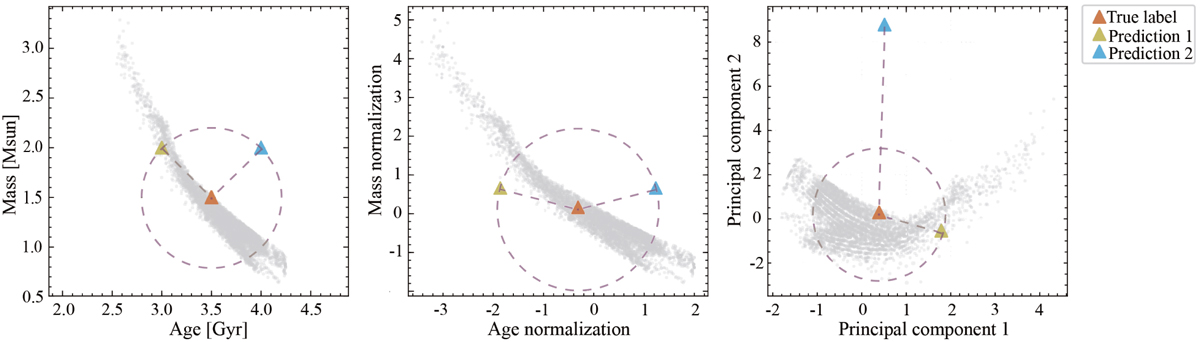
Preference for loss function. To illustrate the effectiveness of different loss functions, we randomly selected a true label (“True label”) from the dataset and produced two predictions (“Prediction 1” and “Prediction 2”), represented by red, green, and blue triangles, respectively. The gray dots represent the distribution of data samples. The dashed circle is drawn with a radius equal to the Euclidean distance between the “True Label” and “Prediction 1”. Left panel: original data distribution. Middle panel: data distribution after z-score normalization is applied separately to age and mass. Right panel: data distribution post-normalization using the Mahalanobis distance.
Current usage metrics show cumulative count of Article Views (full-text article views including HTML views, PDF and ePub downloads, according to the available data) and Abstracts Views on Vision4Press platform.
Data correspond to usage on the plateform after 2015. The current usage metrics is available 48-96 hours after online publication and is updated daily on week days.
Initial download of the metrics may take a while.