Fig. 4.
Download original image
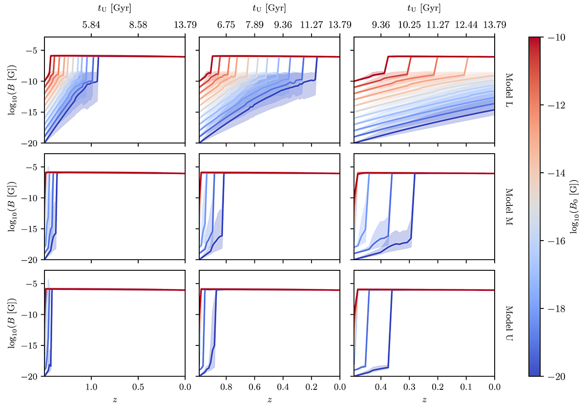
Evolution of magnetic field amplitude over redshift for different models of effective Reynolds number. The curves and shaded areas correspond, respectively, to the average and the 90% confidence interval given by the averaging process described in Appendix C. The age of the Universe tU at each redshift is plotted on the second x-axis. Each row corresponds to a different model, and each column corresponds to a different starting redshift of the dynamo. Model L (top row) has the lowest growth rate, while Models M and U (middle and bottom rows, respectively) show faster growth rates. The figure also shows that the dynamo was much faster in the past (higher redshift values).
Current usage metrics show cumulative count of Article Views (full-text article views including HTML views, PDF and ePub downloads, according to the available data) and Abstracts Views on Vision4Press platform.
Data correspond to usage on the plateform after 2015. The current usage metrics is available 48-96 hours after online publication and is updated daily on week days.
Initial download of the metrics may take a while.