Fig. 5.
Download original image
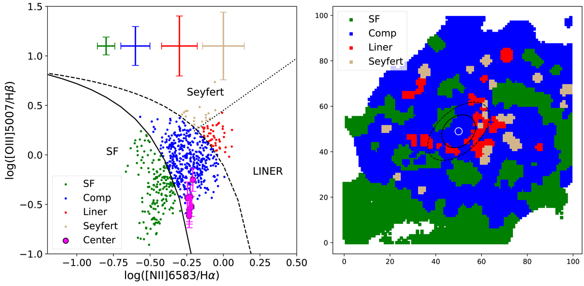
[N II] BPT diagram of the inner region of the Cartwheel. Each point plotted in the left panel corresponds to the MUSE data cube’s single spaxel. Four different colours signify regions of four different ionisation origins of the conventional BPT diagram: green is for star-forming (SF); blue is for composite; red is for low-ionization nuclear emission-line regions (LINER); and grey is for Seyfert. The magenta points represent spaxels inside the small white circle shown in the right panel at the Cartwheel centre. The error bars shown in different colors (left panel) signify the average uncertainty associated with the measurements of each respective ionisation type. The values and the associated uncertainties for each spaxel encompassed by the central white circle (shown in the right panel) are displayed in magenta. The spatial distribution of these points on the Cartwheel is shown in the same corresponding colour in the right panel. The characteristic lines of the BPT diagram shown on the left are taken from Kauffmann et al. (2003, solid), Kewley et al. (2001, dashed), and Schawinski et al. (2007, dotted). We also show the extent of the bar and bulge in the right panel, as in Fig. 2.
Current usage metrics show cumulative count of Article Views (full-text article views including HTML views, PDF and ePub downloads, according to the available data) and Abstracts Views on Vision4Press platform.
Data correspond to usage on the plateform after 2015. The current usage metrics is available 48-96 hours after online publication and is updated daily on week days.
Initial download of the metrics may take a while.