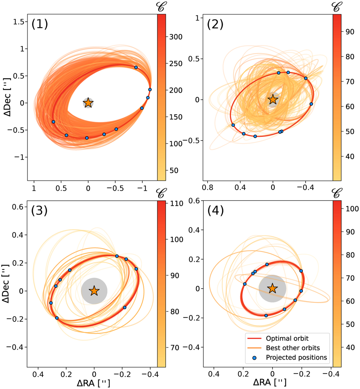
Fig. 7

Download original image
Optimal orbits Sound for each of the tour injected sources along with the best 103 other re-optimized orbits. The red thick line shows the retained optimal orbit, see Table 7. The blue dots art the projected positions of the signal along the optimal orbit ot all epochs and rhe grey circular area represents the largest coronagraphic masi
Current usage metrics show cumulative count of Article Views (full-text article views including HTML views, PDF and ePub downloads, according to the available data) and Abstracts Views on Vision4Press platform.
Data correspond to usage on the plateform after 2015. The current usage metrics is available 48-96 hours after online publication and is updated daily on week days.
Initial download of the metrics may take a while.


