Fig. 10.
Download original image
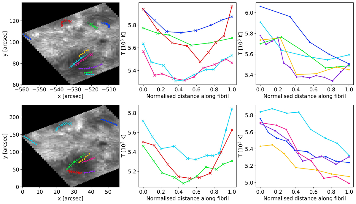
Results of the fibril tracing. The top and bottom panels display the results for sets A and B, respectively. The left panels display the outline of the traced fibrils over a Ca II line centre image, with the colours matching that of the curves from the middle and right panels. Curves marked with an “x” correspond to group 1 fibrils, while dotted curves correspond to group 2 fibrils. The middle panels correspond to the average temperature at the range log τ500 = [ − 5.1, −5.5] as a function of the position along the fibril for the group 1 fibrils. The right panels show the same figures as the middle panels but for the fibrils of group 2. All the distances along the different fibrils have been normalised to the length of each fibril in order to simplify the plots.
Current usage metrics show cumulative count of Article Views (full-text article views including HTML views, PDF and ePub downloads, according to the available data) and Abstracts Views on Vision4Press platform.
Data correspond to usage on the plateform after 2015. The current usage metrics is available 48-96 hours after online publication and is updated daily on week days.
Initial download of the metrics may take a while.