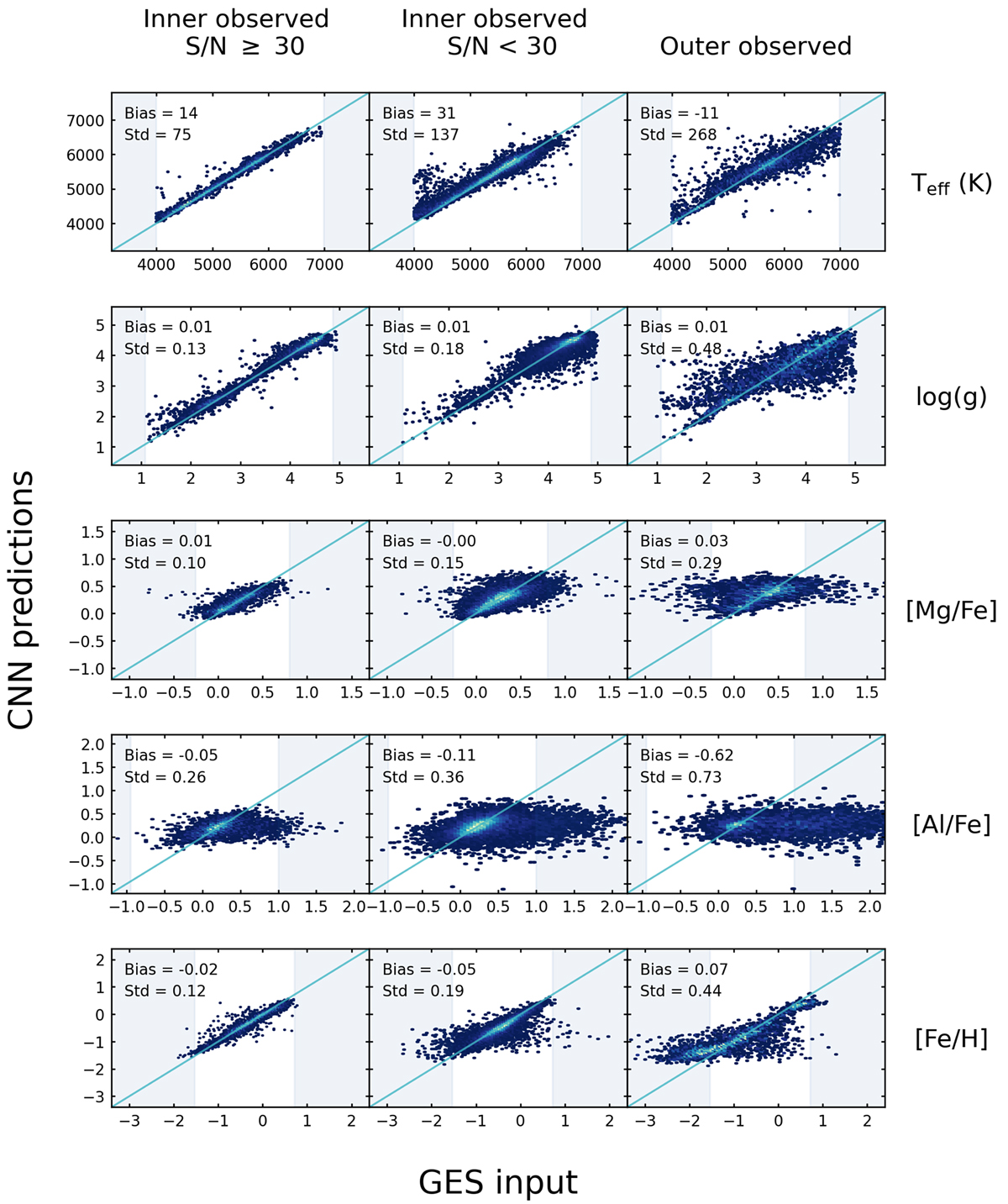
Fig. 9.
Download original image
One-to-one comparison of labels from GES iDR6 and the values predicted by our CNN. The three columns show results for the inner observed set in two different S/N ranges, and for the outer observed set. Each row contains the results for a different label. In every panel, the horizontal axis stands for the GES input labels, the vertical axis represents the labels predicted by our CNN. Brighter colors indicate a higher density of data points (linear color scale). The average bias and the standard deviation (scatter) of the results around the 1:1 relation are given in every panel. Solid diagonal lines indicate the 1:1 relation. Shaded areas indicate GES label values that are outside the training set limits.
Current usage metrics show cumulative count of Article Views (full-text article views including HTML views, PDF and ePub downloads, according to the available data) and Abstracts Views on Vision4Press platform.
Data correspond to usage on the plateform after 2015. The current usage metrics is available 48-96 hours after online publication and is updated daily on week days.
Initial download of the metrics may take a while.