Fig. 10
Download original image
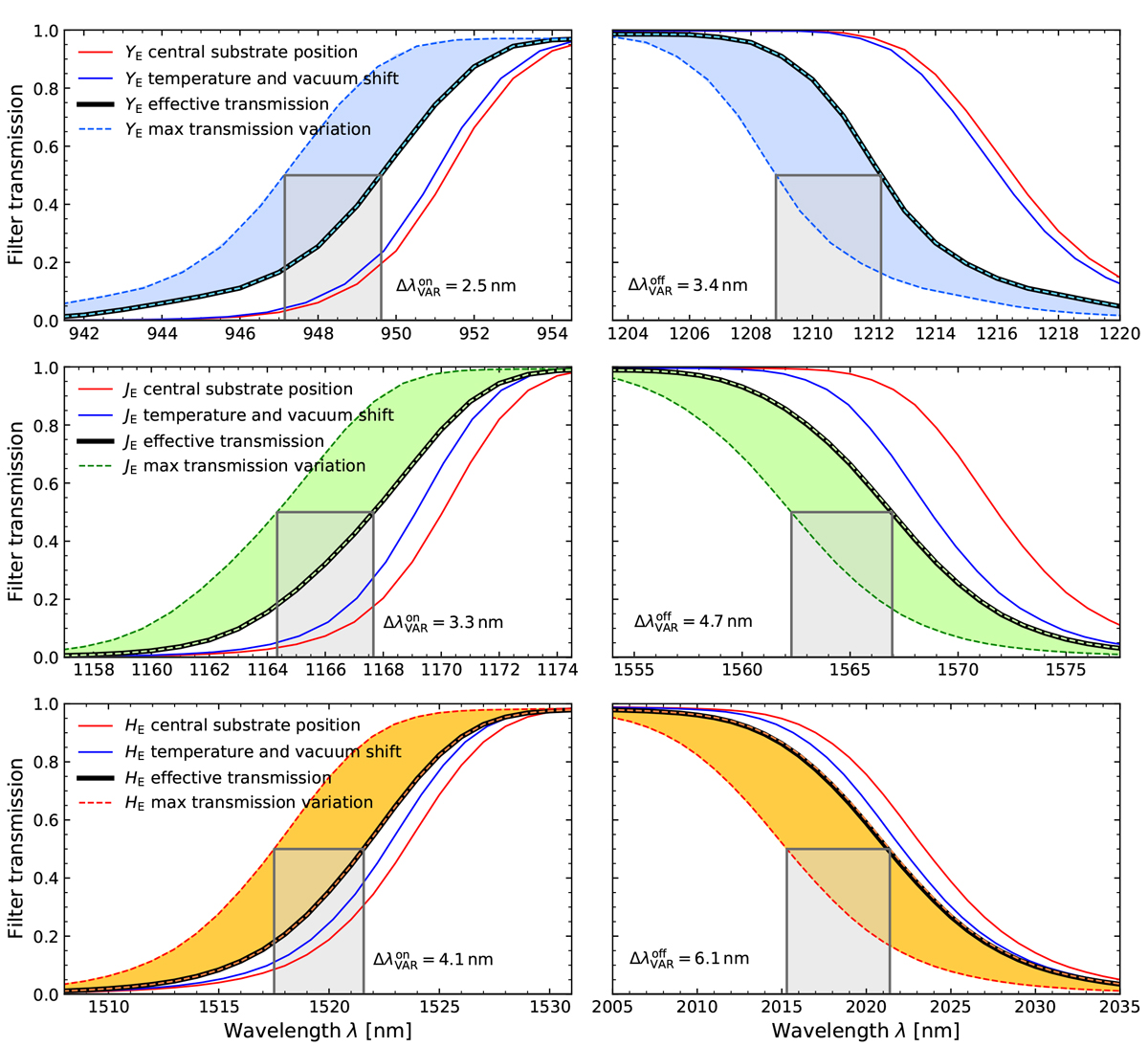
NISP passband flanks and variations. The solid red lines show the local transmission at the filter centre (Fig. 2). The solid blue lines show the combined vacuum and temperature shifts on the red curve. The thick black lines show the effective transmission after integrating over the central beam footprint (centred on the white squares in Fig. 8), cold and in vacuum. The coloured areas enclosed by dashed lines show the range of blueshifts seen by the FPA: the leftmost dashed line corresponds to the bluest FPA corners and the rightmost to the reddest passband near – but not necessarily coincident with – the FPA centre. The grey rectangles show the maximum spread, ![]() of the cut-on and cut-off.
of the cut-on and cut-off.
Current usage metrics show cumulative count of Article Views (full-text article views including HTML views, PDF and ePub downloads, according to the available data) and Abstracts Views on Vision4Press platform.
Data correspond to usage on the plateform after 2015. The current usage metrics is available 48-96 hours after online publication and is updated daily on week days.
Initial download of the metrics may take a while.