Fig. 2.
Download original image
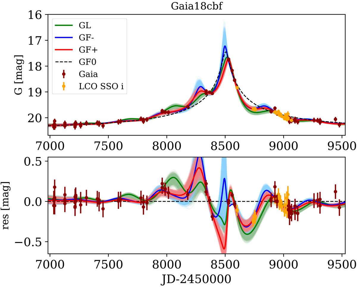
Light curve and best fitting models for Gaia18cbf with follow-up. Maroon dots represent data gathered by Gaia, while yellow dots mark data observed by Las Cumbres Observatory in Siding Spring Observatory (LCO SSO) in the i-band. Continuous lines represent different solutions for a point source-point lens model with parallax effect. Best fitting models for GF+, GF− and GL solutions are shown in red, blue, and green, respectively. In lighter colours, we show other solutions that we obtained through a Markov chain Monte Carlo method. The dashed line represents the point source–point lens model without including a parallax effect, called ‘GF0’. Bottom panel: we show the difference between the GF0 model and other models. The data shown in maroon and yellow dots represent the result of subtraction of the magnitude predicted by the GF0 model and the observed magnitude. We use the same colour representation for the GF+, GF−, and GL solutions, as in the top panel.
Current usage metrics show cumulative count of Article Views (full-text article views including HTML views, PDF and ePub downloads, according to the available data) and Abstracts Views on Vision4Press platform.
Data correspond to usage on the plateform after 2015. The current usage metrics is available 48-96 hours after online publication and is updated daily on week days.
Initial download of the metrics may take a while.