Fig. 11.
Download original image
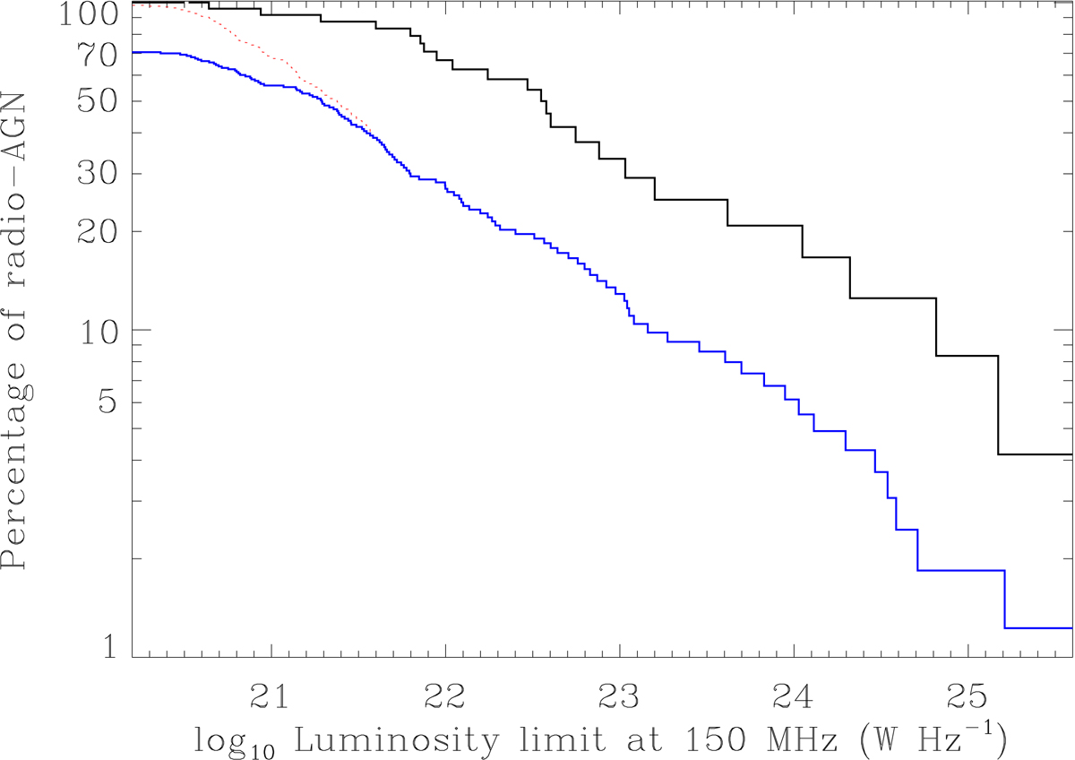
Same as Fig. 10, but splitting the sample into two bins of host luminosity. The black represents the most massive gETGs (K < −25.8), the blue curve corresponds to the less massive gETGs detected with LOFAR, while the red curve includes the upper limits and represents the upper envelope of the distribution for the less massive gETGs.
Current usage metrics show cumulative count of Article Views (full-text article views including HTML views, PDF and ePub downloads, according to the available data) and Abstracts Views on Vision4Press platform.
Data correspond to usage on the plateform after 2015. The current usage metrics is available 48-96 hours after online publication and is updated daily on week days.
Initial download of the metrics may take a while.