Fig. 6.
Download original image
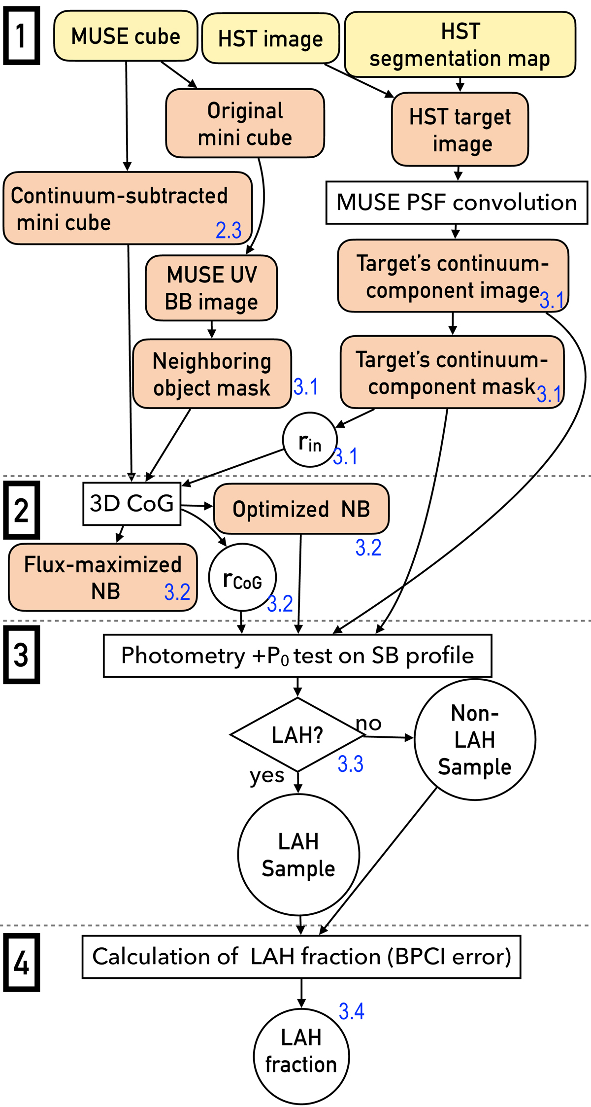
Flowchart of the main part of our analysis with the four steps. The input data are indicated by the yellow rounded boxes at the top of the panel, while output data are indicated by the orange rounded boxes. The analysis and classification are shown by rectangles and diamonds, respectively. The obtained samples and parameters are presented by circles. The details of each step are provided in Sects. 2.3, 3.1–3.4. The numbers colored blue indicate the sections as a reference. The flux-maximized NBs were used to obtain the average SB profiles in Sect. 4.2.1.
Current usage metrics show cumulative count of Article Views (full-text article views including HTML views, PDF and ePub downloads, according to the available data) and Abstracts Views on Vision4Press platform.
Data correspond to usage on the plateform after 2015. The current usage metrics is available 48-96 hours after online publication and is updated daily on week days.
Initial download of the metrics may take a while.