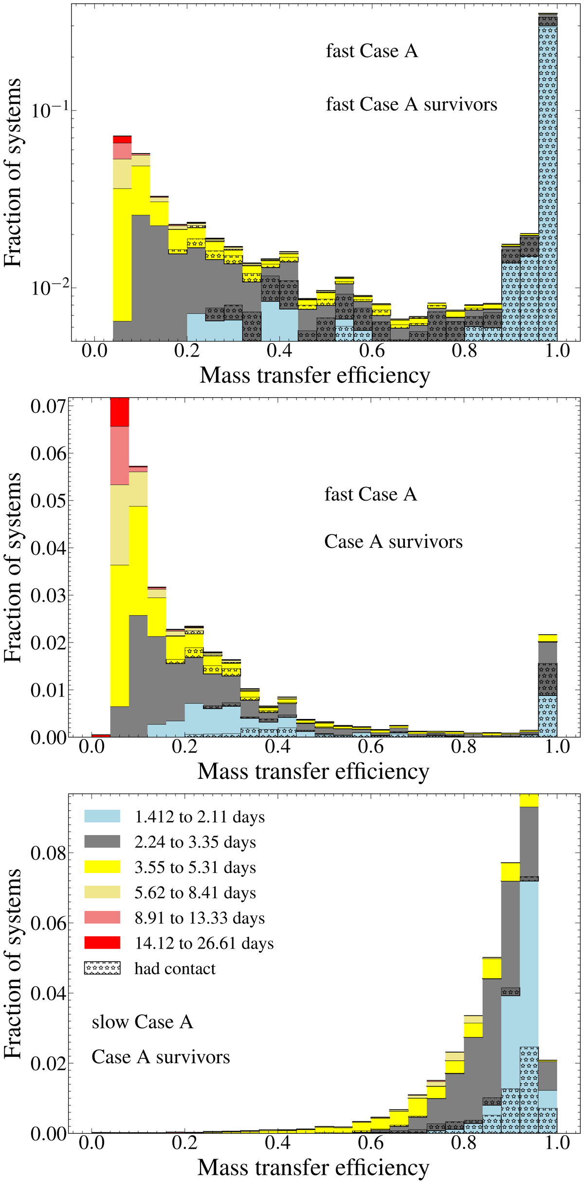
Fig. 3.
Download original image
Distribution of the time-averaged mass transfer efficiency during fast (top two panels) and slow (bottom panel) Case A mass transfer. The top plot includes all models that survive fast Case A mass transfer phase (i.e. light blue, orange and purple models in Fig. 1), while the middle panel includes only those models that survive also the slow Case A mass transfer phase (light blue models in Fig. 1). The colour coding is with respect to the initial orbital period of the binary model. The histograms are weighted with the birth probability of the binaries, and with the amount of time spent in the respective Case A mass transfer phase. The ordinate values are normalised to unity such that the value for each bin gives the weighted fraction of models that have their mass transfer efficiency between those bin edges during fast/slow Case A mass transfer. The fraction of models in any bin that undergo a contact phase are marked with star hatching.
Current usage metrics show cumulative count of Article Views (full-text article views including HTML views, PDF and ePub downloads, according to the available data) and Abstracts Views on Vision4Press platform.
Data correspond to usage on the plateform after 2015. The current usage metrics is available 48-96 hours after online publication and is updated daily on week days.
Initial download of the metrics may take a while.