Fig. 4.
Download original image
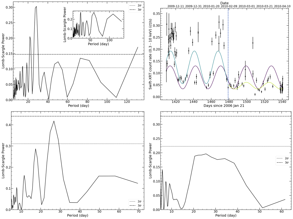
Top left: Lomb–Scargle periodogram for the entire 2009−2010 Swift-XRT dataset of Holmberg II X–1 (black solid line). The 2σ and 3σ levels (dashed and dotted lines, respectively) mark the false alarm probability computed from bootstrapped samples (see text for details). The inset shows the structure of the observing window. Top right: Swift-XRT light curve corresponding to the 2009−2010 segment. The solid purple line indicates the best-fit period from the periodogram of the whole light-curve segment. The solid light blue line indicates the best-fit period from the periodogram considering only the light curve segment to the left of the blue dashed line, while the yellow solid line indicates the best-fit period from the light-curve segment to the right of the blue dashed line. Bottom: Lomb–Scargle periodograms of two sub-segments of the 2009−2010 data separated by the blue dashed line in the top right panel (left and right panels correspond to the data prior to and after ∼day 1480).
Current usage metrics show cumulative count of Article Views (full-text article views including HTML views, PDF and ePub downloads, according to the available data) and Abstracts Views on Vision4Press platform.
Data correspond to usage on the plateform after 2015. The current usage metrics is available 48-96 hours after online publication and is updated daily on week days.
Initial download of the metrics may take a while.