Fig. 7.
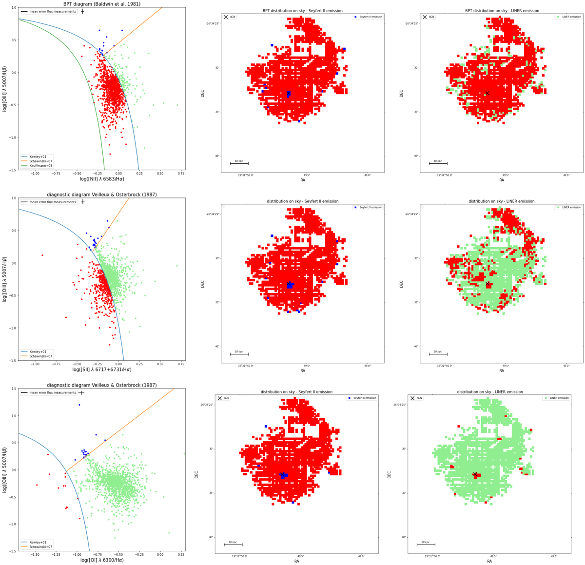
Diagnostic diagrams to distinguish the ionisation mechanism of the nebular gas. First row left: BPT diagram (Baldwin et al. 1981) for all spaxels of the MUSE data cube with S/N > 10 in the emission lines used for the diagnostic. First row middle: BPT distribution on the sky showing the spaxels with Seyfert II emission in blue. First row right: BPT distribution on the sky showing the spaxels which fall in the LINER region of the diagnostic diagram in green. Second row left: diagnostic diagram of Veilleux & Osterbrock (1987) using the [O III]/Hβ vs. [S II]/Hα emission line ratios. Second row middle: distribution on the sky showing the Seyfert II emission in blue. Second row right: distribution on the sky showing the LINER emission in green. Third row left: [O III]/Hβ vs [O I]/Hα diagnostic diagram of Veilleux & Osterbrock (1987). Third row middle: distribution on the sky showing the Seyfert II emission in blue. Third row right: distribution on the sky showing the LINER emission in green. In the latter two diagrams, each data point represents a spaxel of the MUSE cube with an S/N > 10 in each emission line used for the diagnostic. The cross from the upper left corner of all three diagnostic diagrams shows the mean error of the flux measurements. The cross in the neighbouring maps show the location of the AGN.
Current usage metrics show cumulative count of Article Views (full-text article views including HTML views, PDF and ePub downloads, according to the available data) and Abstracts Views on Vision4Press platform.
Data correspond to usage on the plateform after 2015. The current usage metrics is available 48-96 hours after online publication and is updated daily on week days.
Initial download of the metrics may take a while.