Fig. 6.
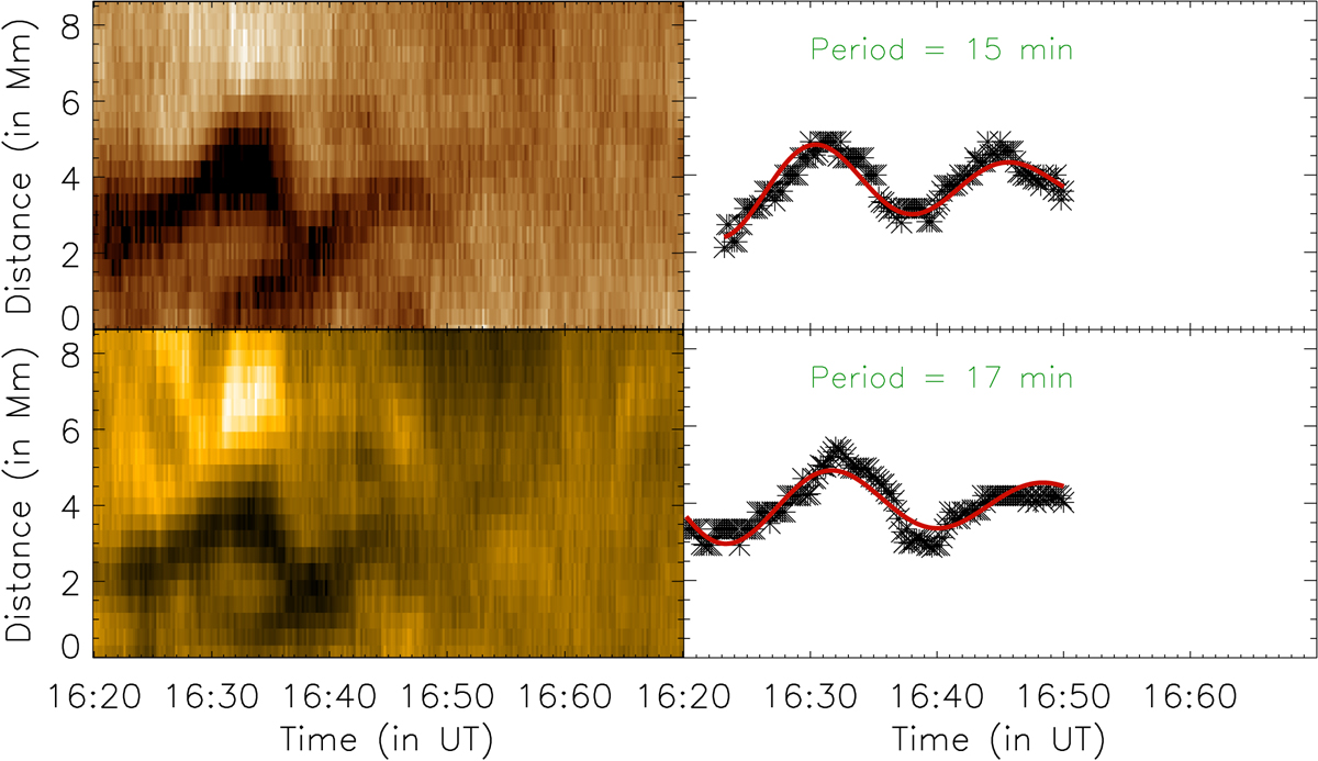
Upper left panel: time–distance map obtained using artificial slit A (see right panels of Fig. 1) in AIA 193 Å data. Lower left panel: similar to the upper left panel but for AIA 171 Å. Black asterisks in upper (and lower) right panel represent the minimum intensity corresponding to the time–distance map shown in the left panels. Overplotted in red is the best-fit exponentially damped sinusoidal curve to the minimum intensity points.
Current usage metrics show cumulative count of Article Views (full-text article views including HTML views, PDF and ePub downloads, according to the available data) and Abstracts Views on Vision4Press platform.
Data correspond to usage on the plateform after 2015. The current usage metrics is available 48-96 hours after online publication and is updated daily on week days.
Initial download of the metrics may take a while.