Fig. 5
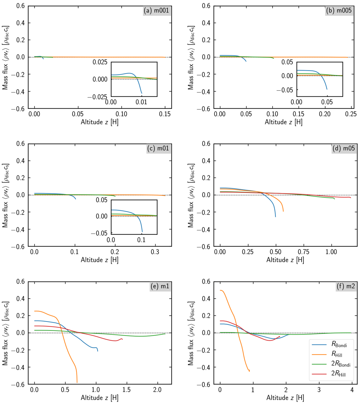
Azimuthally averaged mass flux, ![]() , as a functionof altitude, z. Each panel shows each result obtained from analysis of a series of simulations labelled in the upper-right corner. Each solid line represents the changes of
, as a functionof altitude, z. Each panel shows each result obtained from analysis of a series of simulations labelled in the upper-right corner. Each solid line represents the changes of ![]() ; altitude is varied along with the Bondi radius (blue) of the planet; with the Hill radius (orange); with twice the Bondi radius (green); with twice the Hill radius (red). The correspondences of each solid lineare shown in the lower right legend of panel f. The figures displayed at the lower right of panels a–c are an enlarged view of a specific area in each panel. Gas flows in where
; altitude is varied along with the Bondi radius (blue) of the planet; with the Hill radius (orange); with twice the Bondi radius (green); with twice the Hill radius (red). The correspondences of each solid lineare shown in the lower right legend of panel f. The figures displayed at the lower right of panels a–c are an enlarged view of a specific area in each panel. Gas flows in where ![]() and flows out where
and flows out where ![]() , respectively. Black dashed line corresponds to
, respectively. Black dashed line corresponds to ![]() where inflow and outflow are balanced. We assume substantial inflow and outflow occur in the area where mass flux is dominant; i.e. gas mainly flows in and out of the Bondi or Hill sphere of the planet, depending on which is smaller. We note that the scale of the vertical axis is the same, but the horizontal axis is different for each panel.
where inflow and outflow are balanced. We assume substantial inflow and outflow occur in the area where mass flux is dominant; i.e. gas mainly flows in and out of the Bondi or Hill sphere of the planet, depending on which is smaller. We note that the scale of the vertical axis is the same, but the horizontal axis is different for each panel.
Current usage metrics show cumulative count of Article Views (full-text article views including HTML views, PDF and ePub downloads, according to the available data) and Abstracts Views on Vision4Press platform.
Data correspond to usage on the plateform after 2015. The current usage metrics is available 48-96 hours after online publication and is updated daily on week days.
Initial download of the metrics may take a while.