Fig. 10.
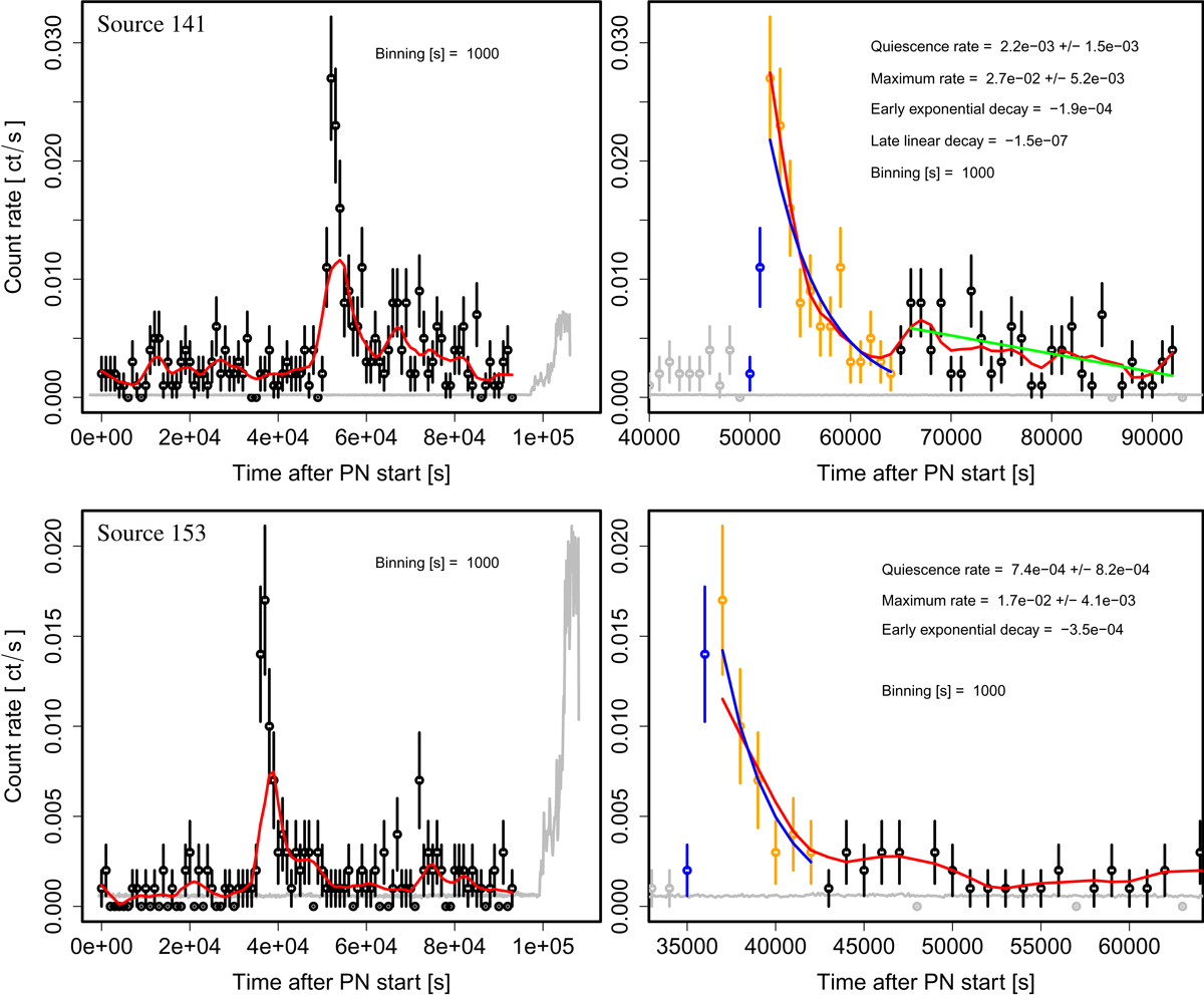
Top: light curves of source 141 (upper panels) and source 153 (lower panels). Left panels: entire pn light curve (black, 0.2–5.0 keV) with a smoothing fit overlaid in red. The background light curve is shown in grey. MOS light curves are not shown since the photon statistics are too low. Right panels: analysis of the individual stages of the flare in a time window around it. Blue data points show the rise to maximum. The early decline (orange) in both sources can be reasonably well modelled with an exponential decline (blue fit curve; compare the red smoothing fit). The decline rates are given in units of cts s−1. Before the flare there are no indications for variability in either source. The binned count rates are entirely consistent with a Poisson process.
Current usage metrics show cumulative count of Article Views (full-text article views including HTML views, PDF and ePub downloads, according to the available data) and Abstracts Views on Vision4Press platform.
Data correspond to usage on the plateform after 2015. The current usage metrics is available 48-96 hours after online publication and is updated daily on week days.
Initial download of the metrics may take a while.