Fig. 11
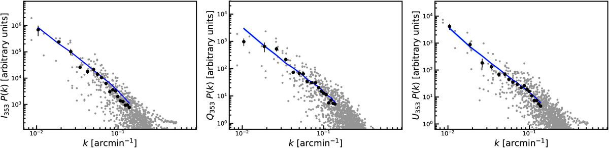
Comparison of the Im, Qm, and Um power spectra extracted from the Planck Polaris Flare maps (grey points representing the two-dimensional power spectra, and black dots representing the azimuthal averages in Fourier space) with the observables computed from simulations using the best fitting parameters (blue curves). The latter curves are averaged over 60 realizations as described in Sect 4.2: the average is given by the central blue curve and the narrow shaded bands give the 1σ and 2σ standard deviation in each bin.
Current usage metrics show cumulative count of Article Views (full-text article views including HTML views, PDF and ePub downloads, according to the available data) and Abstracts Views on Vision4Press platform.
Data correspond to usage on the plateform after 2015. The current usage metrics is available 48-96 hours after online publication and is updated daily on week days.
Initial download of the metrics may take a while.