Fig. 1
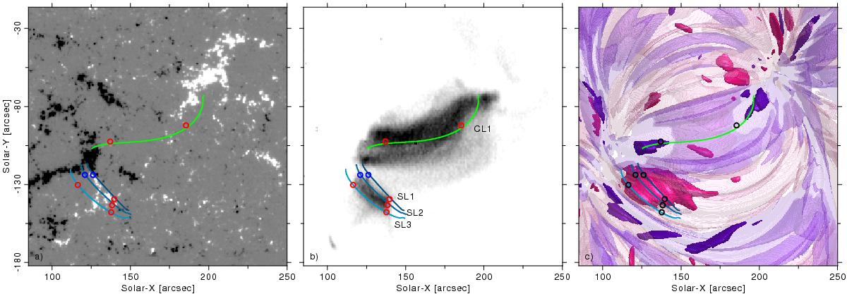
Panels, from L-R, showing a) a Hinode/SOT magnetogram of an AR core seen on the 14th Nov. 2007 saturated at ± 300 G; b) a Hinode/EIS image of the Fe xv emission (at 1.5 MK) of the corona above this region and c) the co-spatial and co-temporal simulated parallel electric field strength and orientation within this region (where pink/purple represents positive/negative E||, and the opacity represents the relative strength of E||− fully opaque regions identify ![]() while transparent regions show
while transparent regions show ![]() , for a peak coronal electric field strength
, for a peak coronal electric field strength ![]() in the simulation domain). The right hand panel is generated by simulations described in Bourdin et al. (2013), which also describes field lines which cross the intensity maxima of several EUV-emissive coronal loops, which have been overlaid in each panel; “CL” indicates core loops, while “SL” indicates shorter loops. The circles indicate EUV-emissive loop footpoints in the model and the corresponding plasma motion (and observed Doppler shifts) at these locations; red represents draining (i.e. motion along the line-of-sight away from an observer) while blue represents upflows (motion towards an observer).
in the simulation domain). The right hand panel is generated by simulations described in Bourdin et al. (2013), which also describes field lines which cross the intensity maxima of several EUV-emissive coronal loops, which have been overlaid in each panel; “CL” indicates core loops, while “SL” indicates shorter loops. The circles indicate EUV-emissive loop footpoints in the model and the corresponding plasma motion (and observed Doppler shifts) at these locations; red represents draining (i.e. motion along the line-of-sight away from an observer) while blue represents upflows (motion towards an observer).
Current usage metrics show cumulative count of Article Views (full-text article views including HTML views, PDF and ePub downloads, according to the available data) and Abstracts Views on Vision4Press platform.
Data correspond to usage on the plateform after 2015. The current usage metrics is available 48-96 hours after online publication and is updated daily on week days.
Initial download of the metrics may take a while.